

The e-commerce concept is pretty simple. You sell products or services online.
But there are a ton of different variables that determine how successful you are. And many involve the features of your website. There’s layout, design, navigation, popups, and calls-to-action (CTAs) just to name a few.
Finding the right combination of variables is critical because this paves the way for an optimal customer experience.
In turn, this helps increase good things like engagement, conversions, and sales, and reduces bad things like a high bounce rate, shopping cart abandonment, and overall customer friction.
Making sure you’re doing the right things largely depends upon one thing—A/B testing. This is what provides you with objective data to inform your decision-making so that you can fine-tune things until they’re just right.
The only problem is that with so many variables, it’s not always easy to know what to test.
But don’t worry, I’ve got you covered.
Here are some A/B testing examples that brands have already had success with and can greatly improve your e-commerce performance as well.
8 A/B Testing Examples You Can Try Today
1. Use Pure Text vs Images and Text in a Popup
2. Try Out Different Backgrounds for Campaigns
3. Adjust Campaign Positioning
5. Experiment with a Grid Layout for Your Products
6. Experiment with Product “Quick View”
1. Use Pure Text vs Images and Text in a Popup
Løbeshop is the largest running specialist in Denmark and has an e-commerce store as well as a brick-and-mortar.
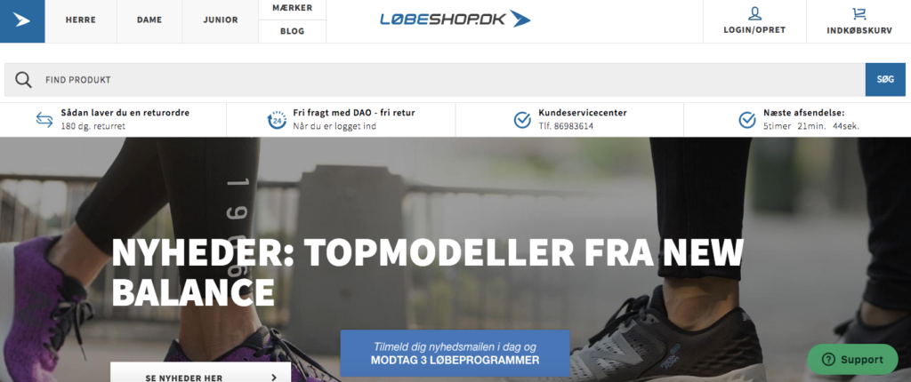
On Løbeshop, shoppers can find products like running shoes, athletic apparel, and outdoor gear.
They also happen to be a Drip customer.
Their primary reason for using our product is to increase signups for their newsletter. They also use a popup to promote their fitness membership.
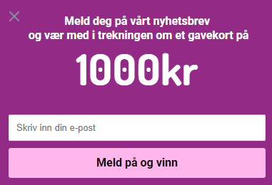
One A/B test that Løbeshop performed was seeing whether visitors responded better to a campaign with pure text or one with a combination of an image and text.
Here’s what the pure text version looked like.
And here’s what the image and text version looked like.
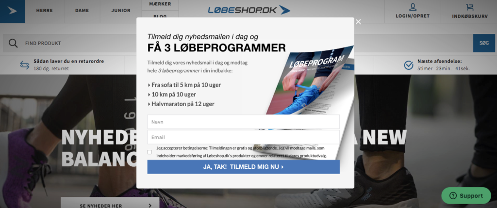
The results?
The pure text version had a conversion rate of 1.3%. After redesigning to the image and text version, it increased conversions to 2.1%.
In other words, conversions were raised by 0.8% by simply adding an image.
And this should come as no surprise.
“Thirty-two percent of marketers say visual images are the most important form of content for their business,” according to HubSpot.
So it’s easy to see why images outperformed text in this instance.
However, as Løbeshop discovered, it’s still a good idea to do this form of A/B testing because it will let you know just how big of a difference it makes.
This brings me to my next point.
2. Try Out Different Backgrounds for Campaigns
Newsletters are still an effective way to obtain customer information and begin moving them through the sales funnel.
Often, this is what gets your foot in the door and is the first step in nurturing leads.
So it only makes sense that a newsletter signup form is something you would want to test.
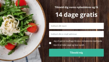
A good example comes from another of Drip’s customers, Arono. They’re a Danish company who created a successful weight loss, diet plan, and workout app.
They run a subscription-based model, where users can get a 14-day free trial and then purchase a monthly, quarterly or annual subscription.
One of the main ways Arono drums up business is with their newsletter signup form, which they create using a popup.
Their test was simple. They used two different visual elements for the background to see which one performed better.
Here are a couple of examples of different backgrounds they used.
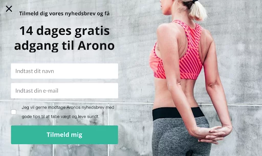
The results were impressive.
By using a different background image, they found that the first popup converted 53 percent better than the second.
These simple changes let them know what their customers’ preferences were, which was a huge asset.
“It’s often difficult to predict what kind of content your users will respond to,” says digital marketing assistant at Arono, Ida Kirstine Hansen. “So we split test different layouts and content to find out what works best.”
This willingness to test has played a big role in Arono’s success and has enabled them to attain higher than average conversion rates.
3. Adjust Campaign Positioning
Wallstickerland is a Danish e-commerce store that specializes in designing, producing and selling wall stickers.
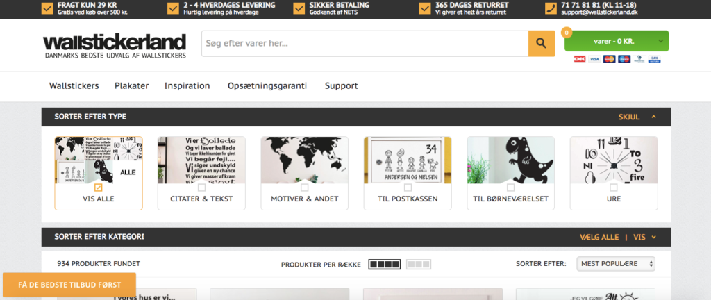
They’ve got some beautiful designs that can really add character to a room.
The main way they use Drip is for collecting signups for their newsletter.
Co-founder of Wallstickerland, Sillas Sixten Højgaard Larsen says that he’s a huge fan of A/B testing with Drip.
One specific aspect he’s had success with was testing out different positions for their popup.
For instance, he would place a popup on the left side of the screen and then on the right side.
Here it is on the left.
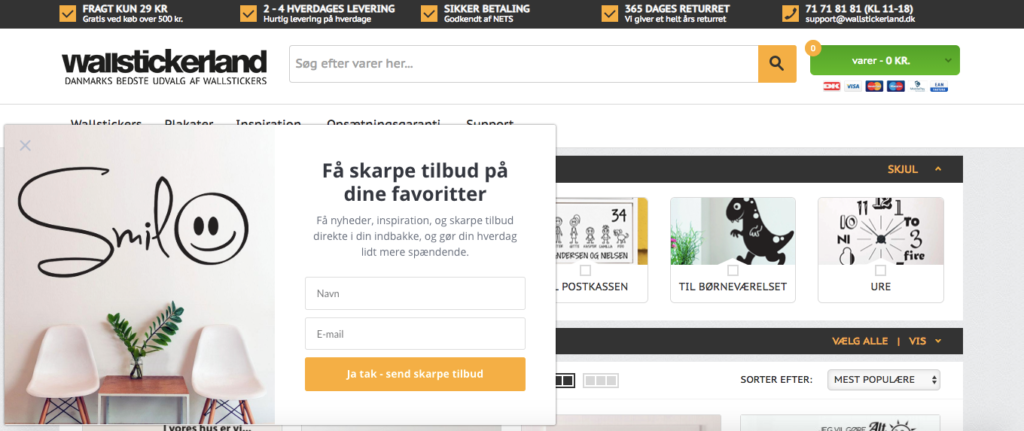
This may not sound like that big of a deal, but adjusting the popup position made a noticeable difference.
Wallstickerland found that they had more success placing the popup on the right side, and they received 17 percent more signups than when it was on the left.
This A/B test proves that even doing something very simple like changing popup positioning can have a significant impact on conversions.
4. Test Promo Timing
Get Inspired is a Norwegian sport and fashion webshop with an impressive selection of shoes and apparel.
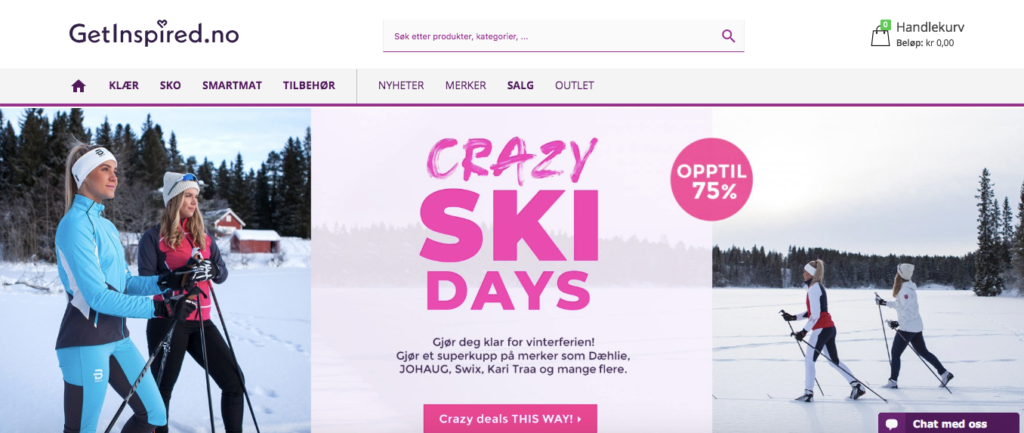
They’ve done a lot of A/B testing with Drip and have also had some great results using Collect Email Addresses.
More specifically, they’ve used it as a means of establishing a healthy email list by giving away a gift card or a product every week to one lucky new subscriber.
Here’s an example.
So far, Get Inspired’s popup have been viewed more than 3.9 million times and have generated over 150,000 leads, for a conversion rate of 3.8 percent.
That’s solid.
But they were able to improve things even more by experimenting with different promo timing.
For instance, Get inspired tested which days of the week they chose the winner to see what people were most responsive to.
And this led to a big difference in their conversion rate.
For this A/B test, you don’t actually change any of the core elements. You simply change when the promo goes into effect.
5. Experiment with a Grid Layout for Your Products
High performing e-commerce stores tend to have one thing in common—great aesthetics.
If you can appeal to shoppers on the visual level, your chances of converting increase.
One way to do this is by experimenting with different layouts for your products.
In particular, using a well-defined grid layout can be beneficial.
That’s something SmartWool Socks did in hopes of increasing its average revenue per visitor.
So, they changed the look of their product pages so that they were grid style and appeared more uniform.
Here are two different versions of a SmartWool Socks product page.
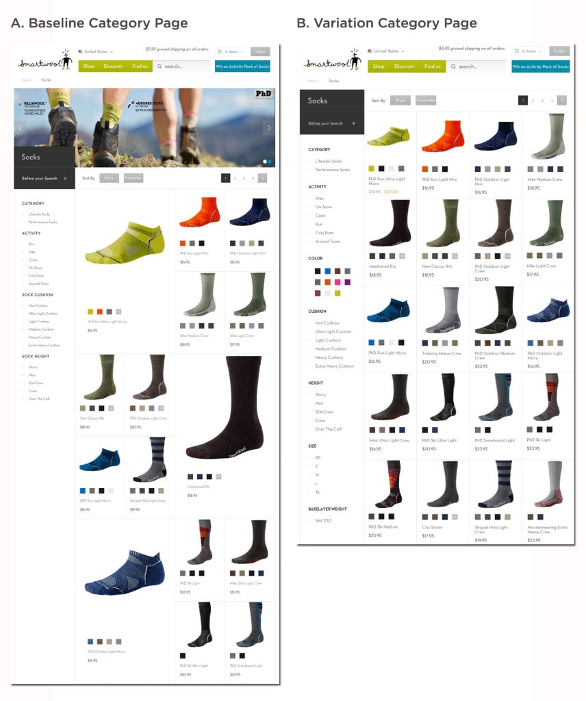
Version A was the original page. It looked good, but the layout was a little funky with a mix of large and small images.
Version B was the new page with a grid layout where everything was nice and uniform.
After testing 25,000 visitors, they discovered that using the grid layout led to a 17.1 percent increase in average return per visitor.
I’d say that’s significant.
This goes to show that testing the layout and experimenting with how you arrange your products can have a major impact on your profitability.
6. Experiment with Product “Quick View”
When browsing your e-commerce store, shoppers want to quickly learn about the products they’re interested in. They don’t want to struggle to get the details.
Most want to extract as much information in the shortest amount of time possible.
That way they can figure out what’s right for them and make a solid purchase without wasting time.
One technique many companies use to streamline things is called “quick view,” where a person hovers their cursor over a product. A lightbox overlay then opens, which offers an in-depth preview of the product.
This typically includes a larger image, product details, and specifications.
Here’s an example.
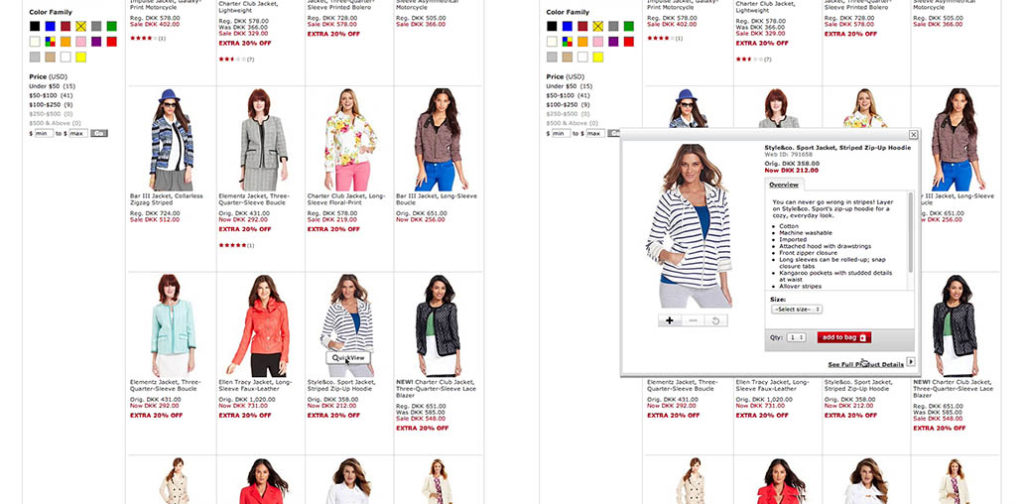
The page on the right offers a quick view, while the one of the left doesn’t.
This means shoppers can learn more about the featured sports jacket without having to manually click on it and check out an additional page/tab.
While they will still have to click on the product in order to purchase it, a quick view can be effective for providing them with key information. And this is nice for making product comparisons.
It’s just a matter of creating a seamless experience that resonates with shoppers.
With nearly half of the top 50 US e-commerce sites offering quick views, this is something that may be worth A/B testing on your own site.
7. Put Enticing Offers Front and Center
Arriving at the shopping cart is a critical stage in the online buying journey.
It’s a make or break moment.
Unfortunately, shopping cart abandonment is a huge problem that can quickly eat away at profits if it’s not kept in check.
Recent data from the Baymard Institute actually puts the online shopping cart abandonment rate at nearly 70 percent.
One way brands are combating this is by displaying a great offer to sweeten the deal. This provides digital shoppers with some added motivation so that a fewer number get off the hook.
Another of the A/B testing examples I recommend is placing an enticing offer in a conspicuous area of the shopping cart.
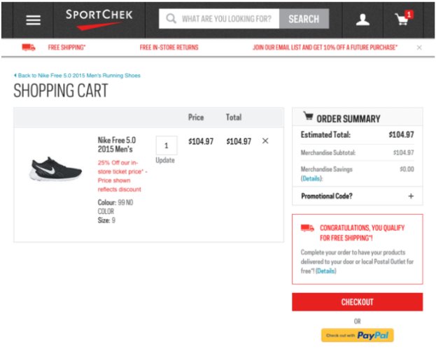
This is something Canadian sports retailer Sport Chek did when changing the way they approached free shipping.
On the original page, it simply said that shoppers would receive free shipping on orders of $25 or more.
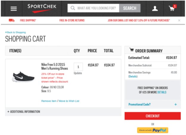
But on the test version, they tweaked it and said “Congratulations, You Qualify for Free Shipping!”
Not only that, they used red text within a box outlined in red to grab shoppers’ attention.
Here’s what it looked like.
It’s hard not to notice it.
This turned out to have a big impact and increased purchases by 7.3 percent.
And you can bet that over time, this raised their overall profitability significantly.
So, if you offer free shipping on certain sized orders or a similar perk, it’s smart to test out some different versions.
Experimenting with font and bordering takes it one step further and should get more eyeballs on it.
8. Use CTA Text Variations
Tweaking CTAs is one of the more old school A/B testing examples.
But it’s certainly still important.
Sometimes, just a minor adjustment in wording can send conversions soaring.
Case in point — an A/B test performed by Dewalt, one of Black and Decker’s brands.
They tested different CTAs on multiple pages of their site to see what type of impact it would have.
One particular page was for one of their hand drills.
The original CTA said “Buy Now,” and the variation said “Shop Now.”
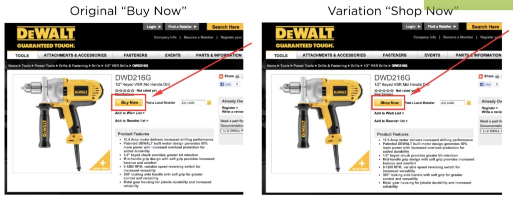
They found that the original “Buy Now” version received 17 percent more clicks than the variation.
So that was obviously the one they stuck with and helped guide their CTA copy from then on out.
This particular test tells us three things.
- Split testing CTAs will likely never go out of style.
- Even a minor adjustment in wording can dramatically improve conversions.
- You don’t want to get “too cute” with your CTAs. Keeping it simple is usually best.
If you’re looking for some ideas for CTAs, I suggest checking out this post.
It’s a list of call-to-action examples that should get your creative juices flowing.
Conclusion
The thing that I love about e-commerce is that there’s always room for improvement.
There’s no end to the different elements and combinations you can test on your site. And it doesn’t have to be complicated.
Sometimes, just a minor tweak can dramatically improve conversions.
More importantly, this enhances the customer experience and reduces any friction on their end. That way they’re happy and more likely to return.
Hopefully, these A/B testing examples will give you some ideas so you’ll know some specific elements to experiment with.
By making the right adjustments, you can take your e-commerce performance to the next level.

