

E-commerce shoppers scroll more frequently than ever. UX designer Joe Rinaldi says scrolling is second nature to today’s users, especially with the widespread use of mobile devices.
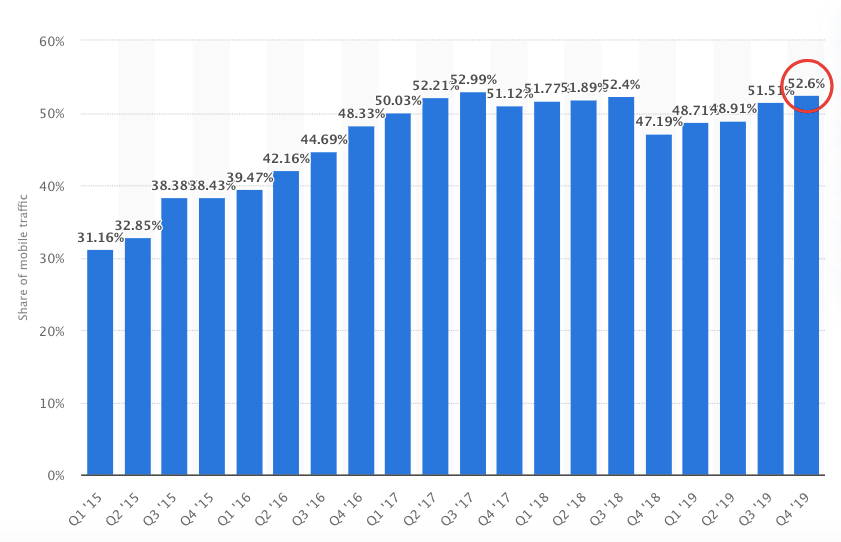
In fact, 52.6 percent of all website traffic came from mobile in Q4 of 2019.
That said, nailing your above the fold content is still crucial. One of my favorite studies by Nielsen Norman Group makes an excellent argument for this.
“The fold matters because what appears at the top of your page matters. Users do scroll, but only if what’s above the fold is promising enough. “What is visible on the page without requiring any action is what encourages us to scroll.”
In other words, if you fail to provide the right e-commerce site elements above the fold and create an enjoyable digital shopping experience, you’re going to have difficulty getting shoppers to scroll.
So that’s what I want to tackle in this post. Here I’ll discuss some key elements to include and offer several different e-commerce above the fold content examples from brands who’ve got it right.
Here we go.
1. What You’re Offering
Let’s start from the absolute top. The moment a shopper lands on your e-commerce store, they need to know exactly what it is you’re offering. If they have any difficulty here, many will leave never to return.
So you need to make it crystal clear. Take SnackNation, for example. They’re an award-winning healthy snack delivery service that sends out delicious snack boxes to customers. And they don’t waste any time letting shoppers know what to expect with their above the fold content.
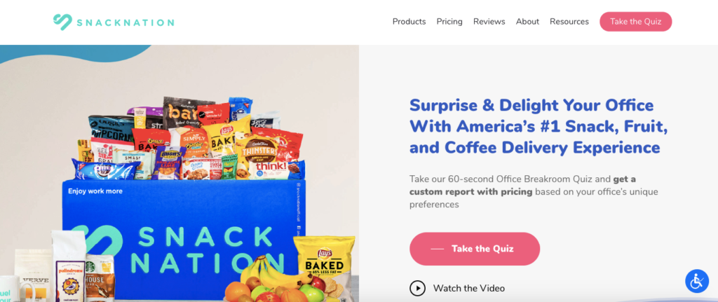
They put one of their snack boxes front and center so shoppers can tell what to expect when ordering. This should definitely pique their interest and encourage them to want to learn more, which they can easily do by scrolling down the page.
But like Nielsen Norman Group pointed out, there’s a sequence that has to happen. Having the right content above the fold, like what’s on offer, is what compels shoppers to explore further.
So there should be no ambiguity in this area, which brings me to my next point.
2. A Clear Value Proposition
Put yourself in your average shopper’s shoes for a second. They just landed on your e-commerce site and have no clue what distinguishes your brand from any other in your industry.
Your job is to succinctly and concisely explain what makes your company stand out and why shoppers should care. And the best way to go about this is with a clear value proposition, which according to Investopedia, “refers to the value a company promises to deliver to customers should they choose to buy their product.”
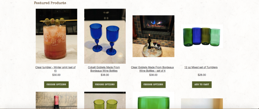
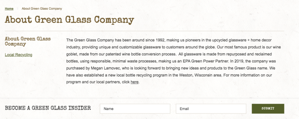
Here’s an excellent example from The Green Glass Company, a brand that sells recycled glassware created from wine and beer bottles.
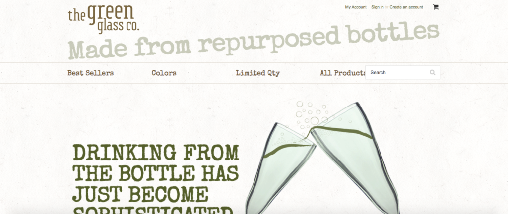
Their value proposition is that their products are “made from repurposed bottles.” It’s one of the first things you notice. You can land on their website and, within second, see why they’re unique without having to do any scrolling or investigation.
With just four simple words, they convey what they’re all about. And when you combine their value proposition with their eco-friendly sounding name—The Green Glass Company—it’s even easier to make the connection.
Given that nearly 70 percent of today’s shoppers are at least “somewhat concerned” with sustainability, and 47 percent are willing to pay more for sustainable products,” this value proposition should no doubt capture the attention of many shoppers.
Then, those who want to learn more can scroll down further to see what specific types of products The Green Glass Company offers and what goes into making their products.
This example shows how simple a value proposition can and should be.
But of course, creating one is often easier said than done, so I suggest experimenting with it and coming up with a few ideas to see what works best.
For advice on this, check out this guide from HubSpot. It will walk you through the fundamentals step-by-step.
3. Simple, Intuitive Navigation
Ninety-four percent of consumers say they want a site that’s easy to navigate and don’t want to struggle to find what they’re looking for. And that’s a reasonable enough request. I know I find it incredibly frustrating when I’m interested in a brand but have to struggle to find a particular product.
Offering simple, intuitive navigation is essential for engagement because it gives shoppers a quick overview of what your e-commerce store has to offer. At a glance, they can get an idea of what types of products you’re selling, so they’ll know whether or not it interests them. If it does, this increases the chances of a shopper either scrolling down the page or clicking on a navigational link.
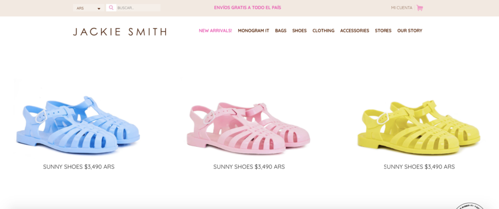
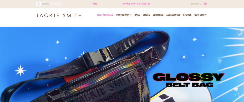
A good example of an e-commerce brand with superb navigation is fashion company, Jackie Smith.
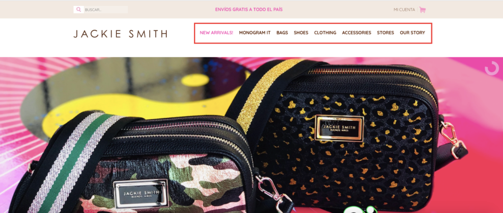
In an instant, you can figure out what they’re selling with zero cognitive expenditure. Their menu makes it a breeze to narrow down the product search, like this one for shoes.
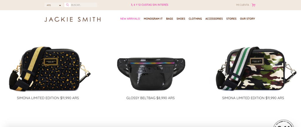
They also use a website carousel to display a few of their top items above the fold like this belt bag.
Once you click on it, you’re taken to the bags page of their site where you’ll find this and other relevant products.
The point here is that navigation is sometimes overlooked because it’s such a basic element of web design. But it’s something you should give plenty of thought to. You should ensure that e-commerce visitors know what you offer and how to seamlessly get to it by simply looking above the fold on your site.
4. Compelling Images
Most of us are hardwired to be visual creatures. It’s just easier to digest images than it is to digest text. “In fact, the human brain processes images 60,000 times faster than text, and 90 percent of information transmitted to the brain is visual.”
Why do you think we go to great lengths to pack our blog content full of images and screenshots? It’s just more pleasing to the eye and makes the content more enjoyable to read. So it only makes sense that you should include compelling imagery.
One of my favorite e-commerce above the fold content examples for this is Allbirds, a company that sells ultra-comfortable, environmentally friendly footwear.
Here’s what I’m talking about.
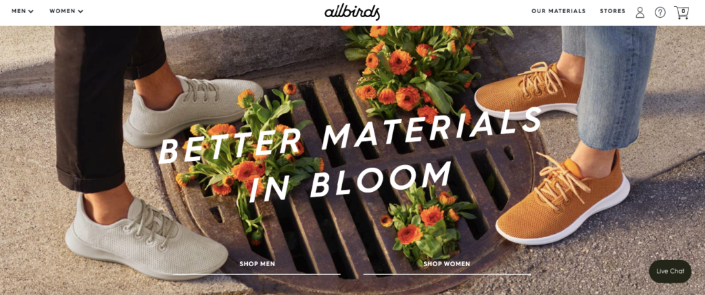
It’s a really simple shot, and there’s nothing over the top about it. But it certainly “pops” and showcases a couple of their products, while pulling you in and quickly generating interest. The image is crisp and professional and uses an attractive color scheme to create an artistic composition.
Another example is this one from Bon Bon Bon, a premium chocolate company that allows customers to build their own box of chocolates.
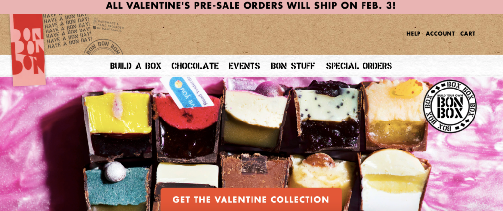
It’s much louder than Allbirds and uses bold, vibrant colors to grab shoppers’ attention. So this goes to show that there are multiple ways to go about it.
What’s important is that your images are uber professional and mesh with your brand identity. Now I realize that the term “compelling images” is subjective, and a picture one person thinks is brilliant may only be so-so to someone else.
My point here is that the images you use in your above the fold content should go above and beyond, and you shouldn’t settle on generic, mediocre stock photos. Instead, opt for personalized ones that capture the essence of your brand.
5. The Benefits of Buying From You
This element of your above the fold content basically branches off of the value proposition and further makes the case why shoppers should buy from you.
Getting this part right can often mean the difference between a shopper exploring your site in-depth and ultimately making a purchase or exiting prematurely.
Here’s a great example.
Bohemian Traders is an Australian-based women’s and family apparel brand that specializes in classic European cuts.
They’ve got a hip, classy style and an extremely loyal customer base.
They’ve also got a great looking website and specifically mention three major benefits of buying from them.
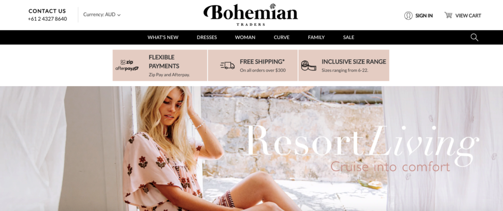
They offer:
- Flexible payments
- Free shipping on orders over $300
- An inclusive size range
And because Bohemian Traders makes it immediately obvious, shoppers know about these benefits right out of the gate, which should encourage scrolling and engagement.
So I suggest doing something similar and taking some time to identify some of the core benefits that your brand offers. Then, look for creative ways to work them into your above the fold content.
You obviously can’t get super detailed because you’re dealing with limited real estate, but you can certainly cover the highlights. And often that’s all it takes to motivate shoppers to buy.
6. A Well Placed CTA
Let me preface this by saying a CTA doesn’t make sense above the fold 100 percent of the time. In some cases, using a CTA this high up on an e-commerce site can target prospects prematurely before they’ve had enough time to acclimate and become familiar with your brand.
There was even one study performed back in 2012 that found no discernible difference when placing a CTA above the fold and one below the fold.
However, most e-commerce experts will agree that using a well placed CTA above the fold in a way that jives with the rest of your content is a smart move and should effectively direct shoppers to the pages you want them to land on.
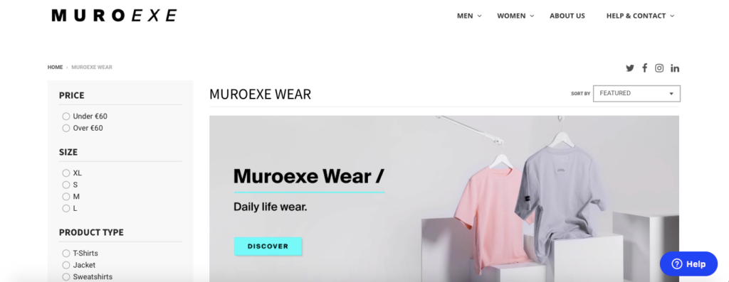
Take, for instance, Muroexe, a brand that specializes in “footwear and backpacks that fuse sports technology with minimalist design.”
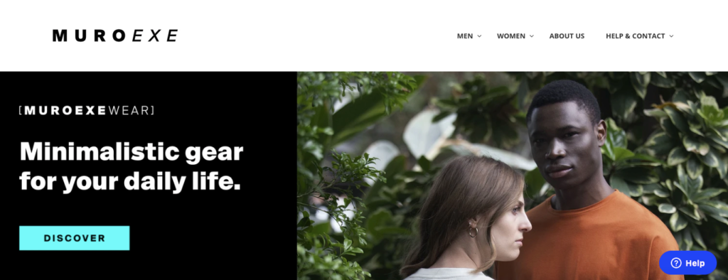
Their CTA is straightforward and uses the word “Discover” to point shoppers to a targeted page to find their top products, “Muroexe Wear.”
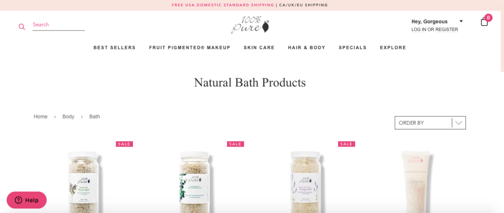
Their CTA incorporates best practices, such as being brief, personalized and using contrasting color with the background. This is something cosmetics company 100% PURE also does well on their site.
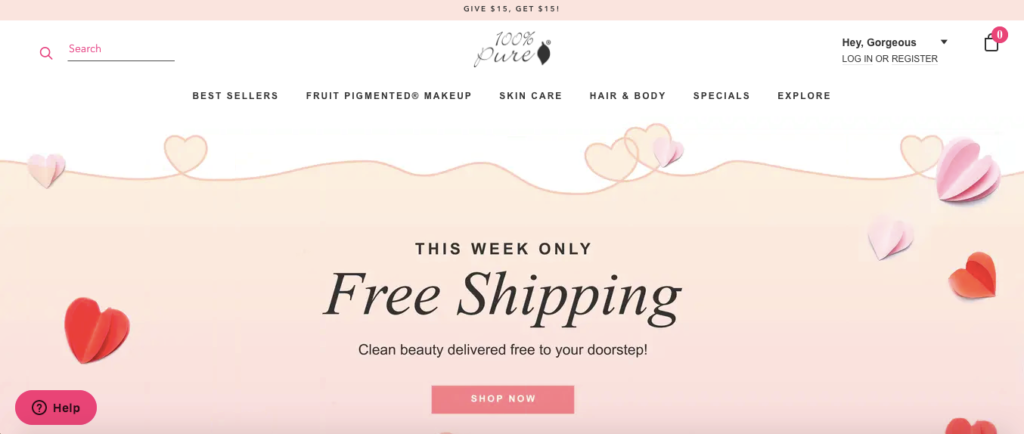
They keep it very to the point using “Shop Now” for their CTA to bring shoppers to their natural bath products section, which is something they’re trying to promote at the moment.
Optimizing CTAs is a whole other topic that I don’t have the time to cover in this post adequately. But this guide from Rikke will fill you in on the details so you can get the absolute most out of yours.
7. Your Brand Logo
This final element serves two main purposes. First, it helps reinforce your brand identity, letting shoppers know who you are and what you’re all about. Second, it provides them with an easy means of quickly returning to your homepage.
If they get “lost” browsing through another page, they can instantly click your brand logo and go back. So you’ll want to include your brand logo in a conspicuous location where shoppers will naturally look—usually in either the top left-hand corner or in the top center.
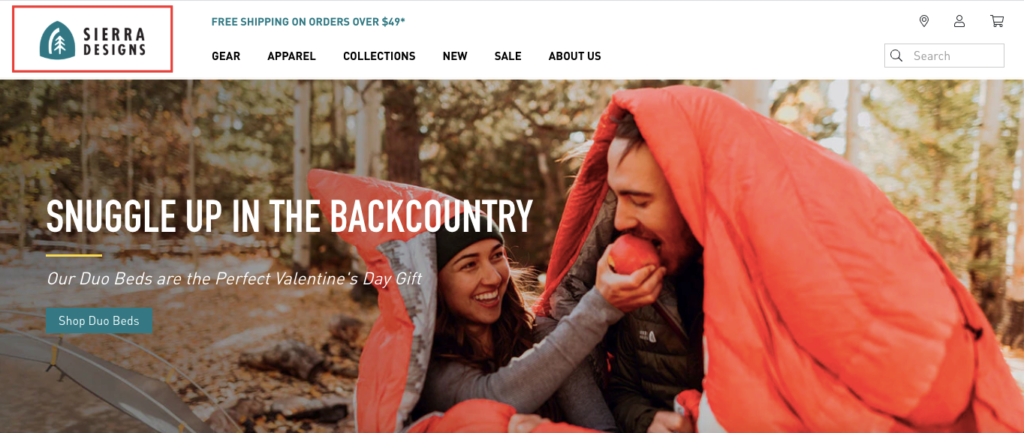
Here’s one example from outdoor and recreational company Sierra Designs.
Here’s another from Frank Body, a brand that sells a skincare coffee scrub.
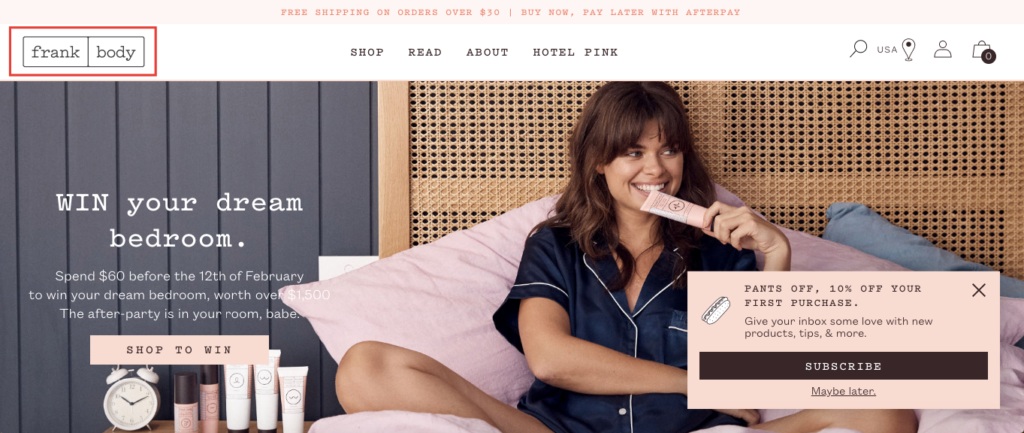
They both stand out nicely and make their shoppers’ lives easier.
Conclusion
When you break it all down, creating above the fold content isn’t rocket science. It simply involves incorporating the right elements that help facilitate a smooth, enjoyable experience for shoppers.
As long as you do that successfully, you can motivate a higher percentage to scroll down further and engage with your store. And of course, no two pages are exactly alike, so there’s plenty of room for creativity.
This guide is simply meant to provide you with a basic template you can borrow from and customize in a way that works for you. With a bit of experimentation, you can fine-tune it to come up with the perfect setup.
Hopefully, looking at these e-commerce above the fold content examples has given you a clear idea of what the essential components are and how to put them all together.

