
B2B emails have on average a higher click-through rate than B2C emails.
A 2018 study by The Data & Marketing Association found that B2Bs receive 52 percent more clicks than B2Cs (3.2 percent vs 2.1 percent).
By these numbers, it’s clear that it’s easier to get subscribers to engage if you’re a B2B brand, and the odds are in your favor.
That said, in order for your email campaign to reach its full potential, you need to understand what makes subscribers tick and what they respond to.
Rather than going over a long, drawn-out list of best practices, I’m going to provide you with some of the best of the best B2B email marketing examples to illustrate what works.
That way you can gain a clear understanding of what techniques to use and get inspiration from B2B brands that are clearly crushing it.
Let’s dive right in.
5 of the Best B2B Email Examples We’ve Seen
1. InVision
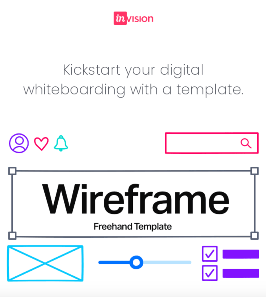
InVision is a digital product design platform that helps companies create better customer experiences.
The first thing you’ll notice about this email is how great it looks visually.
Sometimes I feel like a broken record talking about the need for great-looking images.
But it really is insanely important.
“When subscribers were asked whether they prefer images or text in their email, the results were strongly in the favor of images,” says Lisa Furgison McEwen, co-owner of McEwen’s Media, a content marketing company.
“Sixty-five percent of users prefer emails to contain mostly images, compared to 35 percent who prefer text.”
Featuring a jaw-dropping visual as the one InVision uses here is your ticket to getting your foot in the door and compelling subscribers to check out your email in detail.
You obviously want to include enough text to get your point across and let subscribers know what the offer is like you’ll see in the next part of the email below, but strong visuals should be your bread and butter.
And check out how InVision uses more beautiful images throughout the body of this email.
As for the text, it’s short, sweet, and to the point.
InVision lets subscribers know what they’re offering, using clear and concise language and bolding the key features like Sticky Notes, Diagram template, and Presenter mode.
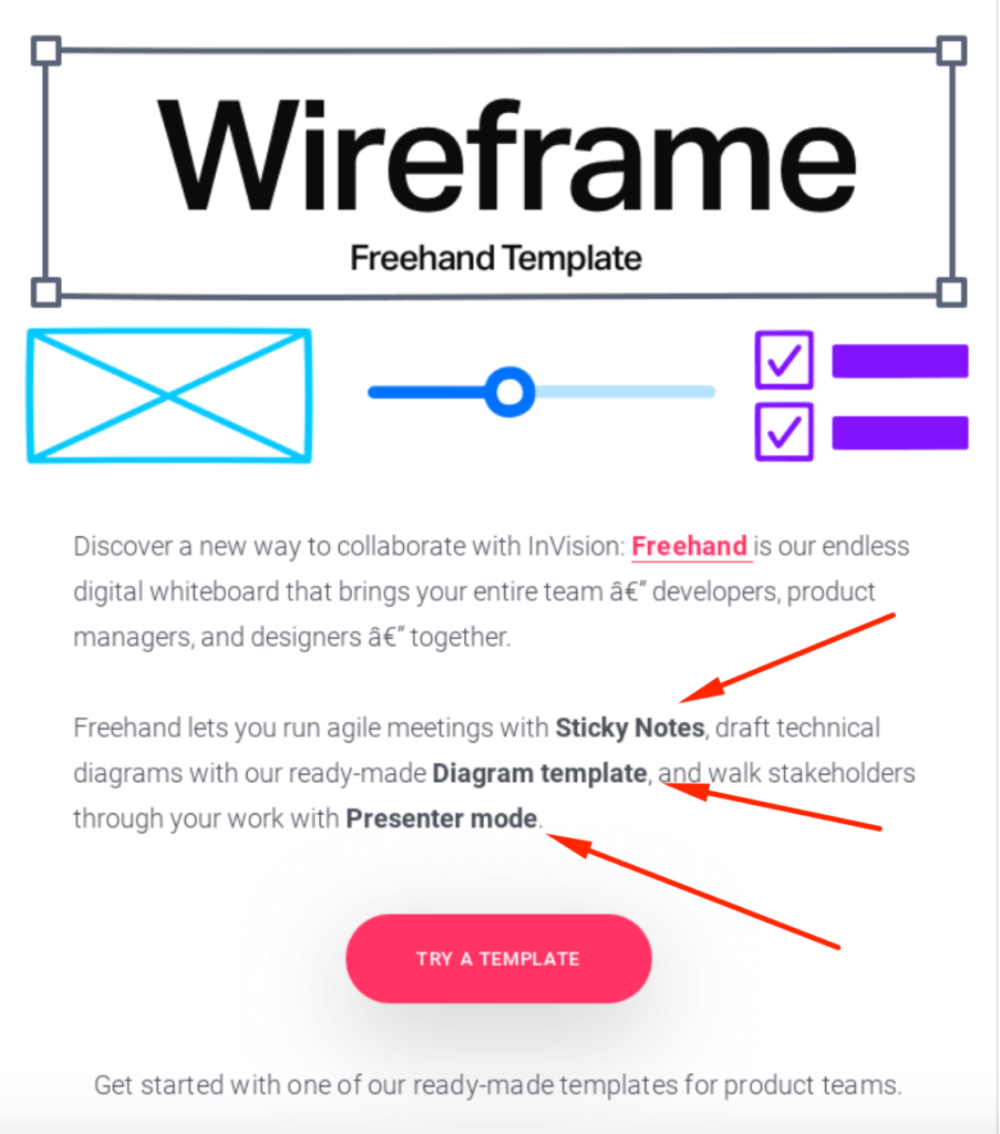
That way subscribers can quickly absorb important information without having to sift through onerous paragraphs.
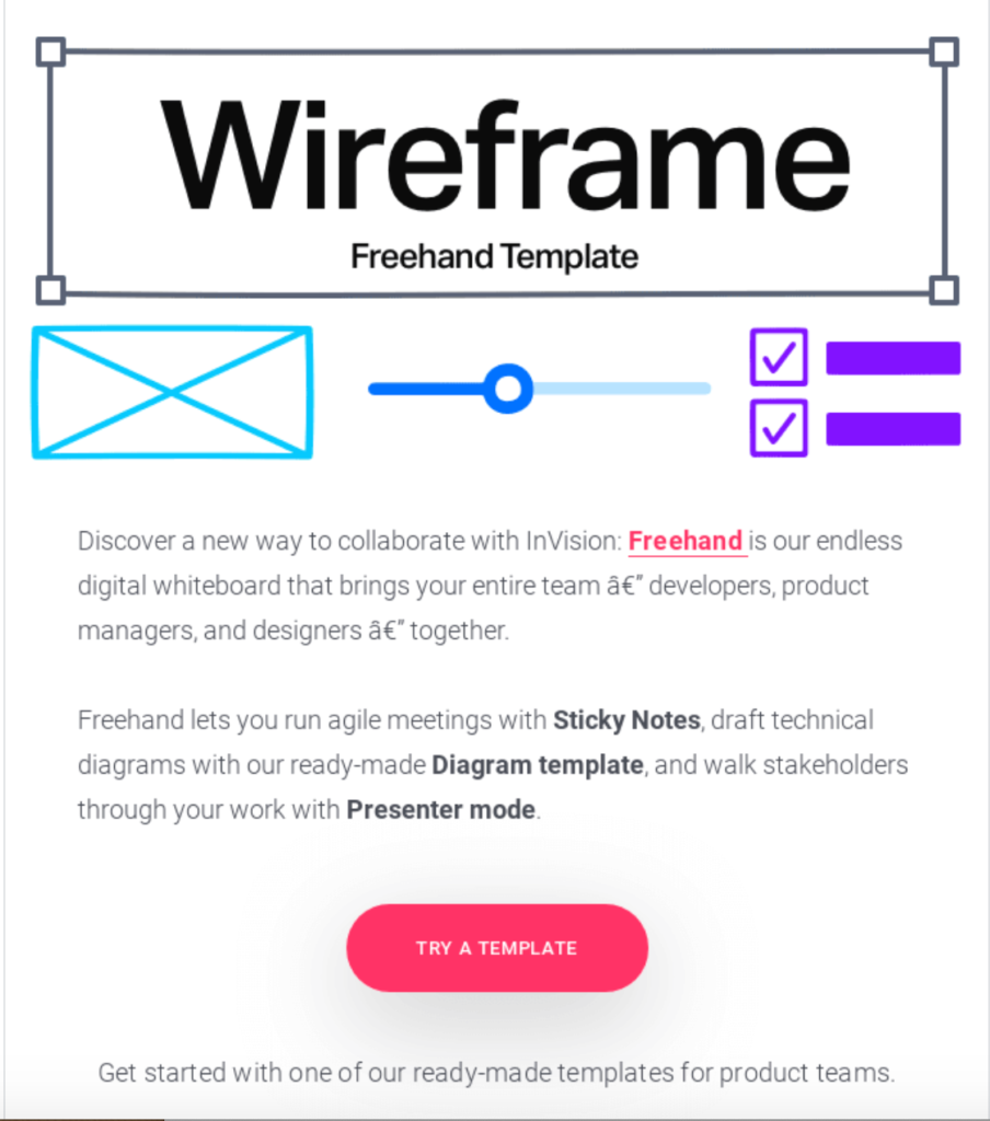
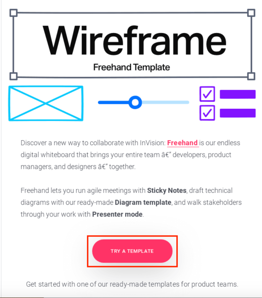
Now let’s talk CTAs.
This email follows CTA best practices and:
- Features an easy to find CTA button that contrasts perfectly with the white background
- Uses straightforward wording
- Lets subscribers know exactly what will happen if they click on it
The last thing to point out about this email is how well structured it is.
InVision doesn’t do anything fancy.
Instead, they use a logical layout that seamlessly presents their offer, gives subscribers the information they need, and urges them to take action by trying a template.
This is tangible proof that you shouldn’t overthink it.
Just stay focused on helping readers navigate your email with zero friction and you should be good.
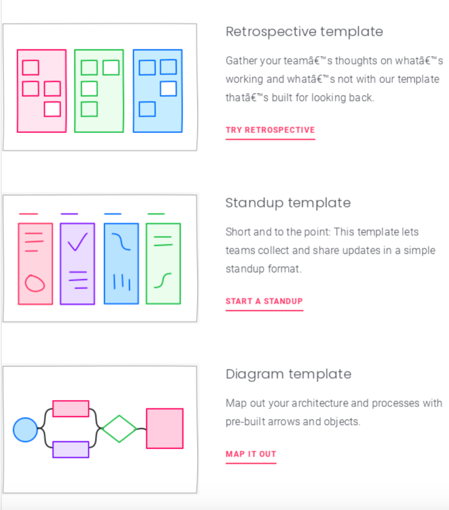
2. Webflow
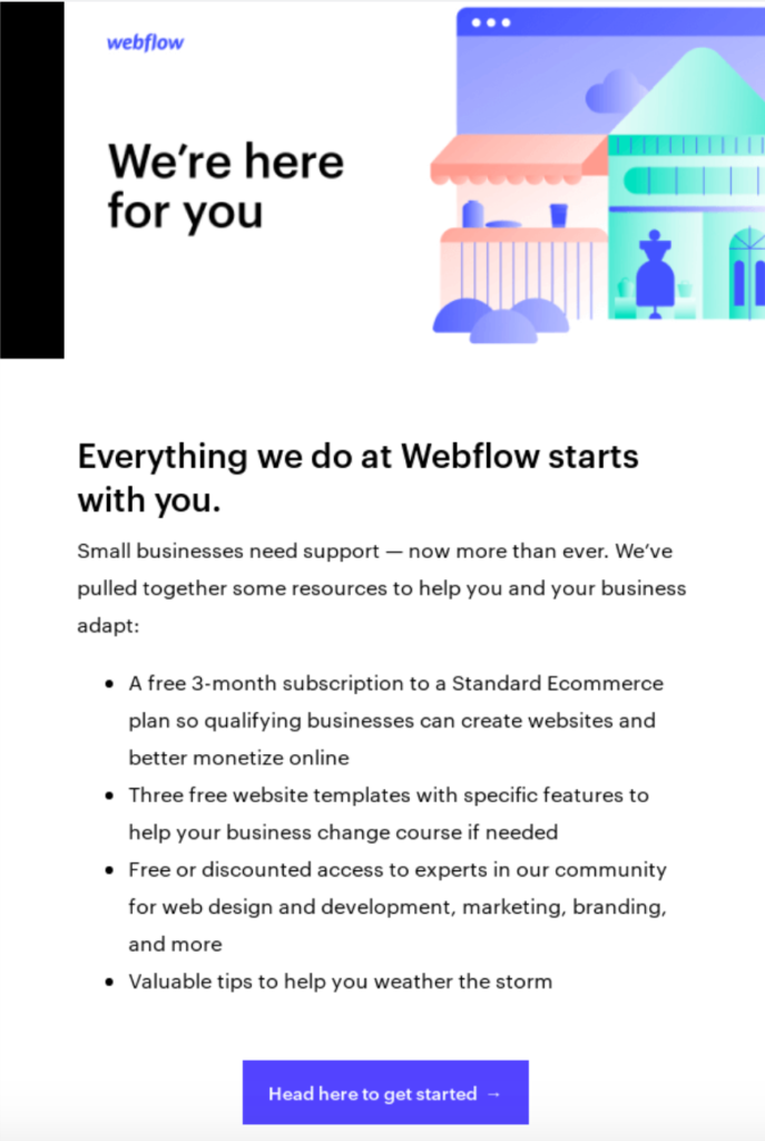
The next of my B2B email marketing examples comes from website building and hosting company Webflow.
When it comes to using a simple, logical structure that allows readers to navigate an email with ease, this example is the gold standard.
Just put yourself in the shoes of one of their subscribers for a second.
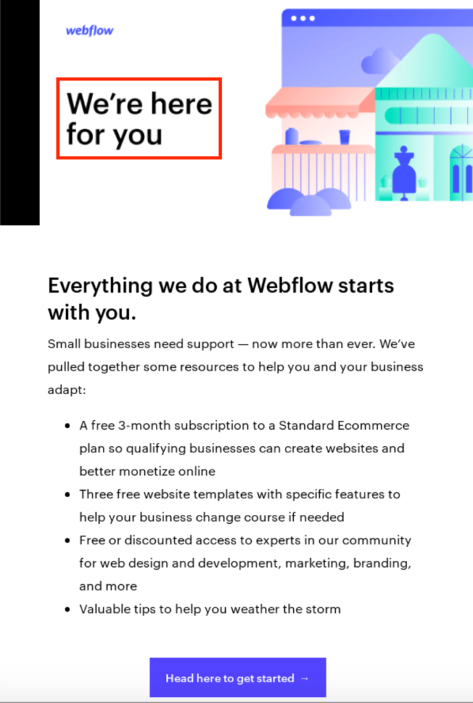
They open this email and are greeted with a nice-looking image and a friendly headline of “We’re here for you.”
They then move down to the main header and a small block of text that quickly lets them know what’s going on without having to exert any effort.
Webflow simply lets them know that they’re committed to providing their customers with support and have put together some helpful resources.
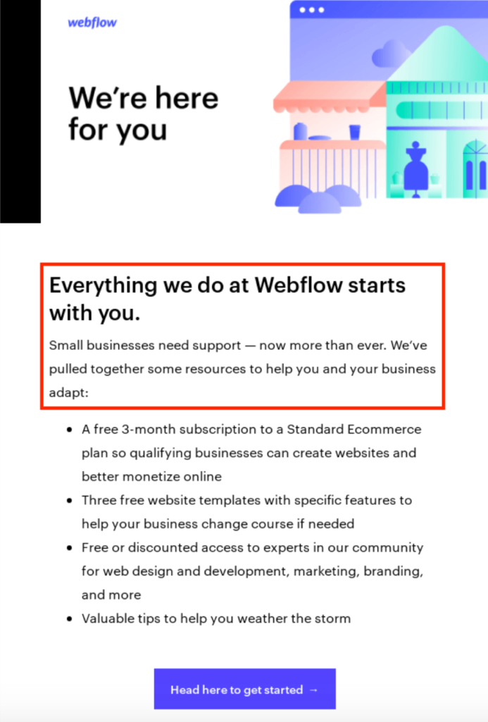
From there, Webflow offers a bullet list that breaks down the specific resources they’ve compiled.
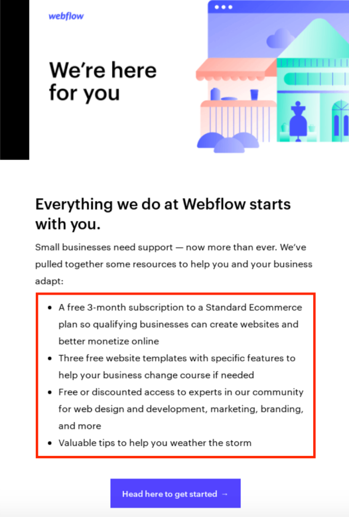
Sandra Muller of The Smarter Writer explains that bullet lists are massively popular with most readers because they:
- Aid scanning
- Help break up long sentences
- Draw your reader’s eye to something important
And they’re absolutely perfect for emails where you want to cover features or benefits in a hurry.
Finally, the CTA is great because it’s well placed at the bottom just after readers have gone over the text.
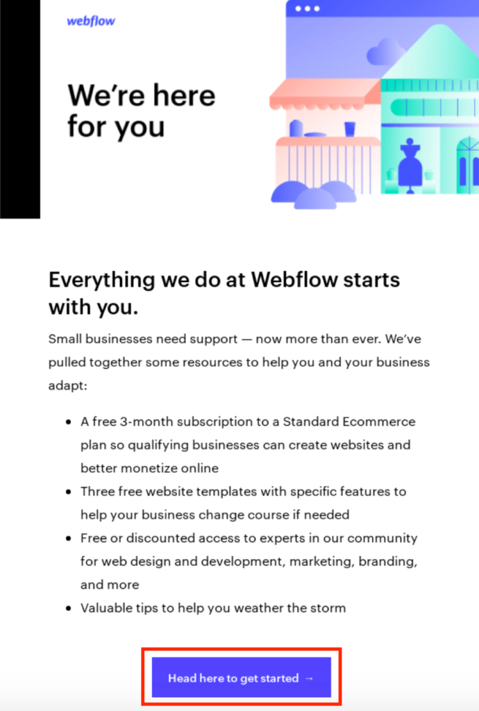
The purplish blue color stands out well from the white background, and the wording is simple and straightforward so readers don’t have to guess what will happen if they click on it.
This goes to show that you don’t have to reinvent the wheel to create a compelling B2B email.
You just need to deliver value and present the information in a way that’s easy for readers to digest.
3. LogMeIn
LogMeIn is “a provider of software as a service and cloud-based remote work tools for collaboration, IT management, and customer engagement.”
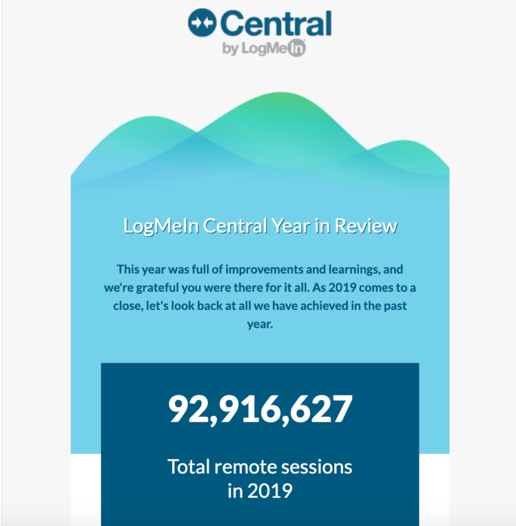
This particular email is for their LogMeIn Central customers who use the platform to enable their employees to work remotely while maintaining top-notch security.
I love it because it takes two of the main strengths from my previous examples—using strong visuals and a bullet format—and combines them into one epic email to keep users informed of the progress LogMeIn has made during the year and to thank them for being part of the community.
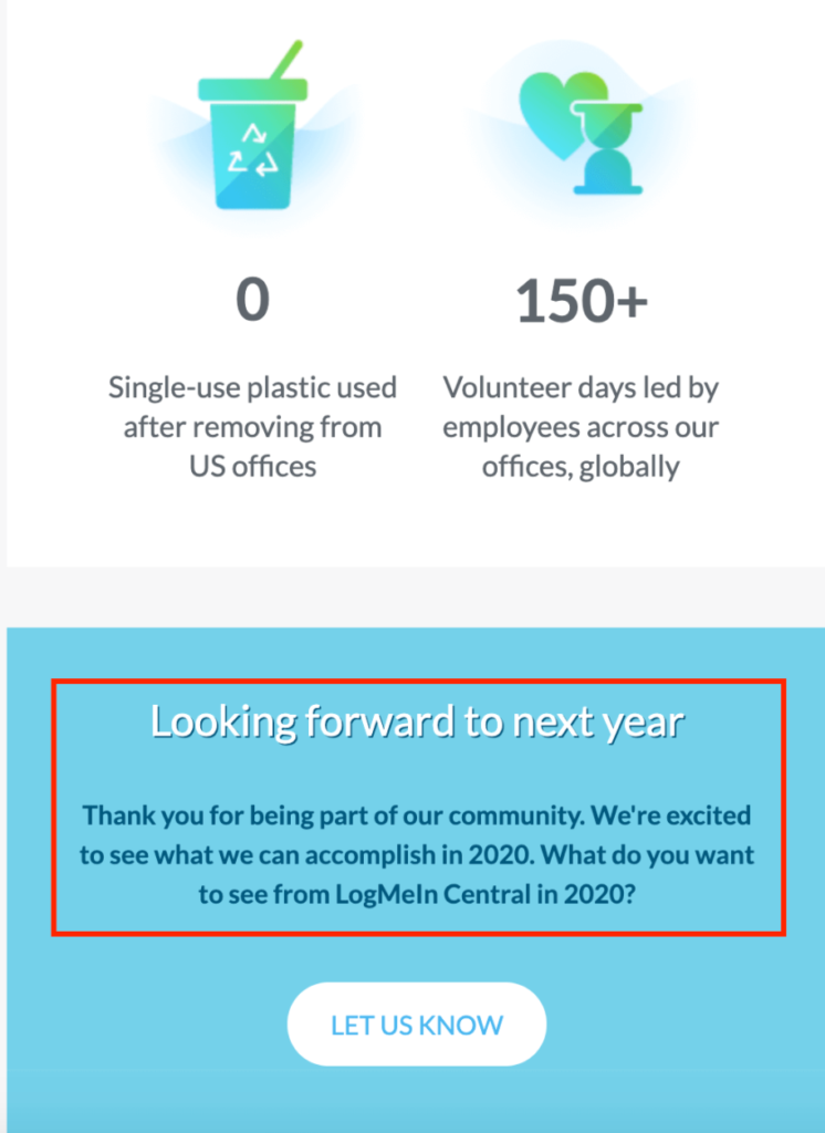
The first thing readers see is a crystal clear headline letting them know the purpose of the email.
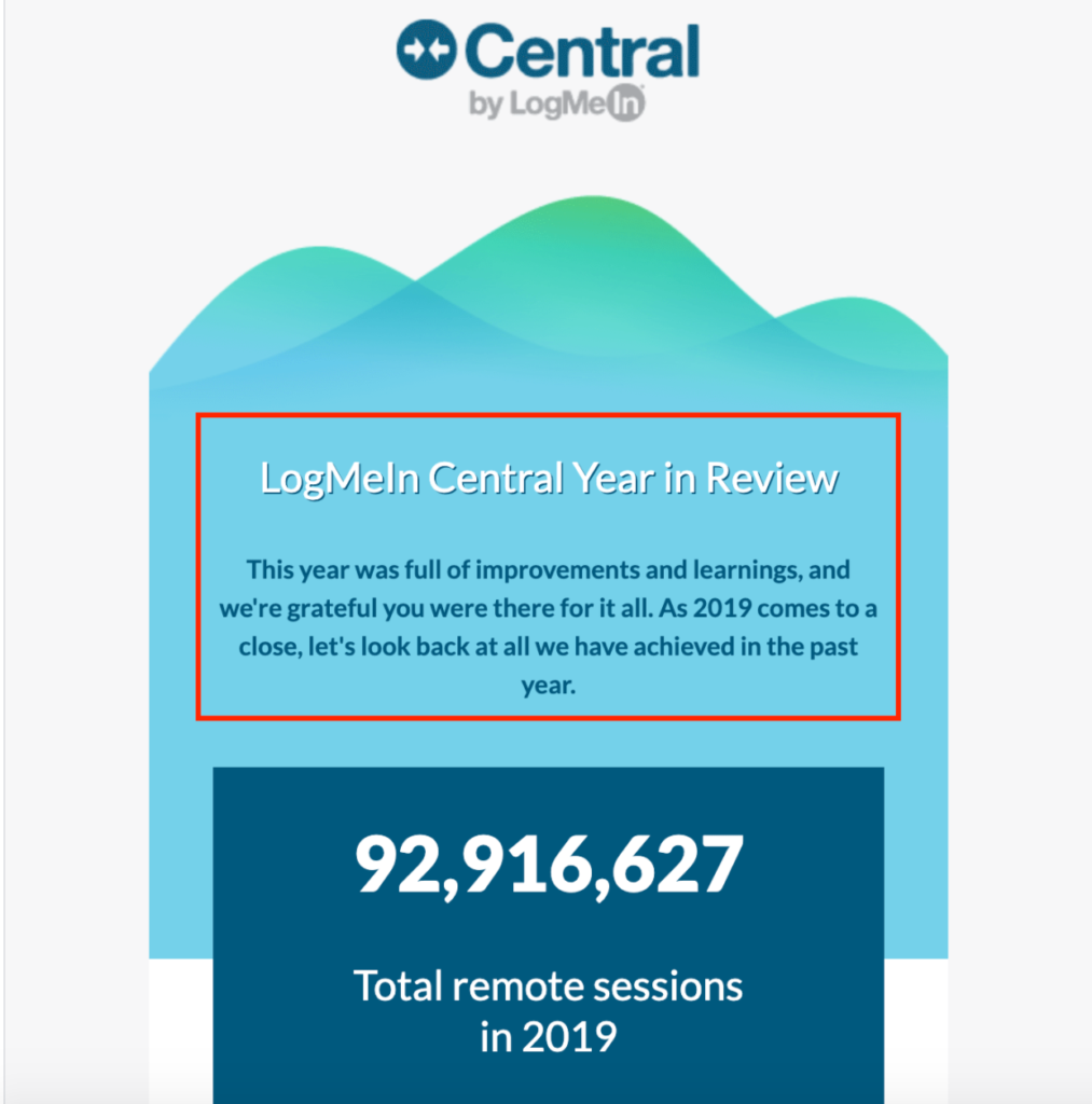
This allows readers to get oriented with just a glance, and the nice-looking graphic in the background provides some eye candy to get their attention.
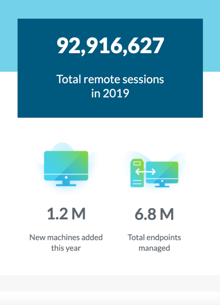
And the visual-centric vibe continues throughout the body, providing info on the number of total remote sessions that happened in 2019…
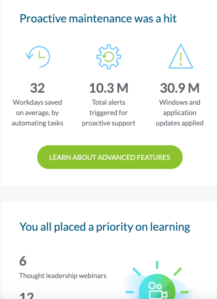
…proactive maintenance that occurred…
…improvements that were made to the platform, and more.
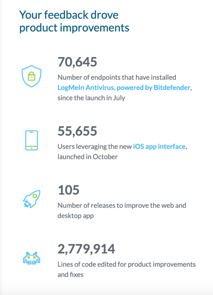
This is an amazing way to present information and uses an infographic approach with icons to make the data easier to absorb.
Given that “almost one-third of all marketers surveyed reported that infographics and other visual assets are the most important content in their arsenal,” this is a highly effective technique to use.
I know that I personally loved the infographic format and thought it was a genuine pleasure to read through this email from LogMeIn.
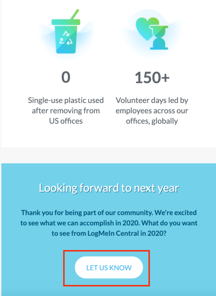
I also thought that it was a classy move to actively seek out their users’ input at the bottom.
In fact, that’s the whole point of their CTA—to get users to let them know what they want to see from LogMeIn the following year, so they can enhance their platform and make it even better.
So, there are two key takeaways from this B2B email marketing example.
One is that beautiful visuals can help hook readers and are perfect for breaking down a lot of complex information.
Rather than writing out four or five paragraphs of text, for example, you could present the same information by using an infographic structure and using icons along with short snippets of text.
The other is that it’s smart to seek feedback from your subscribers from time to time.
This lets them know that you truly care and value their opinion and can help supply you with valuable data so you can keep improving your company.
Talk about a win-win!
4. Bluewolf

Bluewolf is “a global consulting agency and proven Salesforce strategic partner that builds digital solutions and is designed to create results.”
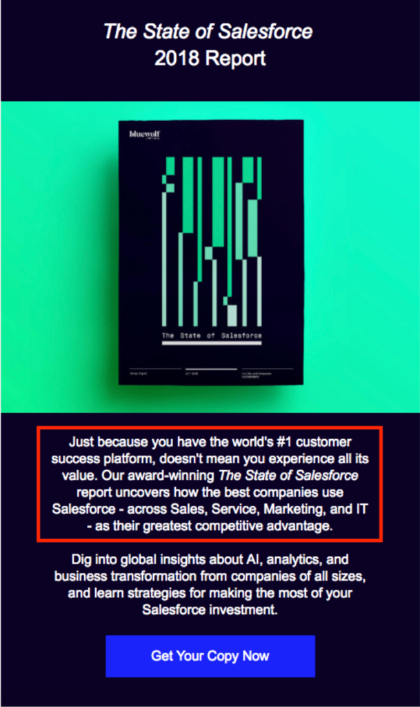
This email promotes its State of Salesforce 2018 Report and has the sole purpose of encouraging subscribers to download it.
There are a few reasons why it works.
First, it has eye appeal.
It features a single image of the report on a green background that perfectly complements its green and black design.
That along with the headline are the first things readers see when opening this email, and it’s a definite attention grabber that instantly helps them understand the offer.
This is critical because readers shouldn’t have to do any guesswork to figure out what’s happening.
Next, this email does a fantastic job of concisely explaining what’s inside the report.
Brevity is important in writing in general, and it’s especially important with email writing.
With just two brief sentences, Bluewolf lets subscribers know that their report examines how top companies are using Salesforce to their advantage.
I also like that they subtly point out that the report is award-winning without sounding pretentious about it.
The second paragraph, which is also super succinct, goes into specifics and lets readers know the benefits they’ll get by reading it without using any more words than necessary.

As for the CTA, it checks all of the boxes and leaves no room for confusion.
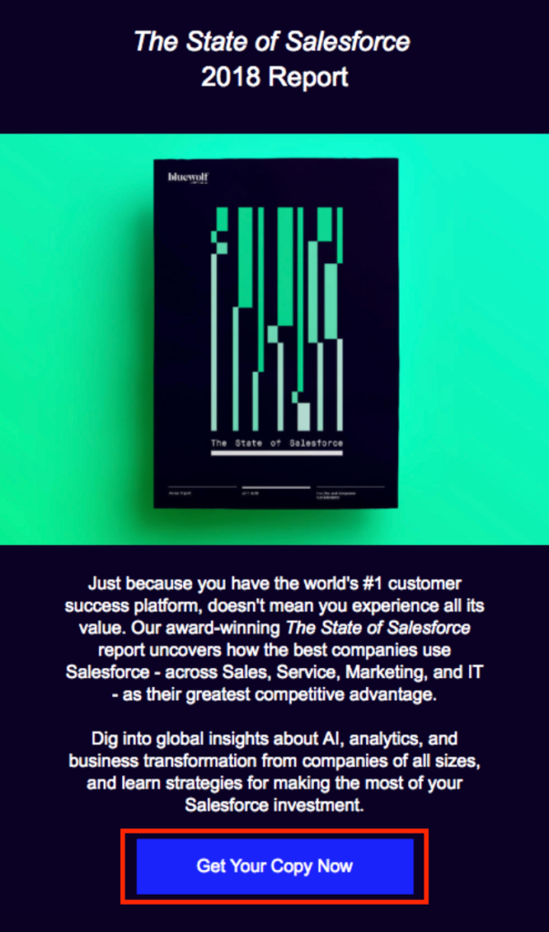
Saying “Get Your Copy Now” is about as straightforward as it gets and tells readers exactly what they need to do.
So, whenever you’re looking to promote content like an eBook or whitepaper, this formula from Bluewolf is a good one to use.
5. Listrak

Webinars have become a wildly popular way for B2B companies to drum up new business and create more loyal connections with existing customers.
I know that I’ve personally gotten a ton of insights from watching them.
And with “Forty-five percent of marketers choosing emails as the most effective webinar promotion tool,” this is one of the top channels for getting the word out.
That’s exactly what Listrak, a marketing automation platform for retailers, does in this B2B email marketing example.
Here they are letting subscribers know about an upcoming webinar to maximize the number of people who attend.
And there’s a lot to love about this email.
Upon opening it, readers instantly know that it’s a webinar because it says so at the very top.
They get a basic idea for what it’s about by the title, “Beyond the Inbox: Social Acquisition.”
And they also see exactly when it’s taking place because the data and time are clearly marked right below.
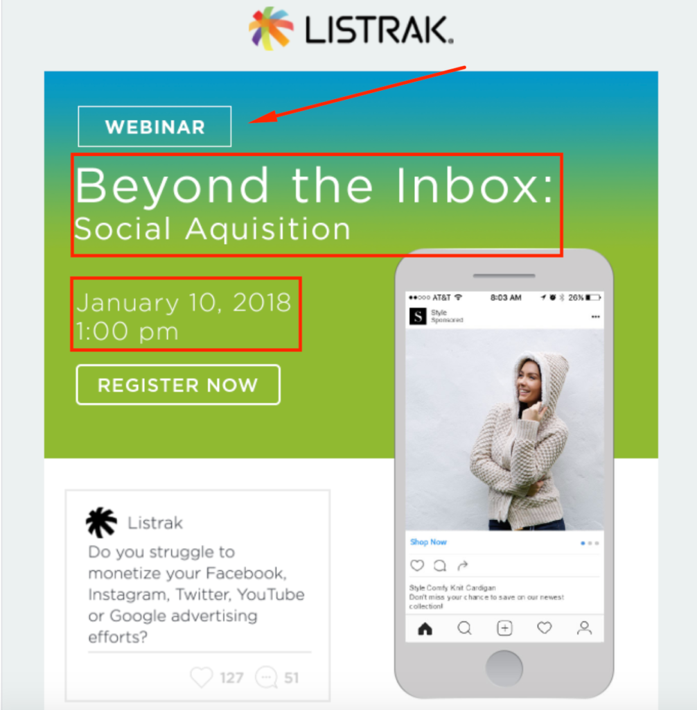
Not to mention, there’s an amazing looking image that gives this email a super professional feel right out of the gate.
When it comes to the CTA, Listrak doesn’t waste any time and places it above-the-fold, letting readers know precisely what action they need to take with “Register Now.”
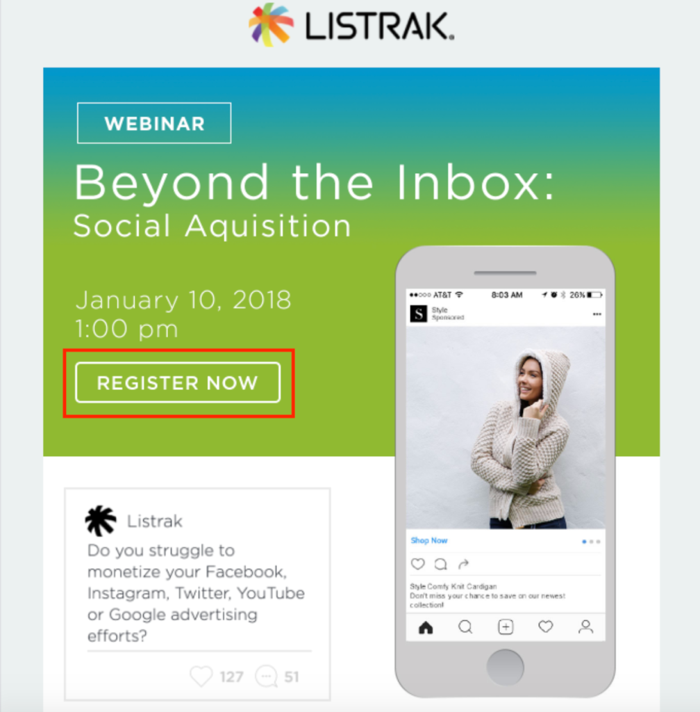
So, within just seconds of opening this email, readers know what’s going on without having to needlessly spend extra brainpower trying to figure it out.
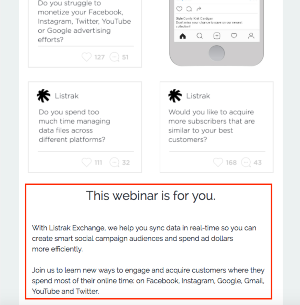
And here’s something I think is really cool about this example.
Listrak incorporates actual questions they’ve asked their audience on social media so readers know what specific topics will be covered in the webinar.
Check it out.
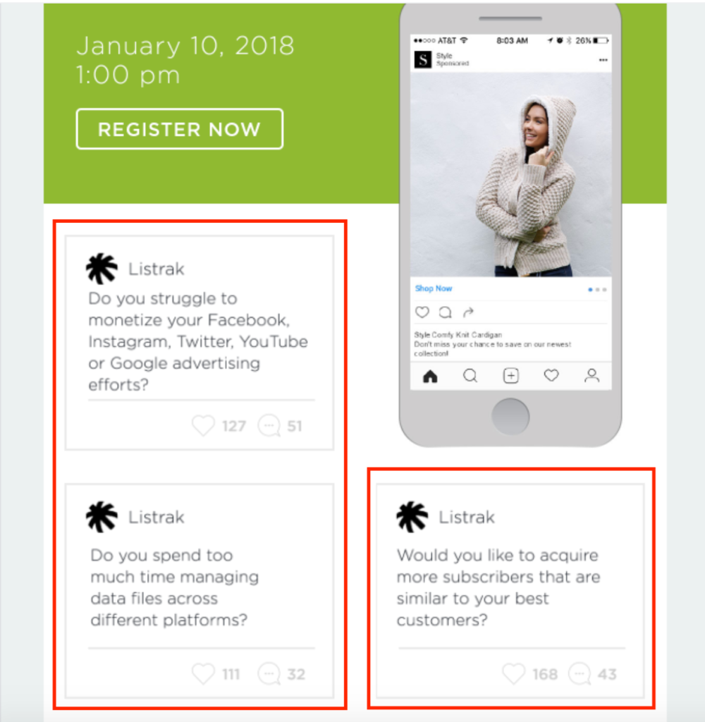
This is a really nice touch and an interesting technique I haven’t seen done before.
Just below that, they elaborate a bit more, letting readers know that if they’ve asked these types of questions, this webinar is for them.
And at the bottom, Listrak mentions two experts viewers will hear from during the webinar and include the CTA once again for good measure.

To recap, this example is:
- Visually appealing
- Well structured
- Tells readers everything they need to know without launching into extraneous text
- Concisely explains the benefits of attending the webinar
- Features well placed, fully optimized CTAs
So, if you plan on hosting a webinar any time soon, this is the perfect format to follow in your promotional email.
Conclusion
I’m the type of person that learns far better from concrete examples than from an arduous explanation through text.
And I think a lot of other people are the same.
When it comes to learning how to thrive at B2B email marketing, learning firsthand by analyzing brands that clearly know what they’re doing is one of the best ways to go about it.
Each of these B2B email marketing examples has a different objective and takes a slightly different approach, but the same basic formula is the same.
Mainly it’s:
- Piquing readers’ interest with jaw-dropping images
- Letting readers know what the brand is offering and why they should care
- Using a logical, coherent structure
- Using brief blocks of text to make information easily digestible
- Throwing in bullet points whenever possible
- Following CTA best practices
Do that effectively, and your email engagement and click-throughs should be rock solid.

