There’s a ton of disparity in the quality level of B2B landing pages.
Some, like the examples I’m about to mention, check nearly all of the boxes and follow best practices to a T.
Others, however, flat out don’t hit their mark and see paltry conversion rates as a result. So let’s not waste any time.
Here’s a rundown on current B2B landing page best practices, along with several examples you can borrow from to ensure your landing page is a winner and your conversions are rock solid.
Table of Contents
1. Start with a Killer “Hero” Image
You’re probably well aware of the limited attention span of most website visitors.
Studies suggest that on average, humans have an attention span of just over 8 seconds, which makes it less than a goldfish.

This means you have an extremely limited window to grab a visitor’s attention and compel them to fully explore your landing page.
Arguably the best way to accomplish this is by placing an epic “hero” image front and center.
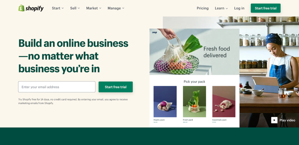
One of the best examples I’ve seen is this one from Shopify, which is crisp and clean and instantly helps visitors understand how they can use this B2B product.
I also like this example from Trello, which is eye-catching and gives visitors a feel for how this list-building app works.
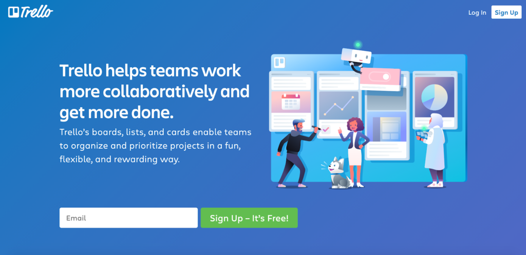
Note that “forty-four percent of SaaS landing pages have people as image heroes,” and “users react more intensely to faces in hero images than they do to a product screenshot.”
So keep this in mind when choosing a photo.
2. Write an Electrifying UVP
The other key above-the-fold element is your unique value proposition (UVP).
This is what lets visitors know what differentiates your brand from competitors, why you’re special, and why they should buy from you.
Writing a great UVP may sound simple on paper, but there’s definitely an art to it.
There are three B2B landing pages I’d like to point your attention to that serve as good examples.
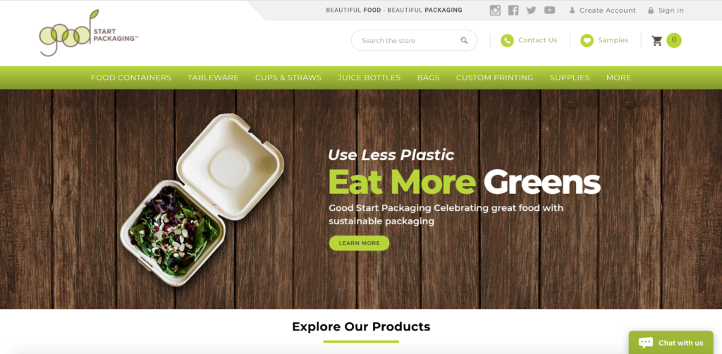
First, there’s this one from Good Start Packaging, a compostable food packaging company that sells environmentally friendly products to businesses.
Their UVP simply says, “Use Less Plastic Eat More Greens.”
Next, there’s this one from BigCommerce that says “Rewrite the Rules of E-Commerce.”
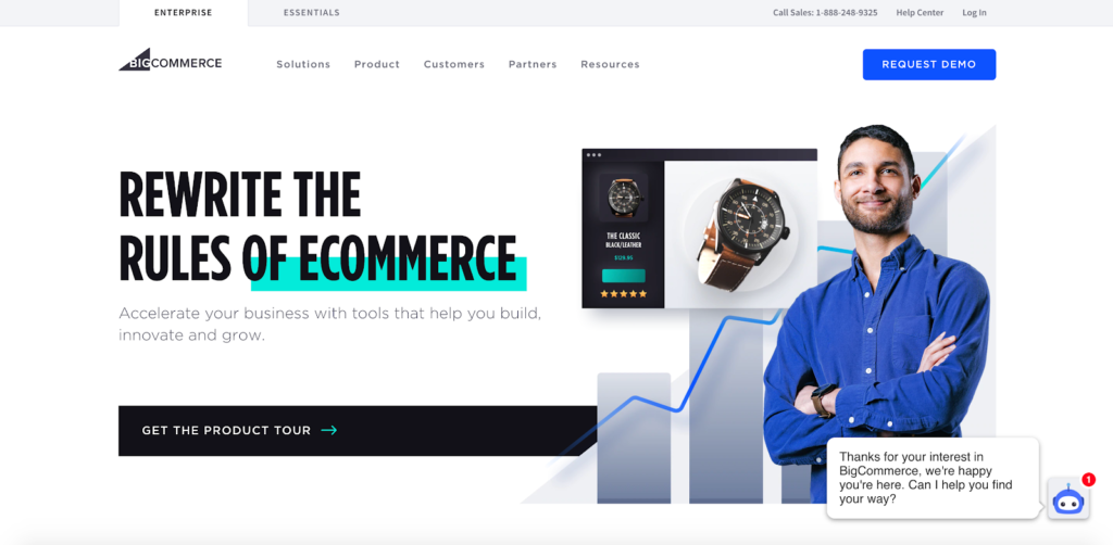
And with the text below saying, “Accelerate your business with tools that help you build, innovate, and grow,” this lets business owners understand the value that BigCommerce brings to the table.
Third, there’s this example from digital banking solutions provider Alkami that says, “The gold standard in digital banking.”
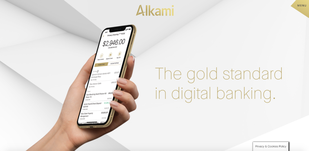
It’s quick, to the point, and has a minimalist aesthetic that jives with their overall brand identity.
3. Give a Quick Rundown on How Your Product Works
Some B2B products are so simple that they can be instantly understood with no help needed.
But more often than not, visitors won’t understand the full scope of how your product works at first glance.
That’s why it’s important to give them a quick rundown so they know exactly what they’re dealing with.
Take this landing page from dropshipping company Oberlo, for example.
This is the first thing visitors see above the fold, where Oberlo explains what their product does.
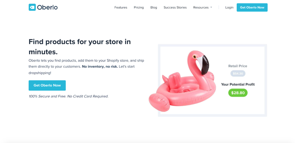
And just below that, they offer a step-by-step outline of how it works.
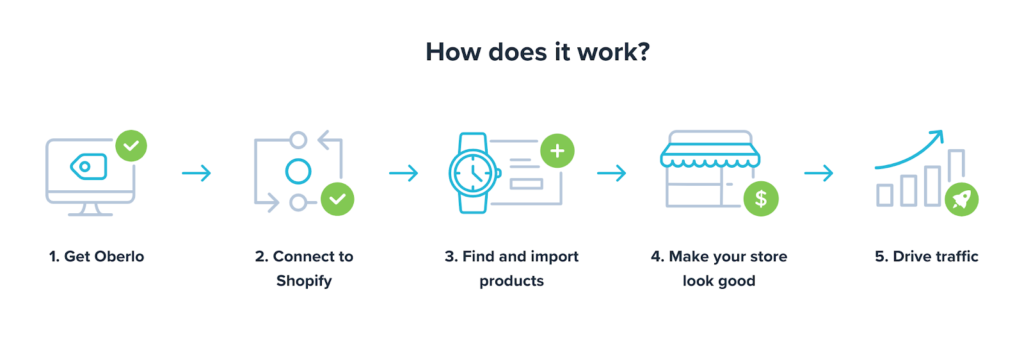
It’s quick, easy to understand, and using image icons like this adds a bit of eye candy that draws the attention of prospects.
So, if there’s any potential for confusion or misunderstanding as to exactly what your B2B product does, I recommend following a similar format to get prospects up to speed.
4. Incorporate Video
Video has proven to be insanely powerful for A) helping prospects understand your company, what you’re selling, why it’s beneficial, etc. and B) increasing conversions.
One particular study by Visual Website Optimizer (VWO) saw more than a forty-six percent spike in conversions by adding a video to a landing page.
Maybe that’s why ninety-nine percent of marketers who currently use videos will continue to do so and why 95 percent of these marketers plan on maintaining or increasing their current video spend.
So you’d be crazy not to add a video to your B2B landing page.
When it comes to examples, I think this one from video interview software company HireVue does a great job of explaining what their product does and letting prospects know why it can be a gamechanger for their business.
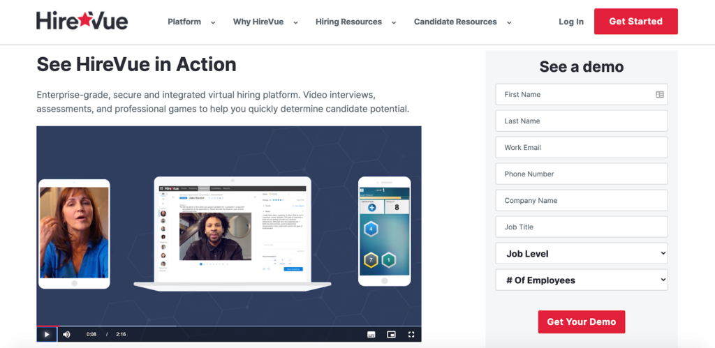
It’s short, to the point, and lists some specific benefits that prospects will be interested in, such as streamlined hiring, increased ROI, and bigger revenue.
And that’s the key to creating a great video.
You need to extract the essential information that visitors need to know about and boil it down so that it’s easily digestible.
For tips on how to create a winning landing page video, I suggest watching this video from HubSpot.
5. Let Visitors See Real Results
“Show me the money.” At the end of the day, that’s what B2B prospects want to see.
They want to feel confident that they’ll get legitimate value from buying your product and they’ll see real results.
So why not give them some quantitative numbers to put their minds at ease and make them feel comfortable buying from you?
That’s exactly what growth content company Nectafy does on their landing page.
They start off with this eye-catching stat about ROI, saying that one of their customers—a government documentation software company—saw a staggering 647 percent ROI during their first year and half of using Nectafy.
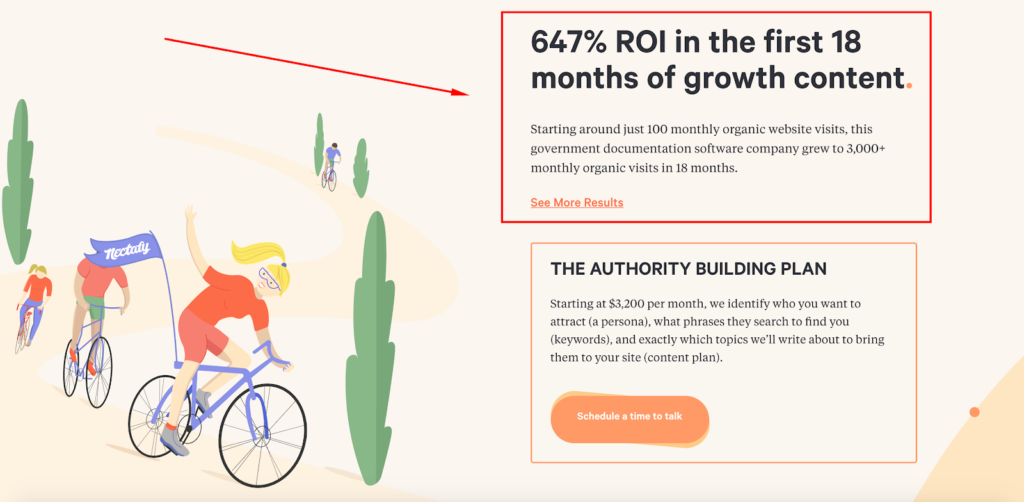
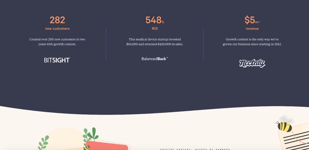
That’s certainly an attention grabber. And a little further down the page, they serve up some more juicy numbers.
They mention how the number of new customers cybersecurity ratings company Bitsight got. They offer another ROI stat for BalancedBack, a medical device startup. And to top it all off, they mention how much revenue Nectafy has earned since its launch in 2012.
Electronic signature and agreement platform DocuSign does something similar where they point out how much money their customers save per agreement, how much faster their turnaround time is, and so on.
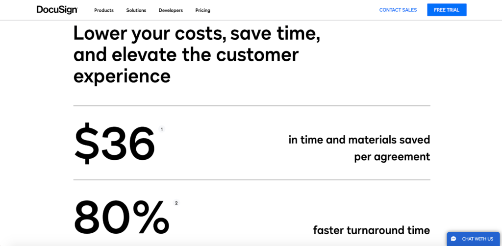
I recommend following the same formula and finding some concrete numbers to feature right on your B2B landing page.
6. Nail Your Social Proof
Another theme you see among most of today’s top B2B landing pages is seamlessly weaving in undoubtedly social proof.
What do I mean by undoubtable?
I mean showcasing real-life customers, real testimonials, or real stats so prospects instantly know your social proof is legit.
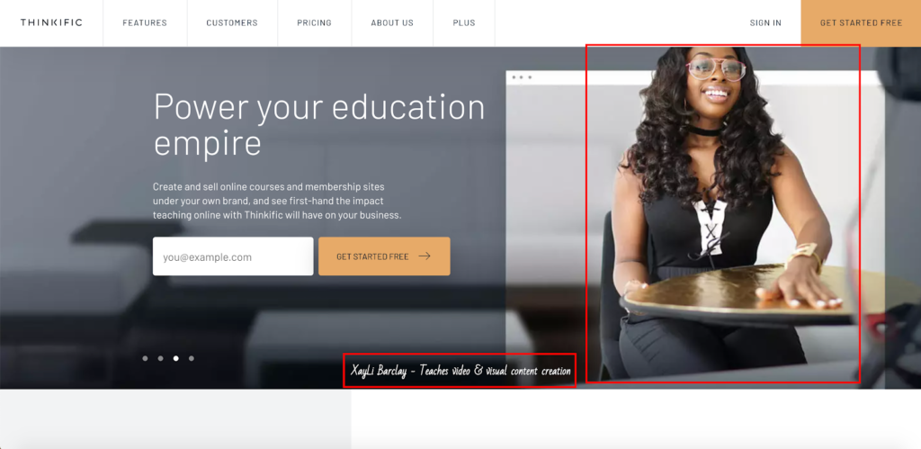
A B2B brand that you can learn a lot from is Thinkific—a platform that lets users create high-quality online courses and membership sites. The first thing visitors see when arriving on their landing page is a slider, featuring some of their most successful users.
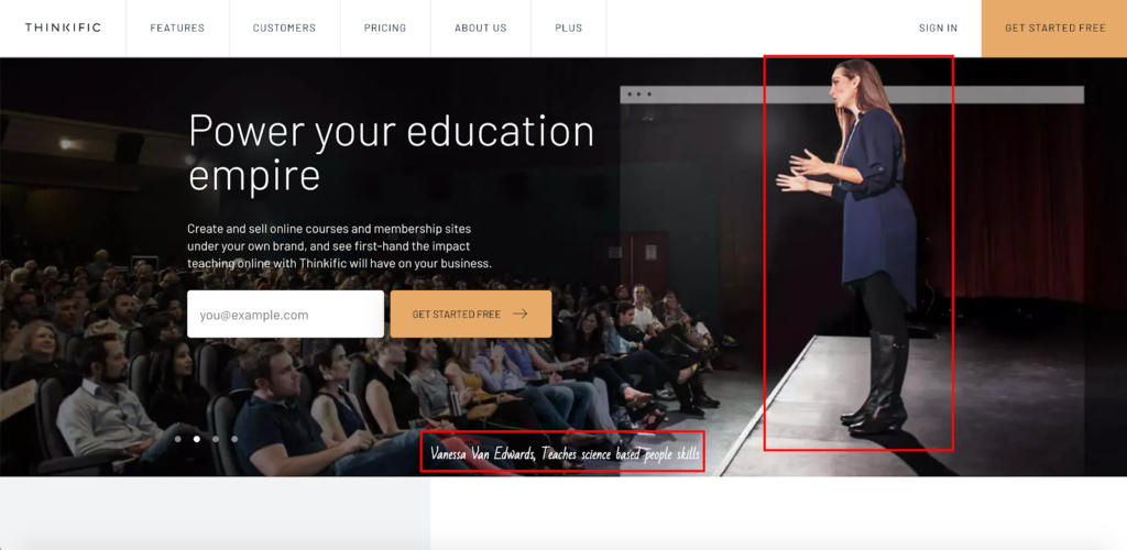
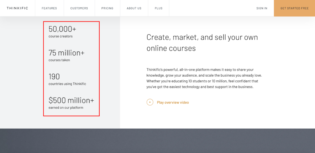
Below that there’s a section that provides a quick overview of how many course creators there currently are on Thinkific, how many courses have been taken, how many countries have used the platform, and how much money users have earned.
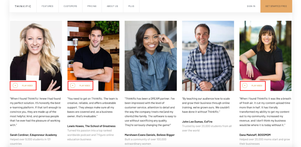
And below that, there’s a robust testimonials section that features images of users and the good things they have to say about Thinkific.

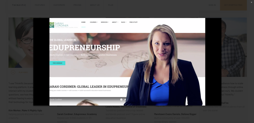
And to top it all off, several of these testimonials include videos so prospects can get the full rundown to see exactly what their experience was like using this platform.
Here’s one from Sarah Cordiner of Edupreneur Academy.
While your social proof doesn’t necessarily need to be at this level to succeed, this shows you how far you can take it.
7. Point Prospects to Other Informational Resources
No matter how amazing your landing page is, only a small portion of prospects will convert right off the bat.
In fact, one study estimates that “only 4 percent of website visitors are ready to buy.”
Many still need to be nurtured, so you need an effective way to keep them in your funnel so that you can gradually build a relationship and get them more comfortable with the idea of buying.
One of the best ways to go about this is to point prospects to other informational resources on your site. That’s what compensation software and data company Payscale does on their landing page.
About midway through, they have this section where visitors can browse through their extensive content archive and learn about the topics they’re most interested in.
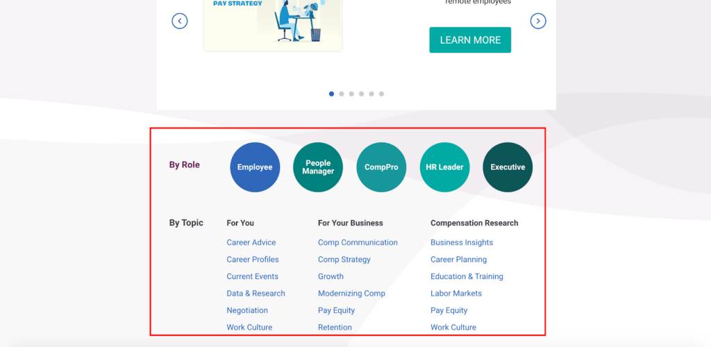
Say, for instance, a business owner wanted to learn how to improve their retention rate.
They can click here…
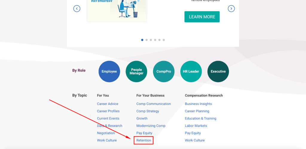
…which takes them to this page.
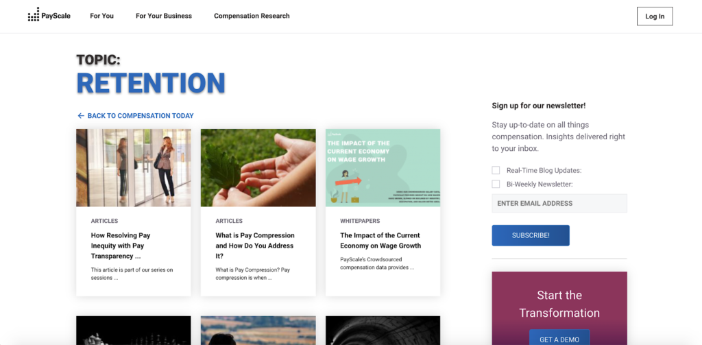
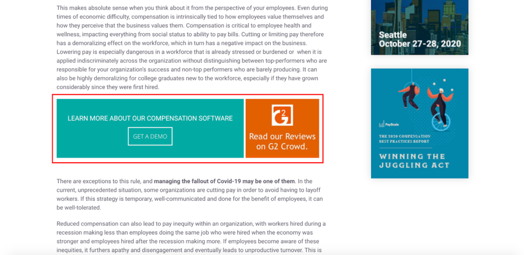
Then, PayScale is able to build rapport by demonstrating their deep industry knowledge and sharing insights.
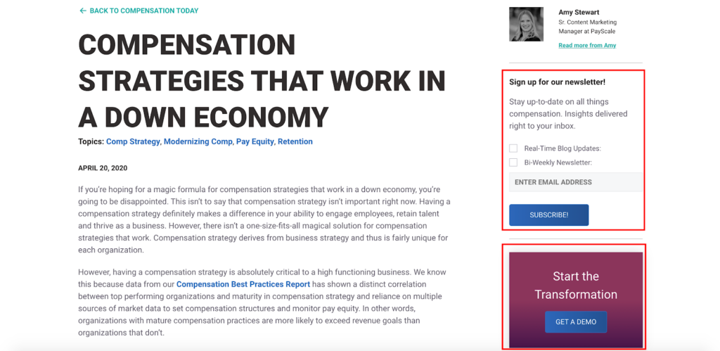
And of course PayScale peppers in links to their newsletter and product demo throughout the content, which gives them the chance to convert leads at a later time after they’ve had the chance to get their bearings and see that PayScale knows their stuff.
The bottom line is that not everyone is going to convert right away.
So, giving the visitors who aren’t ready to buy yet easy access to your content like this is critical for laying down the foundation for relationship building.
8. Use Unmistakably Clear CTAs
The last of the B2B landing page best practices should go without saying, but I’m going to say it anyway because it’s so important.
There should be absolutely zero guesswork for leads when they come across your CTAs, and they should know exactly what action they need to take.
The first CTA from the landing page of resource management software company, Resource Guru, is about as straightforward as it gets.
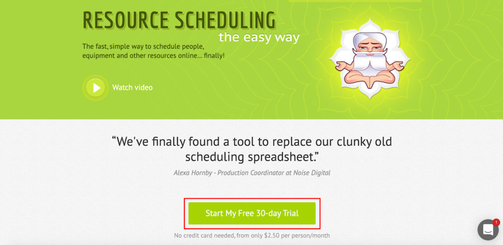
With just a glance, a visitor knows what Resource Guru is asking them to do and exactly what will happen when they click on the CTA.
And the second CTA is equally as effective.
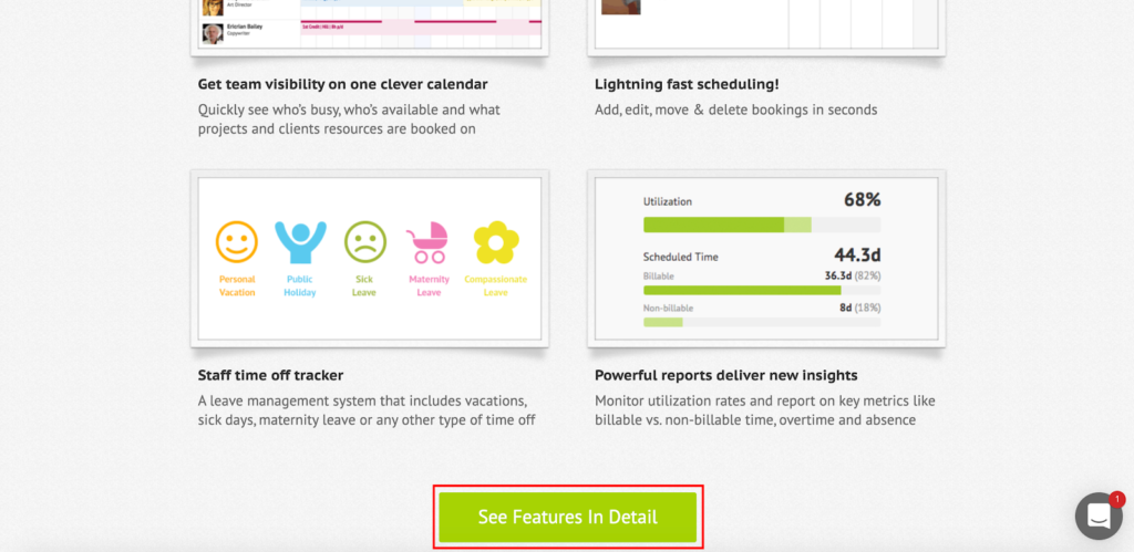
And by the way, if you’re saying to yourself, “Doesn’t using multiple CTAs go against B2B landing page best practices?” it technically might. But when used intelligently and responsibly, I think it’s totally fine.
I like what Aaron Brooks of VentureHarbor has to say about it.
“No matter how good your ad campaigns and landing pages are, you’re never going to convert everyone the first time around. This is why things like email and AdWords remarketing exist — and precisely why having a secondary CTA on your landing pages can make all the difference to conversion rates.”
This goes back to my earlier point about accounting for the leads who just aren’t ready to convert, where having multiple CTAs to choose from, rather than just the “buy now” CTA, can be beneficial for lead nurturing.
Just be sure not to overwhelm prospects with excessive CTAs and ensure they’re all crystal clear. Do that and you should be in good shape.
Conclusion
Building a winning B2B landing page isn’t rocket science. It just boils down to understanding a handful of B2B landing page best practices and basing your approach around them.
The examples I’ve mentioned above illustrate what following these best practices looks like and should arm you with the inspiration needed to rev up your own efforts. That way you can convert a higher percentage of first-time visitors.
And for those who aren’t ready to buy right away, you can nurture them and seamlessly move them from the top of your funnel to the bottom.

