
I bet this scenario sounds familiar: After lots of research and clicking around multiple sites, you’ve finally found the perfect purchase.
Naturally, you’re delighted—it’s got all the features you hoped for, the price is right, and to top it all off, it really brings out the color of your eyes.
But disaster strikes the moment you start the checkout process.
Suddenly, a bunch of extra costs gets added on. You’re forced to create an account and enter the same details multiple times. The discount code you trawled the Internet for doesn’t work. And your preferred payment method isn’t even supported.
Frustrated, you do what anyone else would do in that situation—close the tab, never to return; no matter how many begging emails they send you.
Unfortunately, this sort of experience is too common. Research from the Baymard Institute found the average shopping cart abandonment rate stands at a shocking 69.8 percent. So for every 10 shopping carts your customers open, seven will be abandoned.
But it needn’t be like that.
Baymard’s research also discovered that the average large-sized e-commerce site can enjoy a 35.26 percent increase in conversion rate by implementing a better-designed checkout process.
To help you do that, let’s take a look at seven of the best e-commerce checkout pages out there.
Table of Contents
1. ASOS
The best e-commerce checkout pages aren’t necessarily the most flashy or visually compelling.
By the point your customer adds something to their cart, you’ve already persuaded them to buy. That means there’s no need to wow them with branding or fancy language. Instead, it’s all about getting them to complete their purchase as quickly and smoothly as possible.
That’s exactly what ASOS’s e-commerce checkout page achieves:
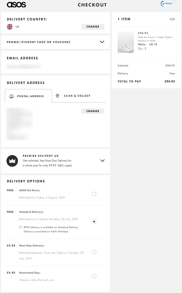
There’s no unnecessary imagery or wasted words here—just a streamlined form that reminds you of the thing you’re so eager to buy, clearly displays the price and any additional costs, and makes it easy for you to choose the right shipping option.
Plus there are lots of trust factors here, from the DigiCert verification logo at the top right of the screen, to the wide choice of payment methods available.
Simply put, there’s nothing on this screen that would put you off checking out here and now.
2. B&H Photo Video
Checkout pages may not be just about closing the deal in the fastest possible time.
Provided you get it right (i.e. don’t interfere with the user journey), they can also be a valuable opportunity to highlight potential upsells and cross-sells.
After all, your customer is already in the buying mood. Evidently, they’re also happy to buy from you and they like what you have to offer. Why not subtly show them a couple of extras that would make their purchase even better?
The keyword here is “subtly”. If you bombard your hard-won customer with additional products before they’ve entered their delivery details and payment information, you risk scaring them off.
B&H Photo Video shows us exactly how to promote add-ons without bringing unwanted noise and clutter to the checkout process:
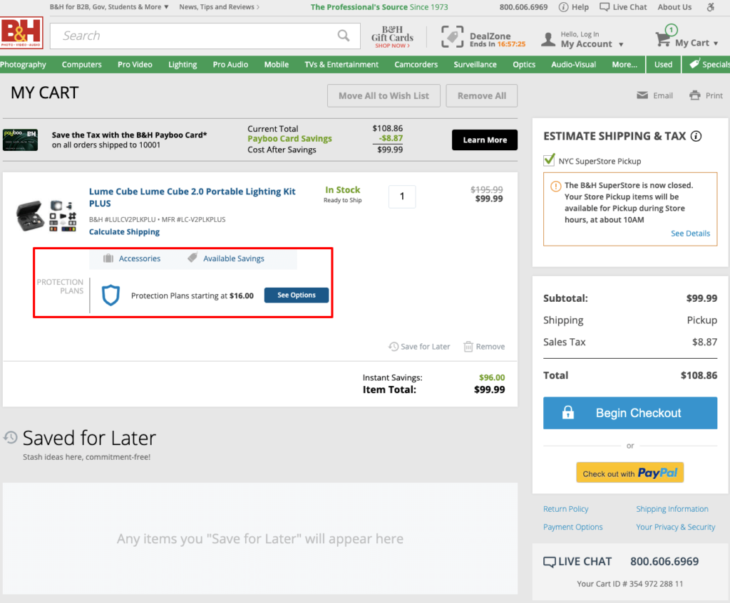
In an unobtrusive way, the options within the section I highlighted draw your attention toward:
- Useful accessories you can purchase alongside your purchase;
- Insurance plans to protect your chosen product; and
- Potential multi-buy savings.
If you’re not interested, no fuss. You can carry on with the checkout process; no extra steps are added to the journey and there’s no pressure to interact with those options.
But if you like what you see, B&H shows you all the potential accessories that are relevant to your purchase, and makes it easy to add them to your shopping cart:
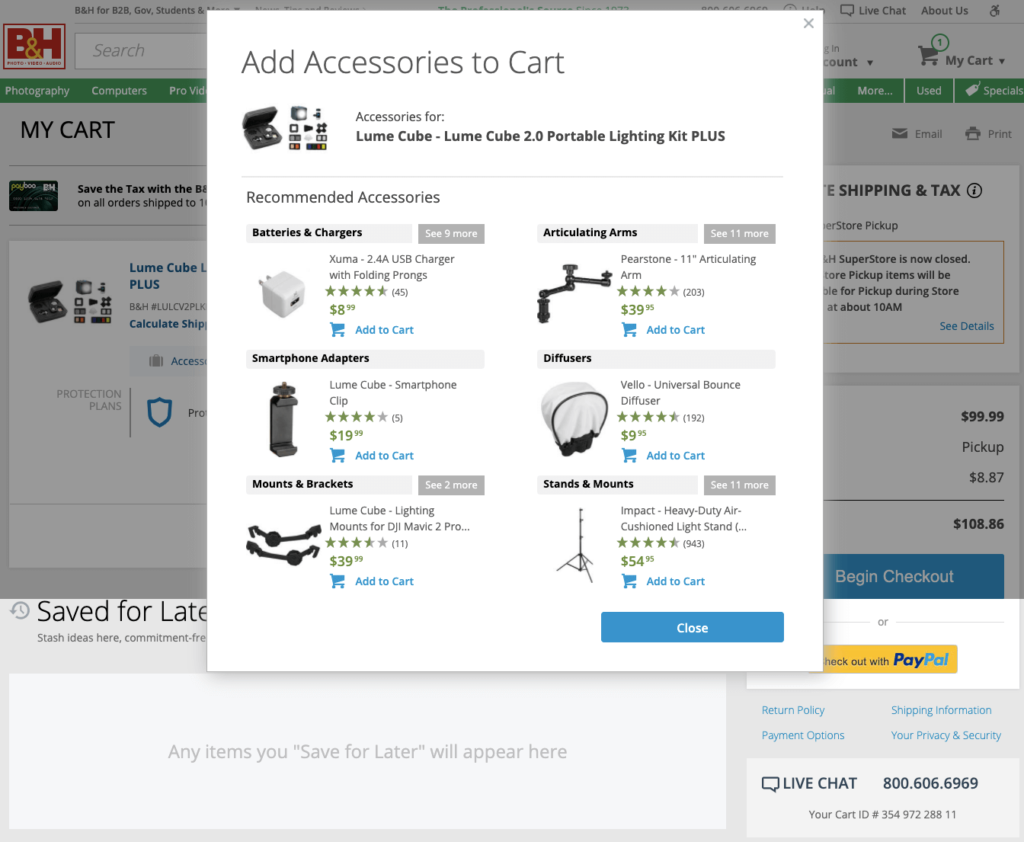
Far from coming across as pushy or greedy, it actually feels helpful.
3. H&M
Technically, this one isn’t a checkout page. But stick with me because it highlights a useful point that’ll definitely help inform your checkout process design.
Remember that Baymard Institute research I cited earlier? It also reveals the biggest reasons why shoppers abandon their carts:
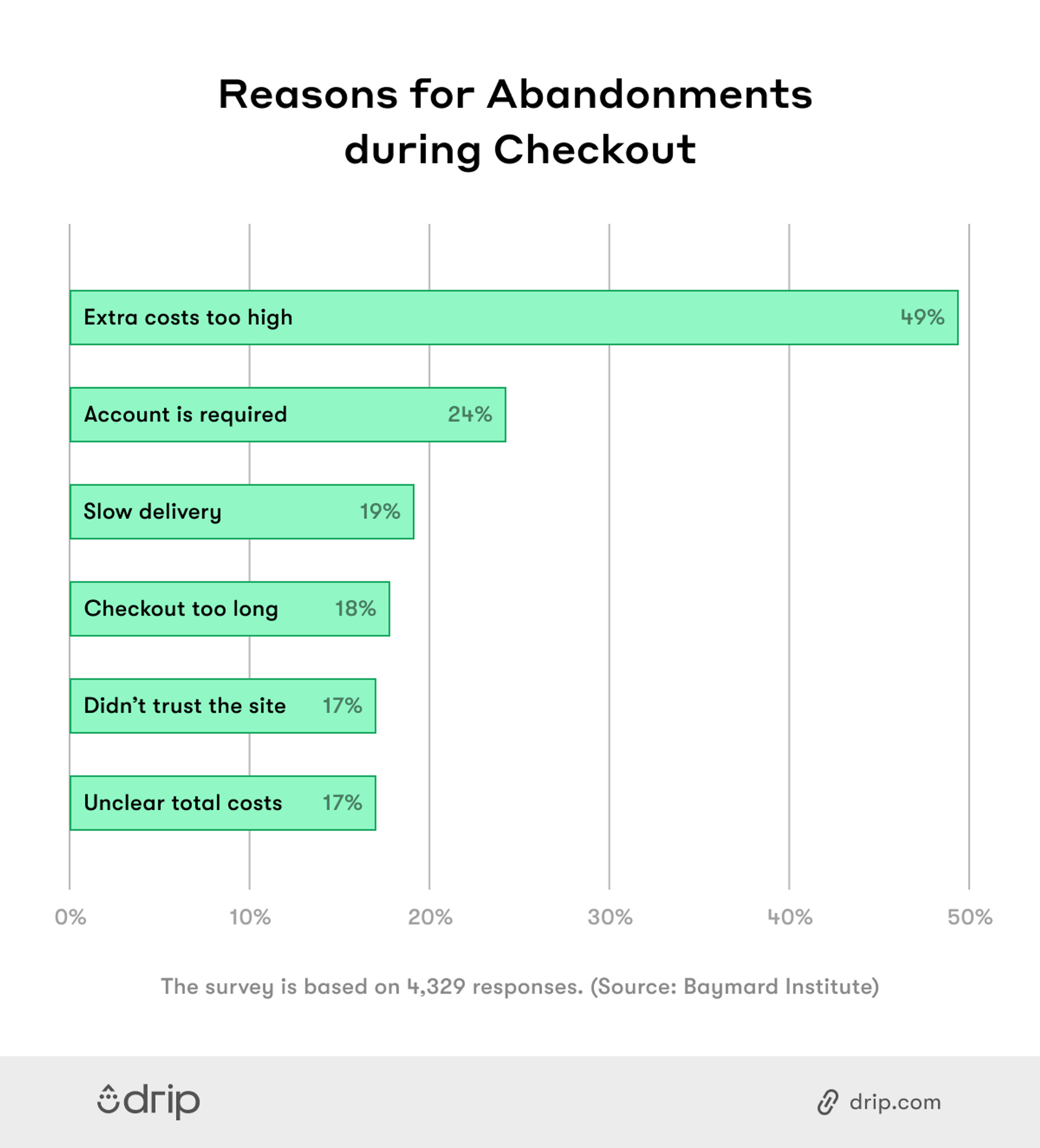
Number one is no big surprise—after all, no one wants to be slapped with a bunch of expensive additional costs when they’re poised to purchase. So instead, I’m going to focus on number two: “The site wanted me to create an account.”
Clearly, shoppers don’t want to spend a bunch of additional time filling in all the details required to start an account. But if you’re not asking people to sign up at this stage, it’ll end up costing you down the line.
Capturing those valuable details allows you to offer better customer service, and it also helps you build up your email list. That lets you send customers relevant offers, which means more conversions. In a world where email marketing delivers an average ROI of $42 for every $1 spent, you can’t afford to live without it.
In short, there are two conflicting goals here:
- Your customers want to check out as quickly as possible; and
- You need to gather their details to support your marketing efforts.
H&M shows us how to walk the tightrope between these two objectives:
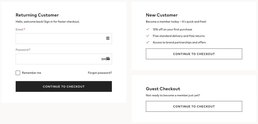
If you’re a new customer, you can easily choose the guest checkout option, in which case H&M only asks for the basic information it needs to get your purchase to your door. But it also spells out all the benefits of creating an account:
- 10 percent off your first purchase;
- Free standard delivery and free returns; and
- Access to brand partnerships and offers.
In that context, creating an account sounds well worth the small investment in time.
4. IKEA
IKEA is synonymous with smart, efficient design. So you won’t be surprised to learn its checkout process is a joy from start to finish.
There is any number of elements I could have chosen to highlight here; enough to fill a whole article. But for the purpose of brevity, I’m going to concentrate on copywriting.
Earlier, I stressed that your checkout page isn’t the place for unnecessarily wordy chunks of text. But words can still play an important role in your checkout process. Here, IKEA demonstrates how copy can be used in a way that feels completely necessary and actively improves the user journey:
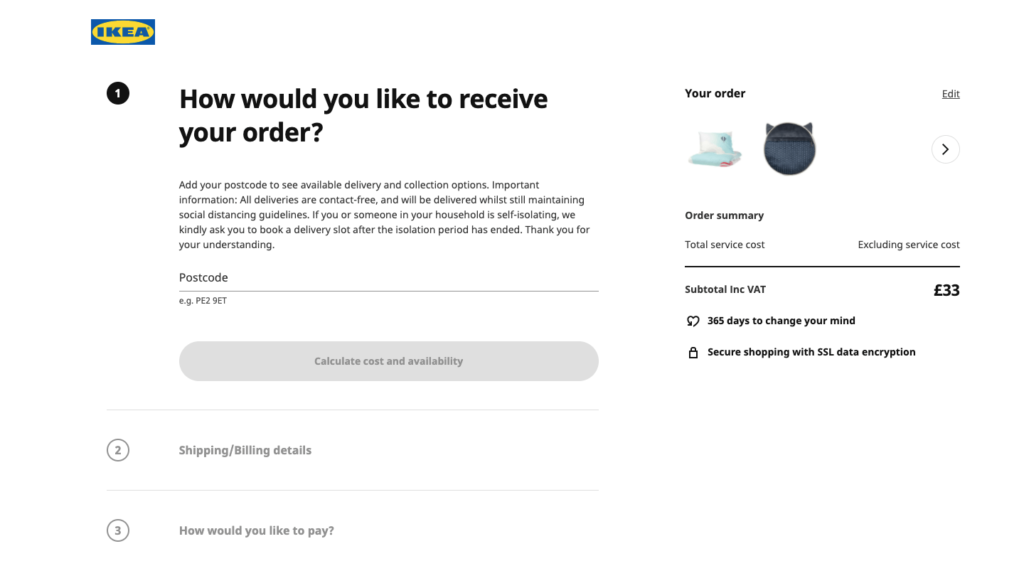
Think about it. Listing all the various delivery and pickup options in as few words as possible could easily become confusing for shoppers. So instead, IKEA asks the user to enter their location details and choose whether they prefer a pickup or delivery. Then it displays the specific options available and asks them to choose their favored option.
It feels like the whole process is centered on the customer, and that IKEA genuinely wants to help.
This sentiment is reinforced by the choice of a subheading: “How would you like to receive your order?” That feels a whole lot friendlier and encouraging than a simple: “Choose delivery or in-store pickup.”
5. Boots
Before I show you my next example, we’re going to dive back into that ever-useful Baymard Institute study.
I’ve already discussed the whole point around shoppers not wanting to create an account before they buy. Now let’s cast our eyes toward number four on the list of biggest reasons for shopping cart abandonment—an overly long or complicated checkout process:
For almost one in five cart abandoners, the complexity or length of the checkout process was the straw that broke the camel’s back. So it’s clearly in your interest to make the process as short, sweet, and simple as possible.
But that poses an additional problem. Before they’ve started the checkout process, shoppers don’t know how long or complicated it’s going to be. How can you reassure them that you’re not going to make a series of ever-more complicated demands?
Take a leaf out of Boots’ book:
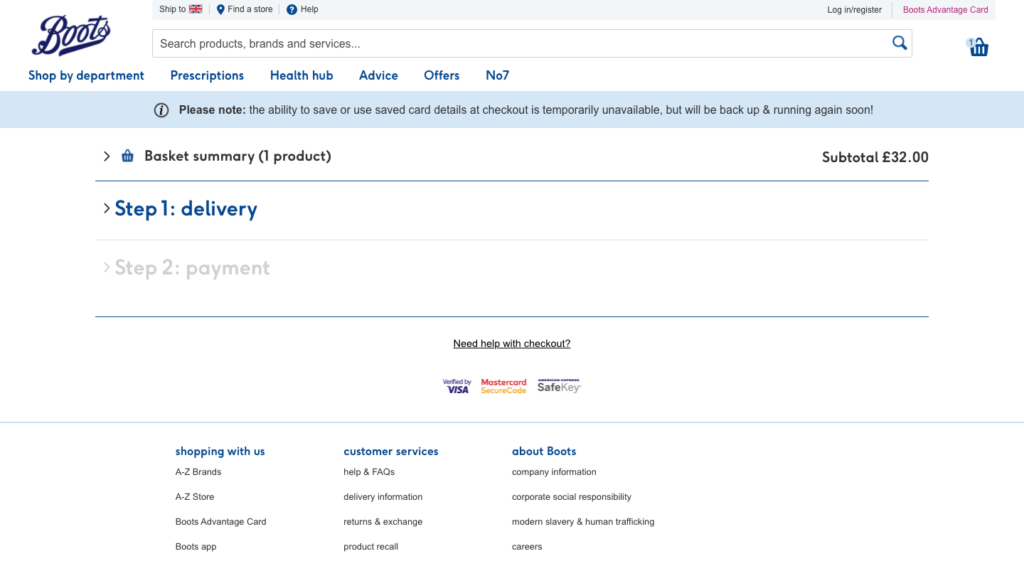
The health and beauty retailer clearly and simply demonstrates there are only two steps in its entire checkout process:
- Delivery
- Payment
If you think that sounds too complicated, you probably shouldn’t be shopping online in the first place.
6. Louis Vuitton
I was definitely glad Louis Vuitton doesn’t have an “instant checkout” function when I was searching for this example. One accidental, sneeze-induced button click and I’d find myself the proud owner of a pair of €970 pillowed ankle boots.
So why have I included this one, other than to make everyone think I’m rich enough to shop at LV? For two reasons:
- It demonstrates that whether your audience is distinctly high-end or not quite so affluent, the principles of a quality e-commerce checkout page remain the same.
- I like how Louis Vuitton reframes a simple email capture form as an opportunity to provide a higher standard of service:
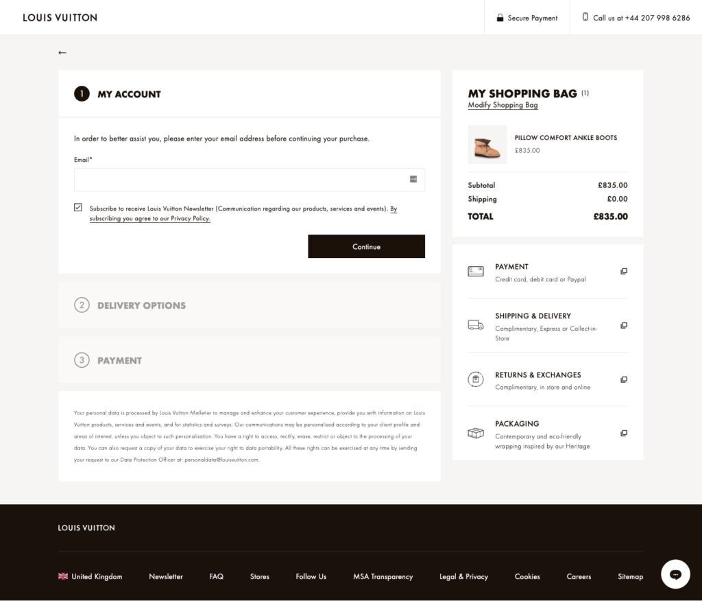
I love the phrasing: “In order to better assist you, please enter your email address before continuing your purchase.” That’s such a neat sell. After all, who doesn’t want to be better assisted?
7. Nike
One of my biggest pet peeves with the checkout process is finding out you have to enter your address in full across multiple fields of a form.
Even worse, sometimes you’ll be told you must enter the second line of your address, even though you only have a number, street name, and city.
Honestly, in this day and age, I don’t see why any brand wouldn’t be looking to streamline this part of the process. This is exactly what Nike has done here:
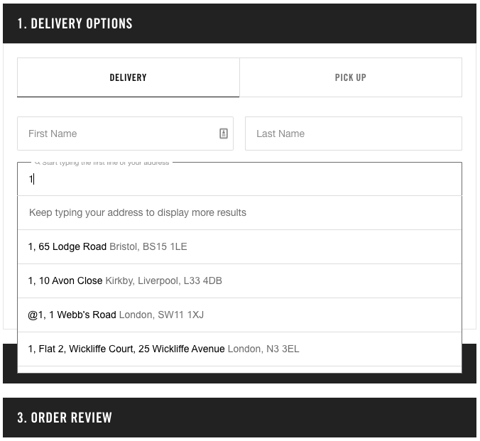
Rather than force me to type out every number and letter of my address across multiple fields, it auto-fills the results as I’m typing. Then I can choose the right one when it appears. It makes the process so simple.
Conclusion
Building a quality e-commerce checkout page isn’t rocket science. In fact, the simplest design will almost always deliver the best results.
Unfortunately, it’s not always easy to design a “simple” page. There are a lot of important steps to include in the checkout process, and (as I’ve discussed throughout this article) you’re often faced with conflicting goals. One decision might be better for your marketing strategy, but worse for your abandonment rate.
With that in mind, I’d always recommend focusing on the following elements when designing your e-commerce checkout page:
- Don’t force customers to create an account before checking out—but make sure you spell out the advantages of signing up.
- Add an autofill function to your address capture form, and never force shoppers to enter their address multiple times.
- Make it clear from the outset how many steps are involved in your checkout process.
- Feel free to showcase upsells and complementary purchases, but don’t let it interrupt the user journey.
- Present the total price of the product (and shipping) as early in the process as possible. No one likes unexpected costs.
Get those things right and you’ll be well placed to drive down your cart abandonment rate, which means more sales.

