

The most important part of your website is your checkout. It’s the place where prospects become customers (read: it’s where you make money).
But creating a seamless checkout experience isn’t always easy.
There are a lot of best practice guides out there telling you how many steps you need to include, what payment options to use, what type of software you need, and so on.
This is not that type of post.
I find it much more interesting to find the unique and overlooked strategies you can implement in almost no time, and see immediate results.
No need to do a complete overhaul of your checkout process to increase conversions.
Take a look at these 12 unique checkout hacks top brands use to get more customers, more quality leads, and increase customer loyalty.
Table of Contents
Part 1: Product Page
Your product page is essentially the first step of your checkout.
It’s where prospects decide whether or not to buy your products, and it’s your job to help them make that decision.
The easier it is for visitors to choose the right product and add it to their cart, the more likely they are to complete their purchase.
Things such as a large call-to-action button, displaying customer reviews, and using high-quality product photos are all best practices when it comes to optimizing your product page. But what about the lesser-known and unused strategies that can really increase conversion rates?
Let’s take a look at a few now.
Strategy #1: Drop a “Hint Hint” to Increase Product Sales
Imagine this…
Your birthday is coming up, and you’ve been asked to send a wishlist to your friends and family.
What do you do?
You go online to browse for things to add to your wishlist, right?
A lot of consumers do so, too.
They’ll find things online and add them to their online or offline wishlist. The problem, though, is there are other brands that offer the same product as you, and you can’t assume that people will buy your product over a competitor.
Or can you?
Granted, you can’t guarantee that people will buy from you when shopping for gifts, but you can make it easier for visitors to send gift recommendations to friends and family with a link to your product page.
Here’s an example from Mulberry:
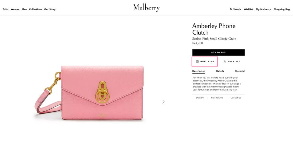
Right below the add to cart button, there’s a button called “Hint Hint”.
When you click that button, this popup appears…
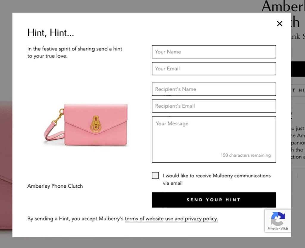
…giving visitors the ability to send an email to friends and family hinting that they want this item.
Here’s what the email looks like:
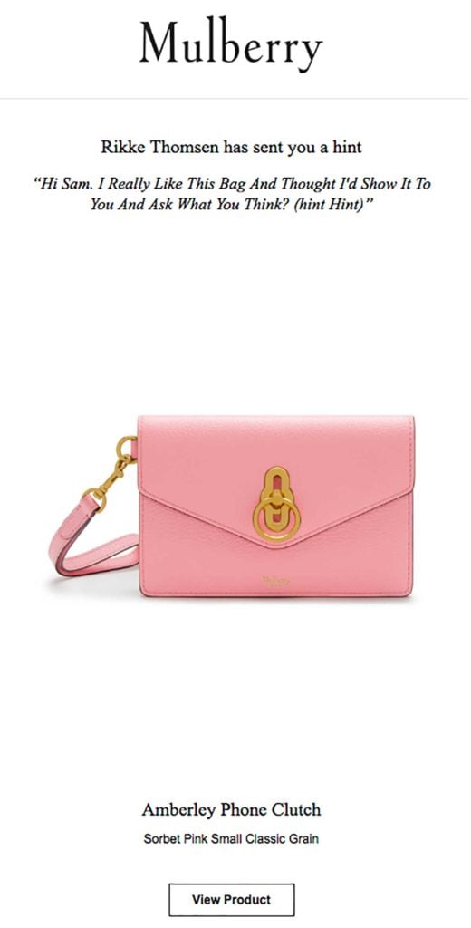
(I sent this to Sam but he didn’t get the hint, so no new bag for me. 😞)
This is a great way to increase sales on your product page for visitors that are only browsing and don’t have any purchase intent at that time.
It also makes it easy for the recipients of the email to click the call-to-action button and go directly to the page where they can buy the product—on your site.
Strategy #2: Use Size Guides to Keep Visitors to Boost Product Page Conversions
Many e-commerce stores offer size guides to overcome the problem consumers have with not being able to try on products online.
But in many cases, visitors are directed away from the product page and to the size guide page to see the guide.
You should never redirect prospects away from a product page because you’re redirecting them away from a potential purchase.
Instead, you can offer a size guide directly on the product page to make it easy for prospects to find the right size and add it to their cart.
Here’s an example from Chubbies:
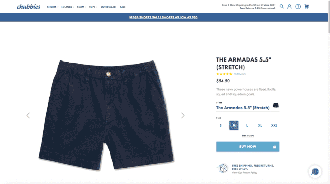
This makes the customer journey much shorter compared to having a size guide on a different page where visitors then have to find the product again after they’ve found the right size.
Part 2: Order Review
Once a visitor adds items to their cart, they go to the order review.
This is where they’ll be able to see the full price of the order and confirm the products in the cart before moving on to entering personal details and choosing a shipping method.
There are several ways to optimize your order review, and below, I’ll show you some unique examples of how top brands are doing this.
Strategy #3: Turn Empty Carts into Full Carts with This Simple CTA
Sam recently stumbled upon this example when writing his recent growth guide.
And this is one of the examples that inspired me to write this post.
Picture this…
A visitor accidentally clicks on their cart without having added any items to it.
And what do they see?
Nothing. Just an empty cart without any call-to-action (CTA).
What’s better, is to add a CTA in your cart to find items to add to their cart.
Here’s the example from MeUndies:
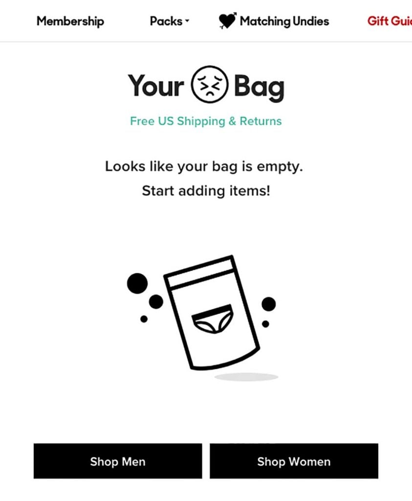
By adding two simple CTAs in their empty cart, MeUndies make it easy for visitors to choose which category they’d like to browse (read: the visitors make an unconscious decision about what products they’d like to buy).
Strategy #4: Increase Average Order Value (AOV) with Relevant Product Recommendations
When a potential customer has added items to their cart you could leave it as is and let them complete their purchase.
Or, you could encourage them to add more items to their cart to increase your AOV.
Product recommendations are responsible for an average of 10-30 percent of gross e-commerce revenues. That’s a number you can’t argue with.
You can even use free shipping as an incentive to upsell customers.
Here’s an example of what that could look like:

Strategy #5: Excitement: The One Emotion That Creates Brand Advocacy
A great way to turn prospects into loyal customers is to give them an unforgettable experience.
One way to do so, it to get them excited about their order to increase chances of them returning to your site and buy again.
I’ve found a few unique examples of businesses who go that extra mile for their customers and create an unforgettable shopping experience.
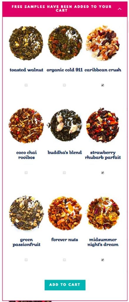
The first one is DavidsTea who offer free samples of their product with all orders. Not just one sample, but three samples.
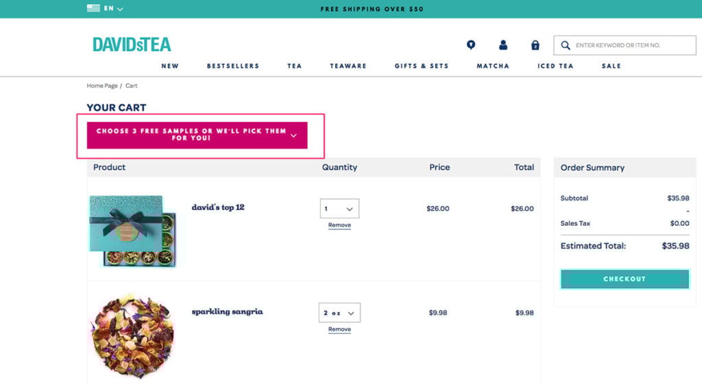
You simply click a dropdown and add the samples you want to your cart—free of charge.
Once they’re added, the free samples appear in your cart and you’re assured once more that you won’t have to pay for them.
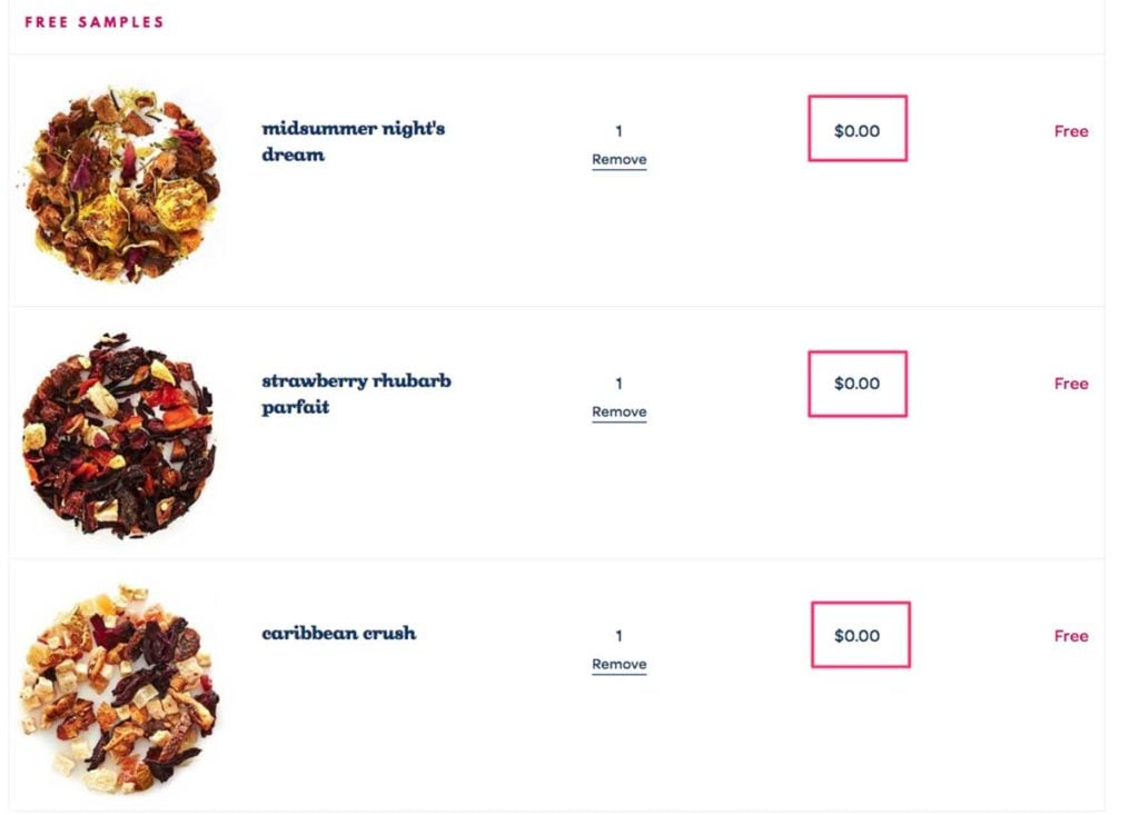
By doing this, DavidsTea not only gives visitors an enjoyable shopping experience where they get more than they pay for. They also give visitors a way to try more products.
The second example is from Man Crates.
On the order review page, they give you the option to add a gift note if you’re buying for someone else.
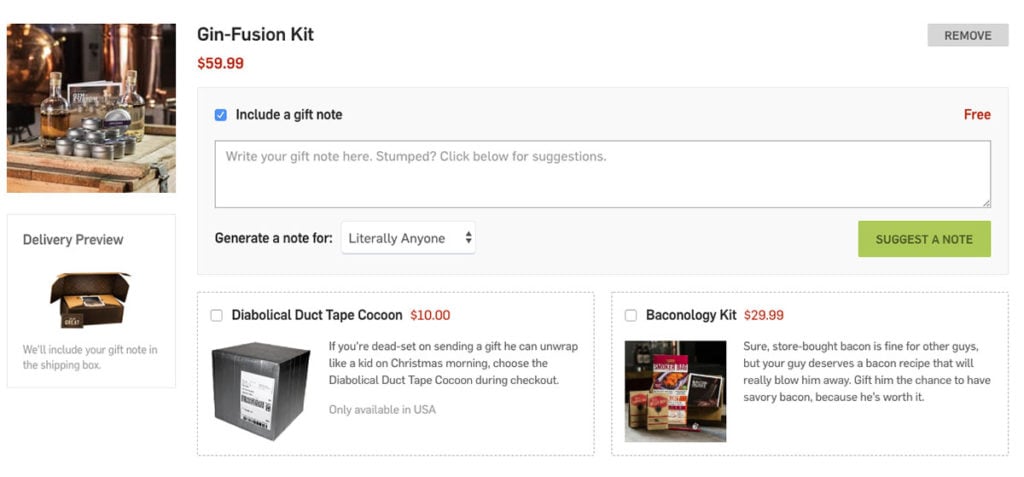
That’s not new. But notice how Man Crates have pre-written suggestions when you choose a receiver of your package in the drop-down:
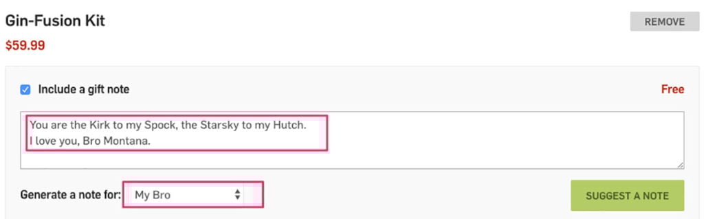
It’s a fun way to encourage prospects to make their gift more personal without needing to come up with a personal note themselves.
Lastly, Man Crates also show a delivery preview of the order.
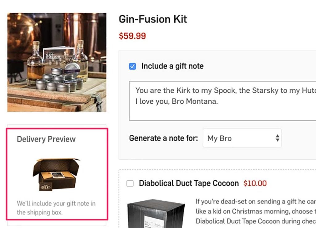
This may seem like a small and insignificant detail, but giving prospects a preview of the package they’ll receive teases the unboxing experience making them more likely to complete their purchase.
Part 3: Shipping and Personal Details
The third most common reason people abandon checkout is due to a long or complicated checkout process.
This is especially true in the shipping and personal details section of checkouts.
It’s the step in your checkout where you need the most information from prospects, and how you ask for this information is important.
Some e-commerce sites, requires you to create an account to buy, whereas others offer guest checkout options.
I always recommend including a guest checkout option as creating an account may be too much of a commitment for first-time buyers.
There are other ways to turn prospects into loyal customers without forcing them to create an account.
Let’s take a look.
Strategy #6: Add This Often Overlooked Feature to Get More Subscribers
We all know the importance of email marketing, right?
So why not ask visitors for their email during checkout using a checkbox?
Here’s an example from Poo Pourri:
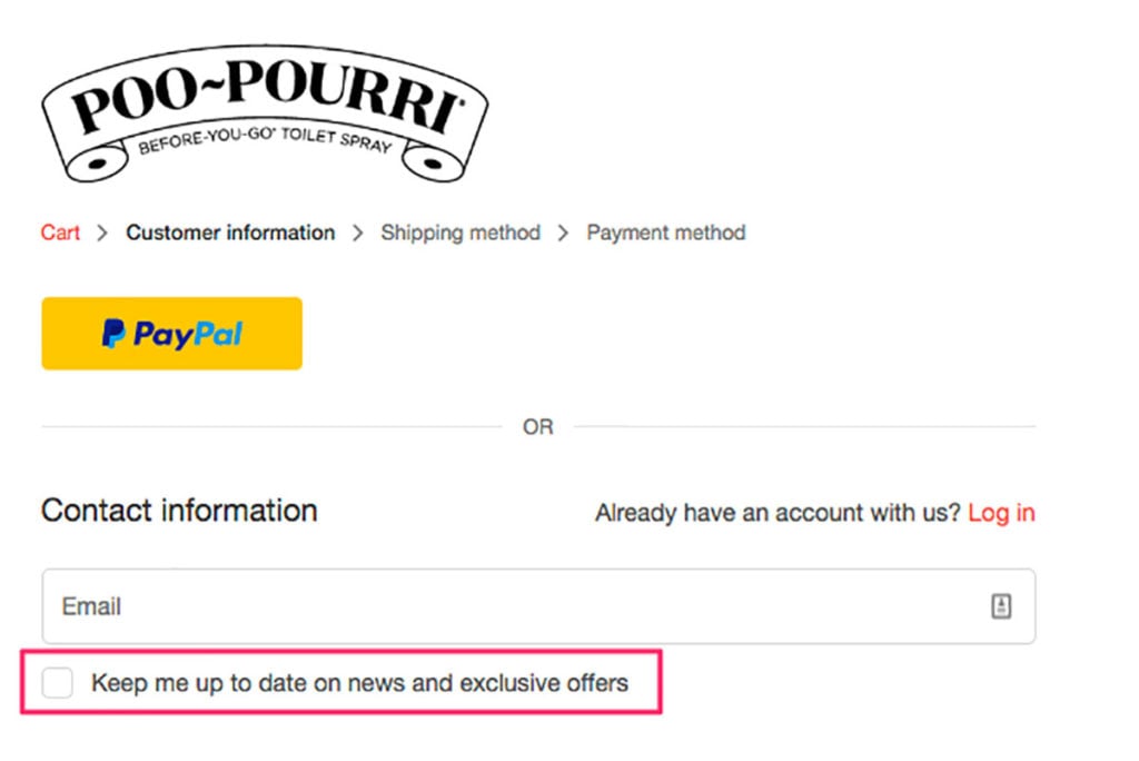
It’s a great way to encourage prospects to join your email list—without taking away focus from the main objective.
Strategy #7: Capture Abandoning Shoppers with Targeted Exit-Intent Campaigns
I think we can all agree that abandoned carts are the worst, right?
Prospects who already made a decision to buy something, for some reason decided not to go through with it.
With abandoned cart campaigns, you can turn abandoning visitors into email leads or customers.
Here’s an example from minimum that focuses on getting leads:

And when you have their email, you can follow up with a well-written abandoned cart email to turn them into customers.
Strategy #8: Tweak Your Shipping Copy to Simplify Your Checkout Experience
The number one reason people abandon their carts is unexpected costs, such as shipping.
I’m not telling you to offer free shipping, but you should always include multiple shipping options to accommodate all your potential customers.
Some people just want a day-to-day delivery and don’t care that they have to pay a little extra, while others want the cheapest delivery option and don’t mind the extra delivery time.
No matter how many shipping options you include, it needs to be easy to see the delivery date, the shipping method, and the cost of each shipping option.
Once again, you can be creative with your copy, and evoke excitement in shoppers with your shipping.
Here’s another example from Man Crates:
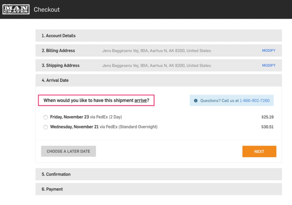
Instead of asking visitors to choose a shipping option, they ask when the shipment should arrive.
This takes away focus from the price and instead evokes a feeling of excitement in visitors when they choose when they would like to receive their order.
Choosing a specific date is also easier for people to comprehend rather than the typical “3-5 business days” option.
Strategy #9: Recognize (and Reward) Returning Customers
One thing I like about shopping online is cookies. (I know, I might be the only one in the entire world).
But cookies enable online stores to personalize and simplify the shopping experience to a whole new level.
Some websites use cookies to recognize returning customers and have their data pre-filled when they enter checkout again.
When you don’t have to fill in personal information again, it saves you a lot of time (and who doesn’t love saving time?).
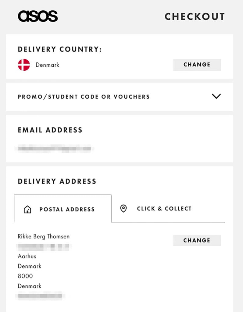
Take this example from ASOS who recognizes me as a returning customer.
They already know my personal information and delivery address:
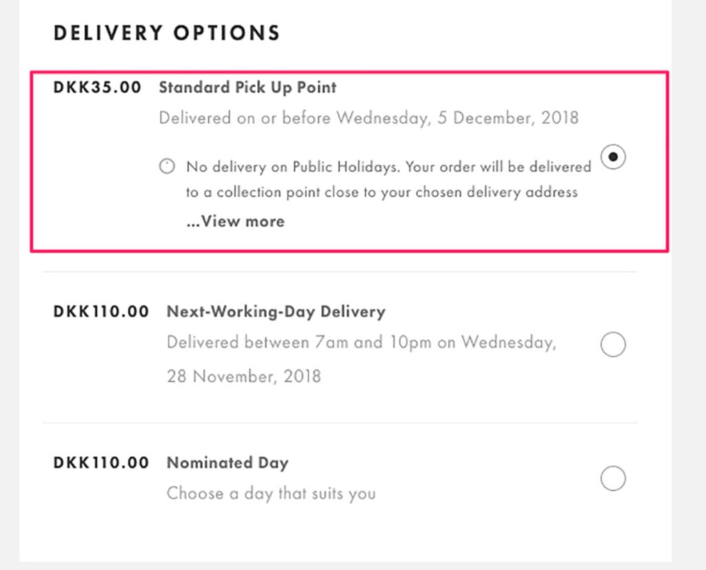
My preferred shipping option (the cheapest, of course):
And finally, they know I typically pay with PayPal so that’s also pre-chosen:
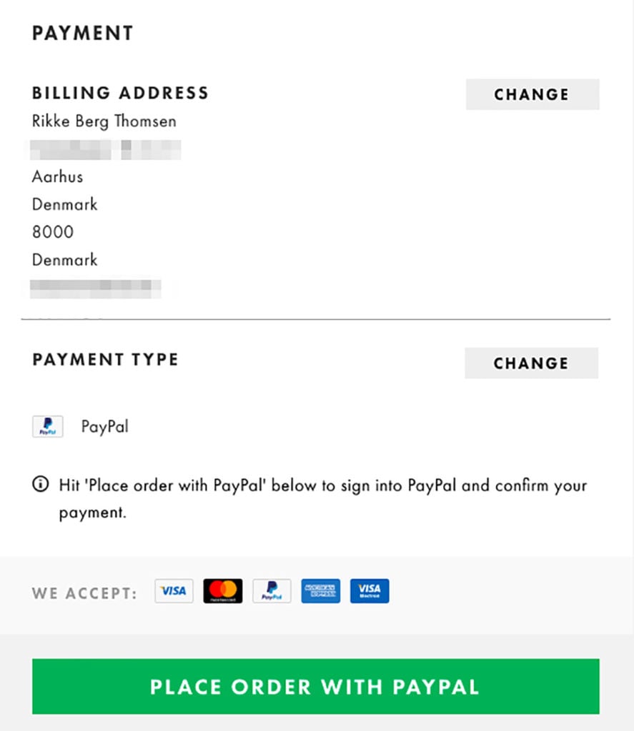
Notice, how I can go through checkout without having to enter any details? Amazing!
Part 4: Thank You Page
Your thank-you page is a goldmine waiting to be tapped.
The truth is, despite their best intentions, many business owners massively underuse their thank you page.
They don’t ask their potential buyer to take action—when they’re primed to do so—and, thus, forgo countless opportunities to encourage engagement, increase their revenue and more.
Here are three ways to get more out of your thank you page.
Strategy #10: Create Positive Word of Mouth with This Replicable Referral Engine
Generating new business is an ongoing challenge for many online stores.
But there’s one acquisition channel that, when consistent, is a predictable source of revenue:
Referrals.
In fact, according to a recent survey by Ogilvy, 74% of consumers identify word-of-mouth as a key influencer in their purchasing decision.
It’s no surprise, then, that many businesses ask you to refer them to a friend or family when you buy something.
Take this example from MeUndies:
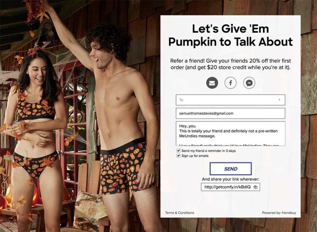
They’re creative with their copy, and offer a pre-written message to make the referral process easier.
(Psst…you can read more about MeUndies amazing referral engine here)
Add a form like this to your thank you page, and you’ll definitely see an increase in referrals.
Strategy #11: Promote Your Loyalty Club to New Customers
Having a loyalty program is a great way to encourage repeat purchases and increase customer loyalty.
In fact, according to one report, repeat customers spend 67% more than new customers.
The best time to promote your loyalty club is right after a visitor has bought something from you.
They’ve just made a purchase. They’re excited about their order and your brand. So, they’re more likely to join your club at this stage.
With that in mind, consider adding a campaign to your thank you page and ask new customers to join your club.
Here’s an example I made using Drip:

Make sure you tell customers about the benefits of joining your loyalty program.
Strategy #12: Get Customer Insights with a Well-Timed Survey
Surveying your audience gives you greater insight into what makes your audience tick (their goals, desires, pain points, etc.).
This will help you craft a highly-targeted marketing message which is both interesting and relevant to your audience.
The problem, though, is, many businesses do it wrong.
They don’t ask the right questions and when they do, they ask them via an overpopulated medium (e.g. email).
What really savvy business owners do, instead, is ask you immediately after you’ve bought something.
After all, people who just bought something have shown a high interest in your business and are more likely to answer a few questions.
Here’s an example from ASOS:
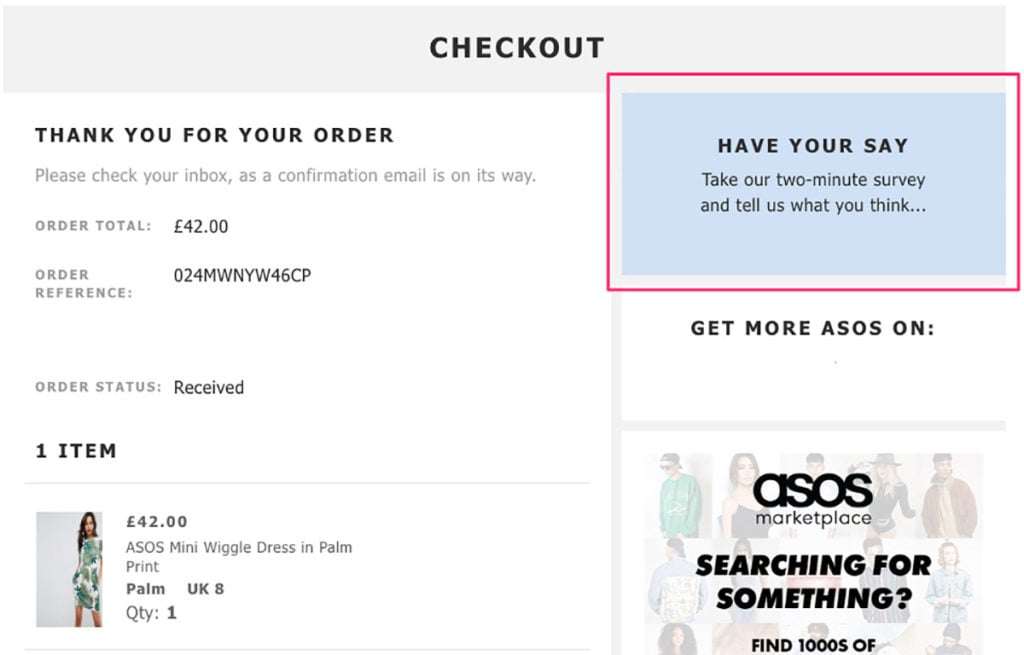
When you click the box, you’re taken to a short three-question survey that takes less than the promised two minutes to fill in.
Conclusion
A good checkout experience is one that requires as little time and effort as possible—and is memorable.
When you give your customers an unforgettable shopping experience, they’re more likely to return and buy again.
It’s the small things that the brands in this post do that makes the difference between an okay experience and a great experience.

