
Ranking higher than your rivals on Google is a must to stay ahead in the game.
However, what many ecommerce sellers don’t realize is the crucial role category and subcategory pages play here, especially to drive conversions and boost traffic.
In fact, customers are likely to visit your ecommerce site through a product category page unless they enter a specific product page through a search. The catch? It’s easier said than done.
Over-optimization, under optimization, or worse, no optimization—there’s so much that can go wrong.
In this guide, we’ve compiled a list of category page best practices that can help skyrocket your sales and conversions.
Excited? Let’s take a quick look.
Table of Contents
1. Improve Your Loading Time Speed
2. Choose Clear and Everyday Words for Your Categories
3. Make Your Filter Design Relevant and Right
1. Improve Your Loading Time Speed
Forty percent of visitors will abandon your page if your site takes longer than three seconds to load. We kid you not.
Precisely why longer loading times can kill your SEO, which, in turn, will have a seriously bad effect on your revenue and sales. Therefore, the first thing you should work on is working to make your ecommerce website fast—very fast. Plus, what’s the point of having a very decorated category page if you’re prospective customers don’t even get to look at it?
A good way to start is to know where you stand in the loading speed game. Check your ecommerce website’s desktop loading time on Google‘s PageSpeed Insight Tool. You can also use Test My Site Tool to find out how well your site loads on mobile devices. This will tell you whether your site’s loading speed is something you need to worry about.
Areas to improve include:
- Reducing the size of your website page by avoiding embedding large images or objects.
- Using caching or in-memory plugins and software tools to avoid opening a database unnecessarily.
- Using compression software to cut down the size of the data sent to a browser.
- Specifying the dimensions of your images—height and width—to let the browser create placeholders for them.
- Ensuring your hosting server, which includes RAM, CPU speed, and hard drive storage meets your traffic requirements.
2. Choose Clear and Everyday Words for Your Categories
You may not know what RX sunglasses are, but you definitely know what prescription sunglasses are. So won’t you agree that using “Prescription Sunglasses” as a product category would be wiser than “RX Sunglasses?”
Do your best to avoid jargon. In our example, RX is an industry jargon that is commonly used by opticians—not regular people. You should try to think of a category name that’s easy to understand and descriptive.
Try to use the same language as your customers. Like literally down to the exact word. Also, category and subcategory names should be simple and relate to the product directly.
Let’s take a look at Interior Define’s homepage:
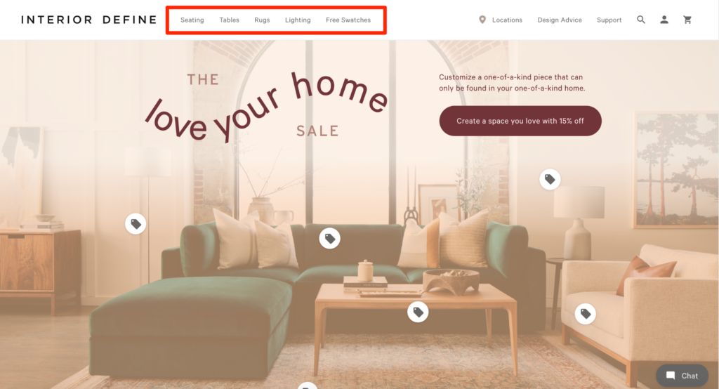
As they sell furniture, they have decided on five categories: Living, Dining, Bedroom, Guides, and Free Swatches. Make sense, right?
The category names are self-explanatory. A buyer looking to buy living room furniture knows that they should click on “Living” to view suitable options.
No matter how tempting it may be to get creative when naming your categories, don’t. Everybody has a different thought process, so what you may think clever may end up confusing your shoppers, which isn’t what you want your customers to feel if you want to make a sale.
Remember the following two rules when deciding on your product category name:
- No adjectives. We get it: Adjectives help emphasize and describe stuff effectively, but if you overdo them, your sentences will feel like fillers. Use them when it‘s absolutely necessary and when they increase the appeal for a product. For instance, adding words like “Free” or “New” is likely to work well for increasing page traffic.
- Avoid overly long sentences. There’s no need for your category page names to be too long. The whole point is to make it easier for shoppers to scan through categories, which is why you should stick to one or two words maximum — no more.
3. Make Your Filter Design Relevant and Right
Having a seemingly never-ending list of products is time-consuming and definitely not appealing. More so, for shoppers who don’t have time to spare. What you need in this case is filtering—nay, relevant filtering.
You can only have a select few products on your category page. This is why you should make most of your page real estate, designing it in a way that benefits you and makes it convenient for customers to browse.
i. Filter Location
Where should you put your filter navigation? Product filters affect a customer’s user experience, so you need to get this aspect right to leave a positive impression. Luckily, experts have already found two viable options that you can consider:
ii. Left-Hand Navigation
Many people are familiar with this system since it was the standard placement for the longest time. While this does mean your customers will know where to look for, research has found that people tend to only focus on the upper-center of the page (something that’s known as tunnel vision), so they may not use the filtering options at all. Yikes.
In our experience, we found that using a noticeable filter design (eg: checkboxes) can help ensure your customers actually use this system.
Forever New, for example, uses the traditional left-hand navigation filter system. But since they use a checkbox, the system is obvious, beating the tunnel vision issue.
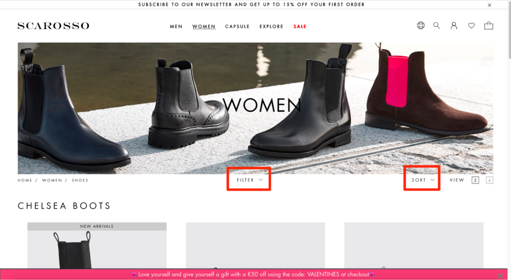
iii. Horizontal Toolbar
The horizontal toolbar features both filters and a sorting tool. Therefore, not only is it easily noticeable, but also lets you put up larger product photos. We would only recommend the horizontal toolbar filtering for ecommerce stores that only require a few filters naturally, though.
Basically, a horizontal toolbar wouldn’t work for a brand like Target, but a site like Scarosso would be perfect for this. In fact, the latter’s website uses this system that includes both filters and the sort tool located at the top of the page.
iv. Multiple Filter Layering
For an ecommerce site, the rule is simple: The more filters, the better. Having multiple filtering methods lets your customers narrow down their search, which, in turn, ensures a better shopping experience.
Suppose a prospective customer wants to buy a laptop. They want it in a specific color, at least 4GB ram, and a large screen. If you sell laptops, you should have appropriate filters that help the customer see options that fit the bill to the T.
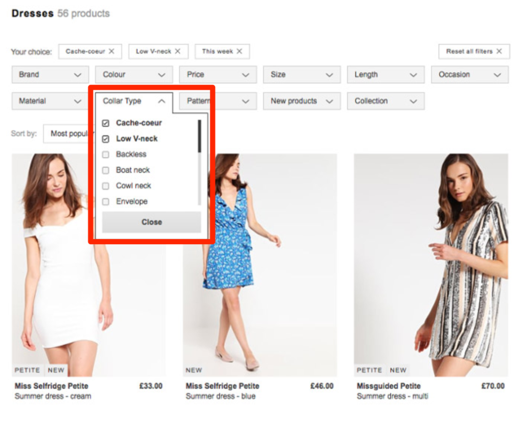
Zalando, for example, offers a collar-type filter. And not only that, you’ll find many other specific filters that aren’t typically offered by other fashion retailers.
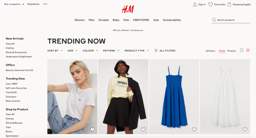
Another filter option that we highly recommend including are temporary and time-based filters. For instance, H&M has a “Trending Now“ category that is the culmination of the latest trends. Similarly, Topshop offers “Festival“ and “Holiday Shop“ under the “Dress“ section that can be helpful for customers shopping for the holidays or specific occasions.
So not only should your filters be located in the right place, but they should also help improve a potential customer’s shopping experience.
4. Add Category Descriptions to Help Customers Make Informed Decisions
Shoppers that look through your category pages are often people who visit your store for the first time. Therefore, it’s possible that they won’t know much about your products.
Now, when users have detailed information about what they want or what their shopping for, their shopping experience becomes less tedious and time-consuming. Your job is to provide them this information.
How? Category descriptions.
Adding category descriptions bridges any knowledge gap. It helps interested parties gauge whether scrolling through a specific category would be worthwhile or not.
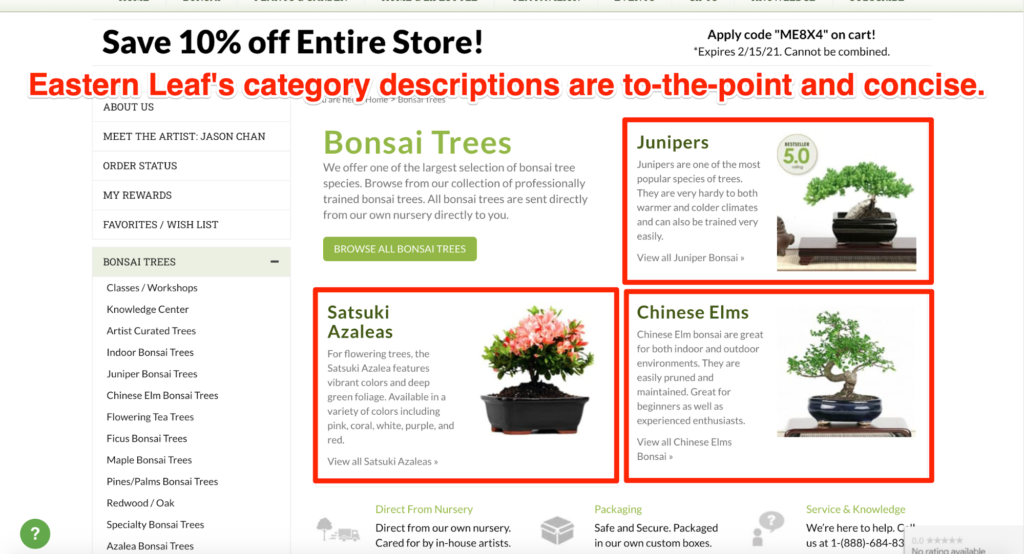
EasternLeaf.com does an exceptional job of adding educational content to its category pages. Their “Bonsai Trees” category page includes short descriptions about bonsai plants, helping potential customers understand the subtle difference between their products.
Snowe is another notable example of category pages that have excellent descriptions.
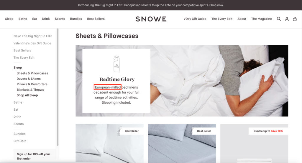
Every subcategory on their category page has an explanatory sentence that informs a prospective customer why they should buy their pillowcases, sheets, or duvets. Their “Sheets & Pillowcases” category talks about the “decadent” bed linens in just two lines but is still impactful enough to make a mark.
Here are two tips for writing impactful and effective category descriptions:
- Emphasize product quality. Your description should mention the high quality of your products. Continuing with our Snowe example, you’ll find that their category description mentions the sheets are “European-milled,” a fact that informs customers about the premium nature of the products.
- Keep it short and concise. Shoppers browse through the category page very fleetingly, which is why they don’t want to read long chunks of text. This is why your category descriptions should be super short that can be read in a few seconds tops.
5. Simplify Searching and Adopt Faceted Navigation
Online shopping is awesome. From the customer’s viewpoint, they can find every product imaginable and get it delivered to their homes. However, things aren’t this simple for ecommerce sellers like you. Yes, you have an ecommerce store where you sell a specific product or service. But then, so does everyone else.
There is stiff competition in the market, and to compete with other stores, you have to make sure your customers can find what they want conveniently and faster in your store. You have to stand out from the rest if you want to score more sales, and the best way to do that is by prioritizing your customer’s convenience.
Here are a few tips to nail simplified searching and faceted navigation:
i. Keep the Search Box Big
We’ve already established how element placement on category pages directly influences customer experience, and your search box is no exception.
Search boxes should be big enough to allow users to type what they’re looking for and even double-check that their query is free of errors. This is particularly useful for ecommerce sites that sell electronics.
In such cases, customers typically enter a long product code. If the box isn’t big enough, they won’t be able to cross-check whether they got the code right. And obviously, if the product code is wrong, they won’t find the right results, which might leave them frustrated. They may even abandon your site altogether in certain cases.
After all, what’s stopping them from visiting your rival with a bigger search box?
ii. Enable Faceted Navigation
Allowing customers to search within certain sections is the best tactic to simplify navigation. To do this, you should make sure they don’t see results from other category pages.
Let us explain this with the help of an example.
If users are browsing through the “Tees and Blouses” category of a clothing website, the search results should only display items that are on the tees and blouses page. Try to include factors that let them get as specific they want by giving them a variety of options to refine their search. In our tees and blouses example, extra filter options like pattern, sleeve length, and so on, can considerably cut down a customer’s search.
This is called faceted navigation. Customers can find what they’re looking for by seeking out a product feature. It can also help you score some serious SEO brownie points.
Jared has an incredibly well-designed category page that’s an excellent example of category pages with faceted navigation.
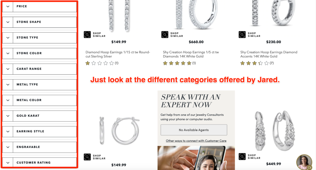
If you search for hoop rings on their website, you can refine your search by name, price, bestsellers, brand, new launches, whether they are for kids or women, hoop style, personalization availability, metal type, stone type, and the collection that they’re a part of.
Phew! Options galore, right?
iii. Avoiding Duplicate Product Categories
Using duplicate category names is a BIG no since it’ll only confuse the customer. That said, we understand that a few ecommerce sites can have two or more subcategories with the same name. For instance, there can be a “Mats and Rugs“ subcategory under the “Bath” and “Outdoor” categories. But you should still avoid duplicating category names if you want to enhance your customer’s user experience.
Even Google gets confused why there are duplicate pages for the same keyword. What you can do is create a single category for overlapping subsections. Continuing with our rug example, it’s better to build a main “Rugs” category instead of a “Rugs” subcategory.
You can also have an alternative category name to sort the products in a specific section. This can be useful for sites selling home accessories and beauty products together. For example, they can have a “Candles“ subcategory instead of having multiple “Fragrances” sections under “Beauty” and “Home” categories.
6. Use Big and High-Quality Images
According to research, content that includes relevant photos can get 94 percent more views. And because we’re discussing an ecommerce store, the importance of images becomes even greater.
The following are a few pointers you should keep in mind:
- Images should visually communicate every detail—big or small—of the product. You should use images that are high-resolution and zoomable.
- Add multiple photos to display a product from different angles. This will give every visitor a better idea about the overall look of the product.
- Your images should download faster as longer loading times might cause visitors to bounce off your site, reducing your conversion rates and sales.
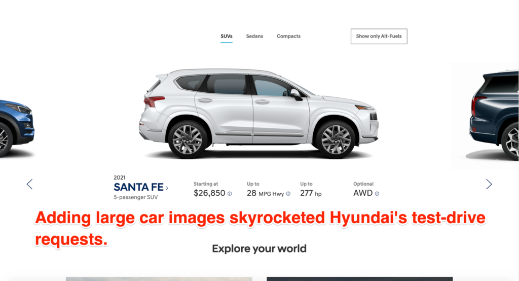
We also recommend choosing big and clear photos as opposed to small and grainy images. In fact, Hyundai was able to increase its test drive requests by 62 percent by employing this simple tactic. On the other hand, smaller product images can have a repelling effect on the user as they make your website look suspicious and unprofessional.
Another tip is to use uniformly-sized product images. Product images affect a category page’s CRO, which is why the organization and neatness factor when displaying multiple products on a single page is so vital. While it doesn’t do much for SEO purposes, users do appreciate consistency when browsing online stores.
If you check out Target’s coats and jackets collection for women, you’ll find every image is consistently sized and spaced.
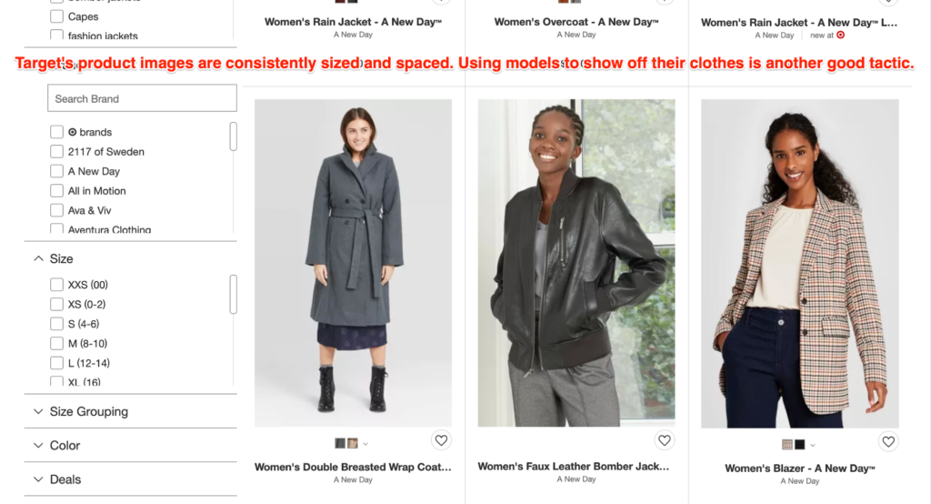
This lends a very neat and clean appearance to the category page, which helps ensure you don’t end up getting too overwhelmed when looking through the photos of Target’s coats and jackets.
Conclusion
Make sure your ecommerce website speaks directly to your target audience. It’s the best way to drive your conversions and sales. To ensure this, you have to first understand your visitor’s expectations. Follow this up by designing your website according to their expectations and requirements.
Start your ecommerce journey by implementing our above listed best practices, but make sure it’s relevant to your website. Every ecommerce store is different, with a distinct audience base, products, and specializations. So don’t try to replicate other ecommerce stores.
Do you, and you’ll surely see concrete results.

