
How does earning $6.5 million in total revenue sound after putting in just three months of work?
That’s what you could potentially earn from eCommerce — provided you do it right. And there’s no better way to boost your conversion rates other than improving your website navigating.
Think about it: Do you prefer to shop from a store with clear navigation and properly marked items, or one where you will probably get lost due to the disarrangement? Exactly.
Every bit of real estate on your category page and contribute towards success. To ensure you’re off on the right track, we’ve compiled a list of the six best eCommerce category pages that are not only aesthetically pleasing but also cleverly designed.
1. Kohl’s
Kohl’s is one of the most reputed department store retail chains. They have stores in over 1,158 locations in every U.S state except Hawaii. When a company is this big, you can be sure they have a few tricks up their sleeves to get customers rolling in, and their online store is no exception.
At first glance, Kohl’s eCommerce website is very easy to navigate. They have circular thumbnails showing the different product categories. Customers will have to click on these to view subcategories.
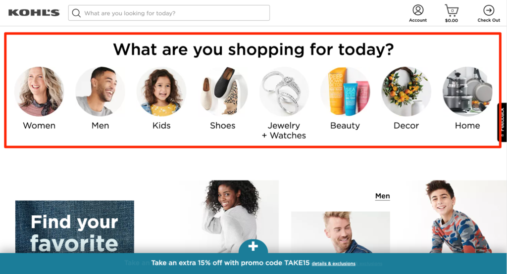
Kohl’s category page is designed from their visitors’ point of view. It lets them browse however they want after giving them direct access to the products they need.Their “Bed & Bath” page, for instance, has a very straightforward design. You’ll find five categories related to your bedroom and bathroom at the top: Bedding, Bath, Pillows, Mattress Pads and Toppers, and Blanket and Throws.
Visitors know what they’re looking at without having to read the category name, thanks to Kohl’s adding high-quality images for every thumbnail.
Customers who know what they want to buy can start shopping right away by clicking on these categories. Those wanting to explore all available options under the “Bed & Bath” page can view all products as well.
As we said, customers can browse exactly how they want to. The only scope of improvement we see is Kohl’s could’ve been more consistent when choosing their product images.
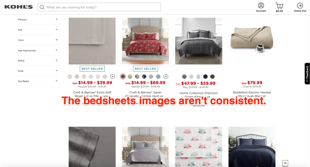
For instance, when you click on the “Bedding” category, you’ll see closeup images of bed sheets, images of bed sheets covering a bed, and packed bed sheets. It would’ve much been better had all the images shown the bed sheets covering beds only — more uniform.
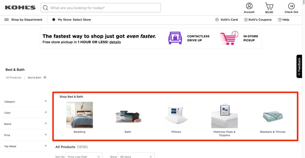
In addition to the common filters like color, brand, and price, Kohl’s also has a “Top-Rated” filter that allows customers to shop based on customer reviews.
Considering customer reviews significantly influence purchase decisions, adding this filter contributes towards a better browsing experience. And as they say, more happy customers mean more business.
2. Eton Shirts
Eton is a global brand—one that has more than 1,500 stores in over 50 countries—and has amassed a loyal customer base for its exceptional range of casual and formal shirts.
The main category page includes large images of men wearing shirts and accessories sold by the brand. There’s a small ‘Shop’ tab at the top of the screen that shows the different clothing categories.
You can look at all the shirts at once or browse according to shirt style (dress shirts, casual shorts), body fit, and occasion (evening shirts, day shirts), along with broad categories like “New Arrivals,” “Most Popular,” and “Essentials.“
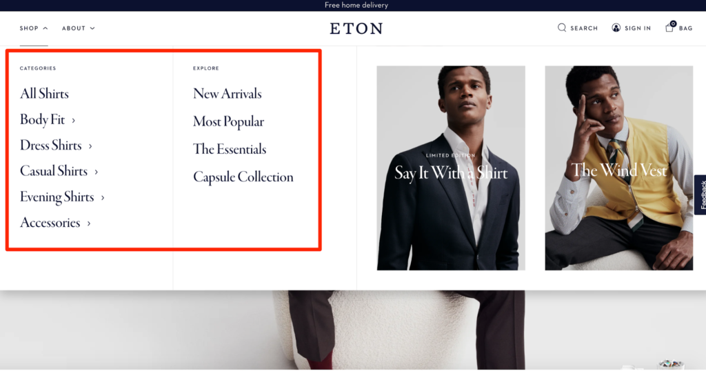
You can see the company has selected the category breakdowns with a lot of care as every option relates to their main product – shirts – rather nicely. What’s more, even the subcategory names are excellent, being focused on shirt styles and prints.
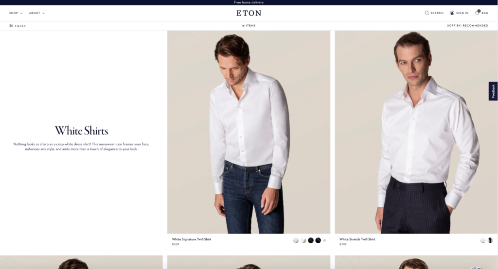
The category page design complements the minimalist aesthetic of the website. They use large, high-quality photographs to serve as visual cues, telling the visitor where they’ve landed on the website.
Now, when we use the term high-quality, we mean it. You can see every little detail, stitching, and button on the shirt. Also, the images are consistently sized and don’t clash with each other.
This is actually very smart (and beautiful to look at). You see, category pages are often SEO-optimized, which is why the customer may end up on there without visiting the homepage.
Having visual cues or inspirational banners spread across the website informs visitors where they are. It also holds their attention, which, in turn, makes it more likely for them to browse through your whole store.
Eton Shirts educate their visitors about product differences, which, in turn, helps them understand the different categories. Let’s take a look at this image from their website:
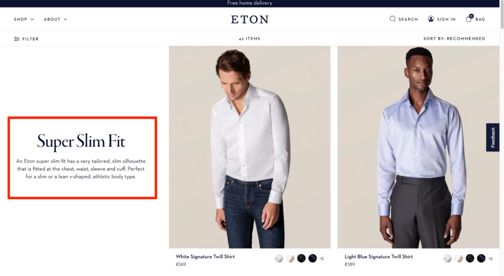
The brand informs its visitors about the tailored and slim-fitting silhouette of their super slim fit. What’s more, they also mention the body types that the fit would flatter best.
Adding this tiny detail enhances their customer’s shopping experience since it gives them all the information they need to decide whether the Super Slim fit collection would suit them.
You should also try to provide additional information about a category that can help your customers make better purchase decisions, especially when they don’t know much about the product they want to buy.
3. HP
The Hewlett-Packard Company, popularly known as HP, is a prestigious information technology that offers top-range laptops, desktops, and printers. Just like their gadgets, the company has put in a lot of thought in designing their online store.
Every product category page has well-defined entries, which makes it easier for customers to shop on their site. The company is doing a fairly good job in ensuring potential customers stay longer on their page by prioritizing the latter’s convenience and requirements.
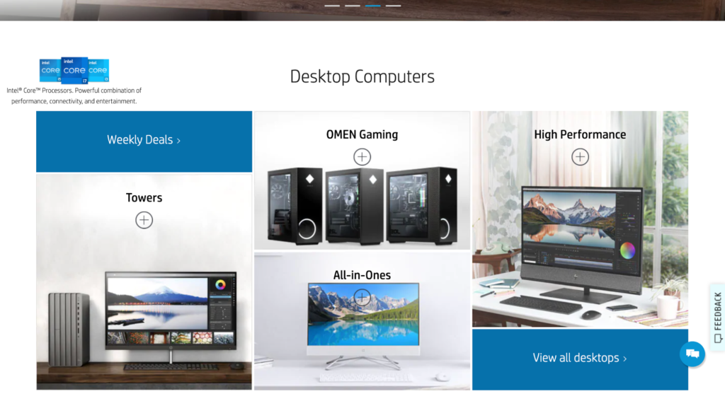
All of HP’s category pages are carefully designed. Their “Desktop Computer” category page, for example, shows a collage of desktop computers and accessories. Again, every photo is high-quality and is accompanied by small descriptive phrases that inform the viewer of their USPs and use-cases.
What’s more, when you scroll down, you’ll see a top menu bar that shows the available subcategories — each denoted by a different icon. When you click on these categories, you’ll see options for different desktop computers.
If you like a specific desktop, you can learn more about it and even place an order by clicking on the “Shop Now” button.
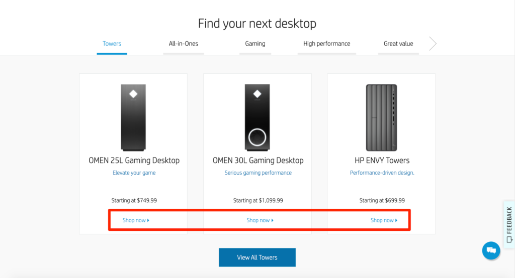
While we absolutely love the simple and visually appealing design, the feature that works best here is that users can explore their options in a single place.
In other words, HP strikes the right balance between having enough products and displaying the other available categories without overwhelming the viewer. You can take inspiration from the way HP has displayed their desktops.
While the high-quality photos grasp the viewer’s attention, the clever placement of CTA buttons makes it easier to learn about products and place orders.
Browsing through products in a specific category is easy and effortless as well. They have created subcategories within every category page to ensure the customers can focus on what matters most, allowing them to save tons of time when shopping.
HP thinks from their audience’s point of view, which is what you should do too. Design your category pages after considering how your target audience would browse for products and what they’ll like to see on your website.
4. Apple
Apple needs no introduction. For years, the company has been creating revolutionary products and has a massive (and loyal) fan base across the globe. Combining style and functionality, every Apple product is designed with a lot of dedication and innovation.
Everything that Apple does is worth talking about, and their category pages are no different.
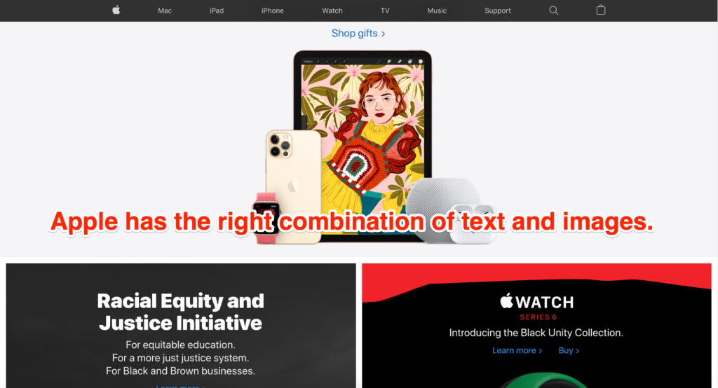
Apple‘s main page uses colorful and clear images of its products, along with contrasting backgrounds that look appealing. Right off the bat, you see the latest iPhones, followed by the Apple iWatch and iPads as you scroll down.
We like how minimalist the whole layout is. Despite having explanatory text below every product, it doesn’t end up overwhelming you. Score! While we love the overall sleek and modern design of the website, it’s their iPhone page that’s a clear winner.
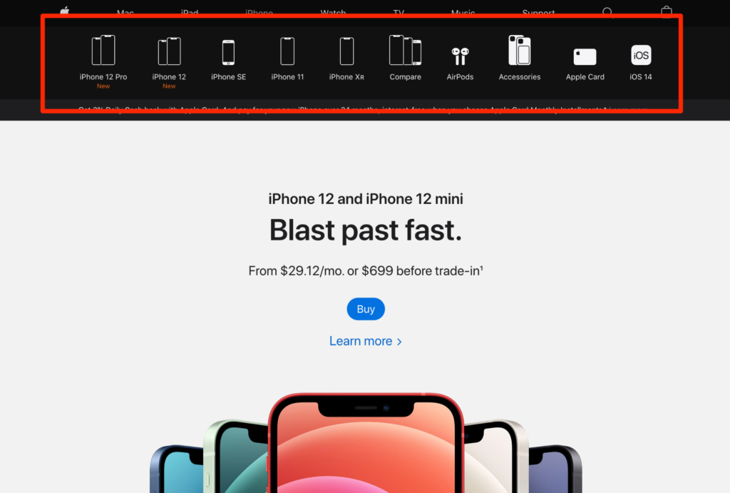
After you select the iPhone category, you’ll find all the latest iPhone gadgets and accessories displayed at the very top of your screen. Moreover, every icon and its labels are large enough to make it easy for users to browse through options without having to squint or zoom in.
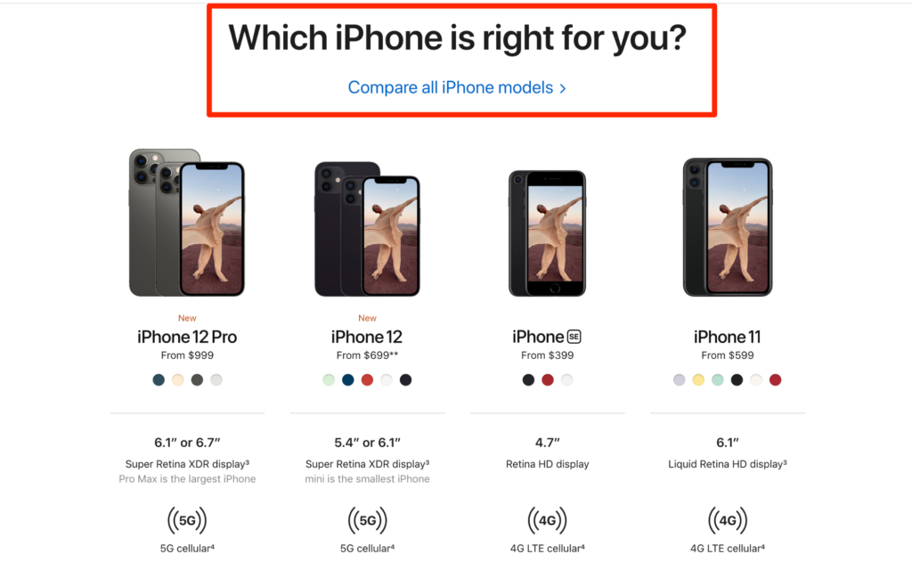
Bold and colorful images of the different iPhones crop up on your screen as you scroll down the page. The “Which iPhone is right for you” section, in particular, sets this category page apart from the others.
Think about it: If you clicked on the iPhone category, it’s obvious you want to buy an iPhone, and what better way to make your customers happy than to help them choose the right device based on their needs and budget?
Your customers consider these sections as bonuses. They don’t expect it, but they’ll appreciate it as they let customers see and compare different product models in one place without any hassle.
So why not grab the chance to earn more brownie points from your customers? Apple’s product category page is more visually dense. It’s eye-catching, clean, and user-oriented.
This can help engage people by giving them some eye candy while they learn more about the iPhone—or other Apple products.
Apple’s category pages also include product comparison features. You should definitely consider adding this functionality to your eCommerce pages as well to help customers take faster purchase decisions.
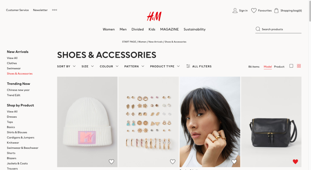
5. H&M
While you may not have heard of Hennes & Mauritz AB, you can’t not know about H&M. With over 5000 stores in 74 countries, this multinational clothing retail company is the one-stop destination for every fashionista.
H&M’s online store is similar to its physical store design. It has a no-nonsense layout dominated by white and features aesthetically shot images of models wearing their clothes and accessories.
The company does a wonderful job of categorizing its offerings. You’ll find sections like “Offers,” “Trending Now,” “Shop by Product,” and “Shop by Occasion.” Plus, other filters like size, pattern, and color, among others, help to narrow down your search further.
H&M has a unique “New Arrivals” section, which works wonders to draw more visitors to their website. This informs interested shoppers about every new product that has been added to the store since their last visit.
Other than this, the company applies most of the crucial category page best practices, such as using high-quality images, breaking down categories into subcategories, and including filters to cut down product search.
Users can shop with a minimal number of clicks because of all these filters. They won’t have to go through multiple pages to look for new items. As discussed above, you should include a “New Arrivals” filter. But other than this, you can also experiment with product categories.
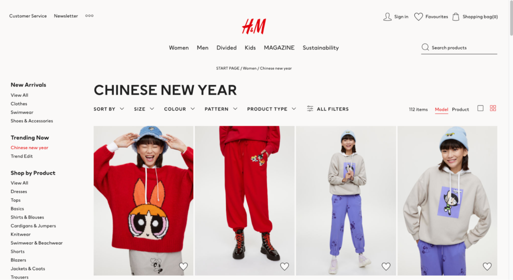
H&M has a “Trending Now” category that highlights the latest trends relevant to that sub-category. Users can check this out to get inspiration on how to use H&M clothes and accessories to achieve stylish looks. It’s definitely an effective tactic to ensure an amazing user experience.
6. Staples
Staples is an American office retail company that deals with office supplies and related products. You’ll find all kinds of office supplies and furniture ranging from pens to chairs available for sale on its official website.
In comparison to the other companies, Staples has a more busy page design. However, they balance it out by using different font sizes and colors, which make it easier for visitors to differentiate between the different product categories.
Staples have adopted a very visual approach with their category pages. Every category is accompanied by a suitable product image and includes clickable links of products that fall within a specific category.
Take a look at their “Office supplies” page, for instance.
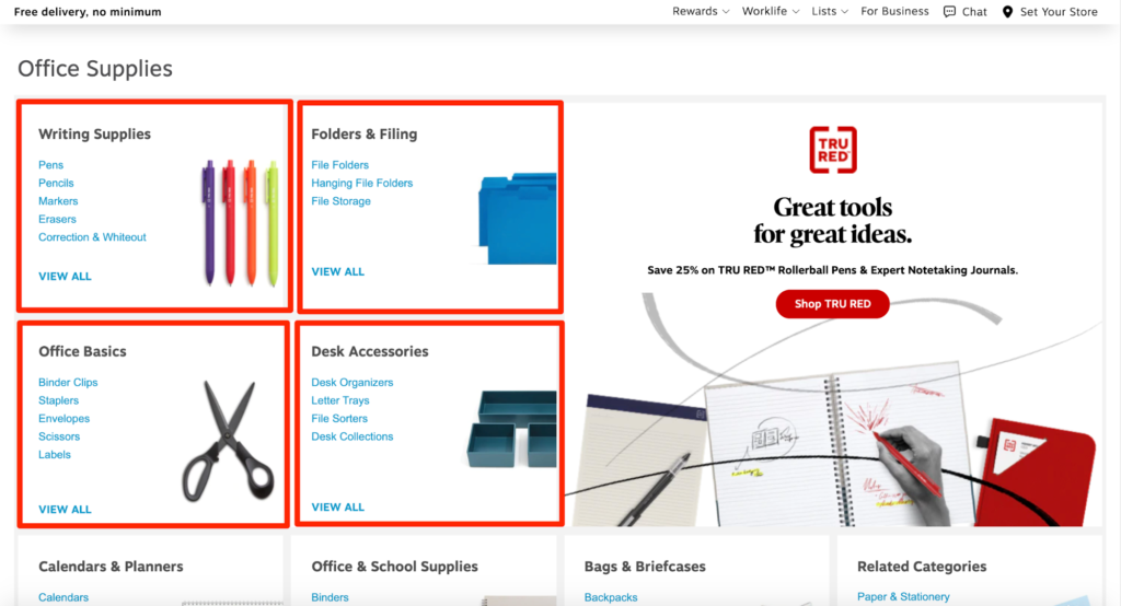
You’ll find the products are broken down into several broad categories like Writing Supplies, Folders & Filing, Office Basics, Desk Accessories, Office & School Supplies, and so on.
Each category includes a different kind of product. For example, the “Writing Supplies” section includes subcategories like Pens, Pencils, Markers, Erasers, and Correction and Whiteouts.
As you scroll down the page, you’ll find different categories for different brand names. This makes it easier for people to look for products by brand name if they want to buy products of a specific company — something that’s common when people buy stationery.
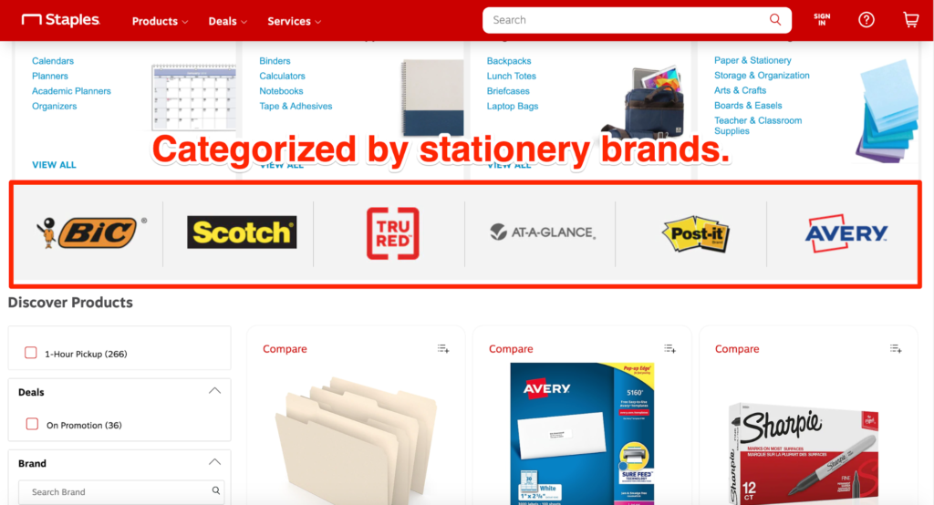
This condensed approach makes it easier (and faster!) for users to get the information they need. They can find the right category and continue to look at products that come underneath it, which, in turn, ensures a positive user experience.
Staples has broken down their category pages into boxes to keep their products well-organized. This is an excellent trick to help your audience navigate your site better.
All your information will be separated and labeled, making it easy for your audience to browse your products. The fact that your online store will look neat and organized is another benefit.
Conclusion
If you want to monetize your eCommerce store, you have to take your category page seriously.
eCommerce category pages play a crucial role in guiding customers to the right products, navigate through the site, and even check out products that aren’t on their shopping list.
To ensure this, though, you must think from the customer’s viewpoint and how the products you display affect their shopping experiences. A good tip would be to carry out A/B testing to identify and implement category page best practices.
Soon you’ll skyrocket your eCommerce sales in no time!

