

While product pages and landing pages get a lot of attention, contact pages are often overlooked by e-commerce marketers. As a result, most contact pages end up being generic, functional web pages.
In fact, your contact page can be one of the most visited pages on your site. So, making it more personal and unique is essential to creating a holistic customer experience.
Making your contact page more inviting and relevant with an attractive design and well-crafted copy will inspire buyers to get in touch and ask their questions.
To help you with that, here are seven e-commerce contact page examples from top brands that are doing this right.
7 E-Commerce Contact Page Examples
1. Use Lighthearted Copy (Ban.do)
Humor, fun graphics, and eye-catching design can go a long way towards catching the attention of visitors and encouraging them to reach out.
If your brand is fun and quirky, a contact page with dry, generic copy will create a disconnect with other pages on your website. So try adding appropriate doses of personality to your contact page copy.
Ban.do is an e-commerce brand that sells clothing, bags, footwear, and home decor items.
The company is famous for its optimism and fun. They reflect their personality on every page of their website, including their contact page.
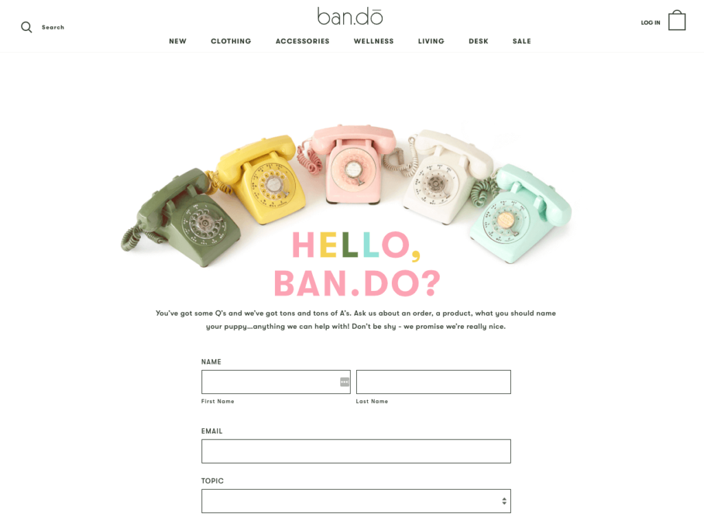
The contact page opens with an above-the-fold image of six phones in different colors that complies with the fun theme of the website’s design.
The lead-in paragraph has a lighthearted tone and clearly communicates what you can expect to find on this contact page.
The form is limited to a few fields and avoids asking customers for unnecessary information.
The final section of the page contains contact information for visitors who want to chat directly with customer support, instead.
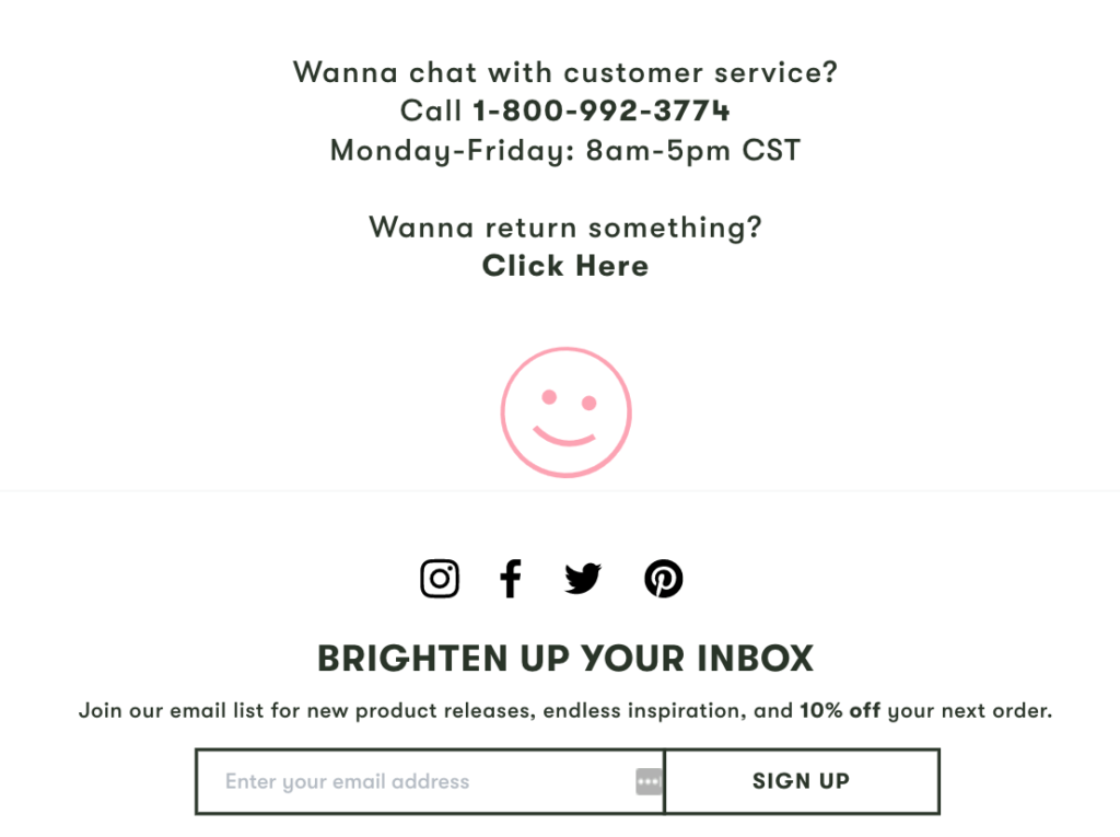
Ban.do’s contact page is fun and welcoming. It’s a perfect example for brands that want to project a friendly and quirky personality.
2. Stay True to Your Brand (YETI)
The design of your contact page needs to align with the overall design of your website. (So, forget about putting together templatized contact pages.)
In other words, your customers shouldn’t visit your contact page and wonder if they have been taken to a completely different website. To stay true to your brand, use similar images, fonts, colors, and brand voice on your contact pages.
YETI gets this right with its contact page. The company sells ultra-durable coolers and other gear to outdoor enthusiasts.
The hero image of the contact page, as well as other images on the website, feature nature-themed photography that resonates with YETI’s customer base of outdoor enthusiasts.
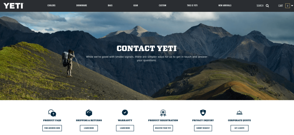
The introductory text also carries the brand’s voice with its cheeky and friendly tone.
Below the fold, YETI provides customers with button links to a range of resources including the FAQ page, product registration page, privacy inquiry page, and others.
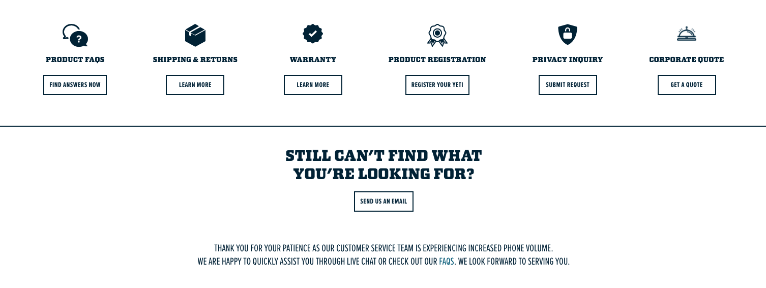
These links make it easy for visitors to find the right answer without the need to contact customer care.
However, YETI’s visitors can still contact customer care if they can’t find answers to their questions.
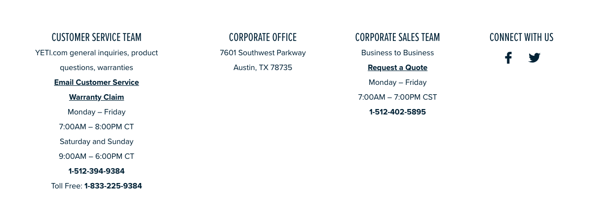
The company makes it clear that visitors can reach out via email or phone, using the contact information provided on the page.
3. Add FAQs to Your Contact Page (MeUndies)
If you often get the same type of questions, consider adding a frequently asked questions (FAQs) section to answer recurring customer questions on your contact page.
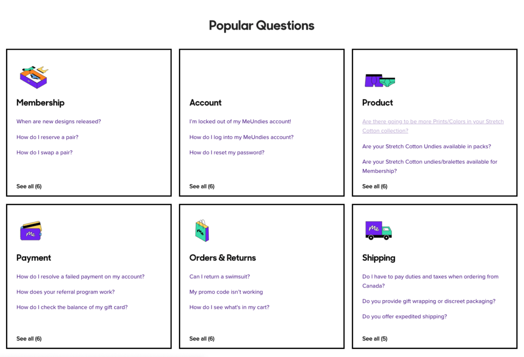
For example, MeUndies designs their entire contact page around a search bar that lets visitors look for articles with answers to their questions, and a list of popular questions grouped into six categories.
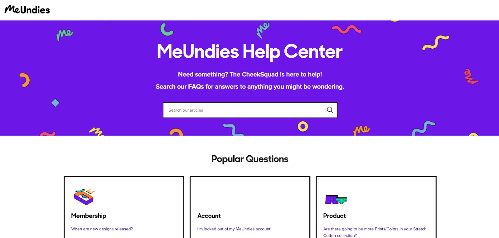
Instead of asking visitors to fill a form, MeUndies leverages its extensive portfolio of articles to provide answers to customers. This works especially well thanks to the search bar that can return relevant answers to user queries.
The categories of popular questions include:
- Product
- Payment
- Orders
- Shipping
- Returns
- Membership
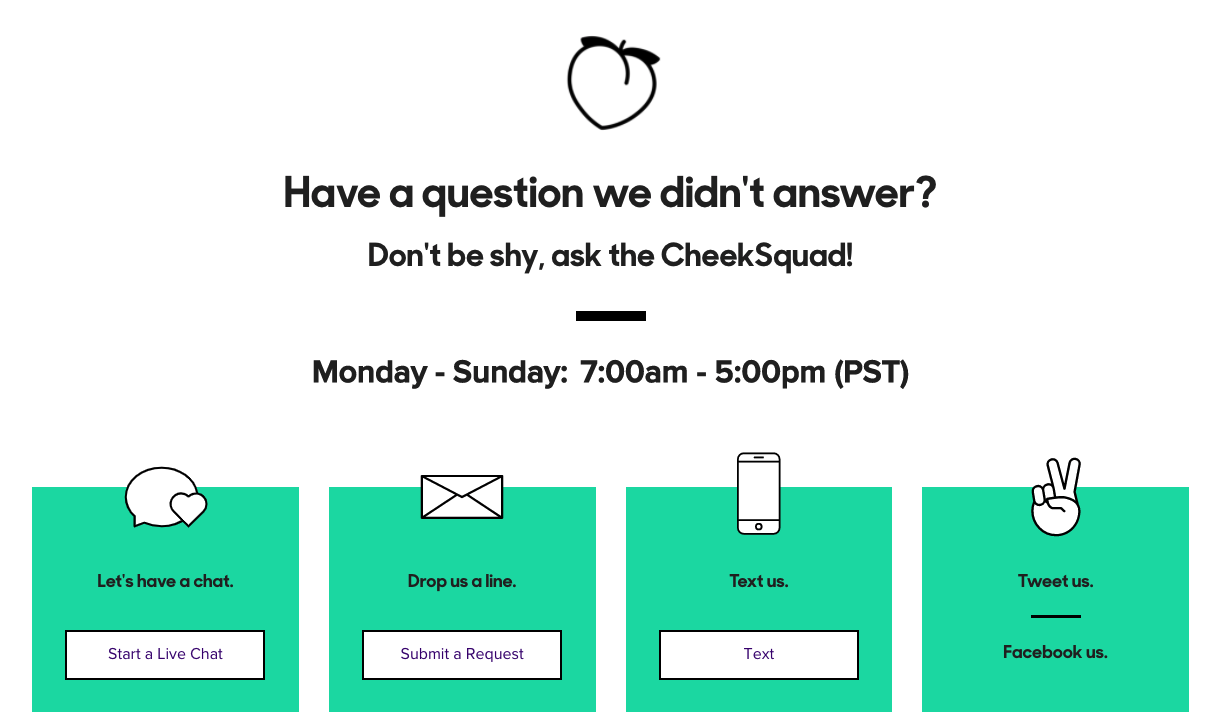
And if that’s not enough, visitors still get a range of options for contacting customer support, including via live chat, email, phone, and social media.
4. Keep It Simple (Blue Bottle Coffee)
When it comes to design, embrace simplicity in the design of your contact page. Use an uncluttered layout and concise copy that doesn’t overwhelm visitors with too much information.
This means no unnecessary form fields, aggressive marketing copy, or image overuse.
Blue Bottle Coffee’s contact page is simple, on-brand, and provides visitors with only the information they need from a contact page.
The company sells fresh coffee through a network of cafes across the US, Japan, and Korea. And their contact page opens with an image of cafe staff brewing fresh coffee—an image that will resonate with an audience of coffee lovers.
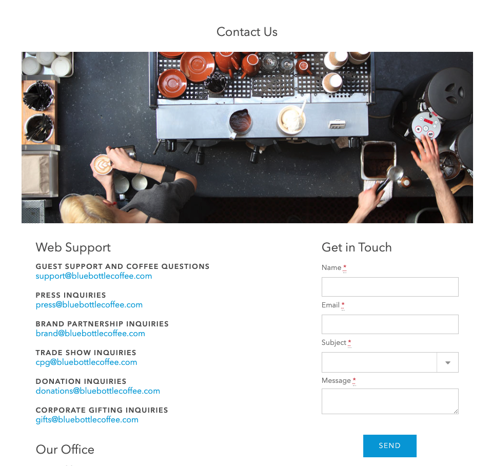
Below the fold is a list of email addresses for contacting the right department for different types of inquiries. Thanks to this list, customers can avoid being redirected multiple times and reach out directly to the staff that can answer their questions.
If the phone isn’t an option for visitors, they can use the contact form included on the page and send their messages to the company.
5. Stick to Your Brand Voice (Poo-Pourri)
Your contact page may not be the most engaging page on your website, but that doesn’t mean you should neglect your unique brand voice in your page copy.
Use similar terms, slang, and jokes that are found on other pages of your website. Poo-Pourri, for example, describes itself as a poop-positive brand, and this mindset is visible in its web copy.
The company sells toilet spray that makes the world a better place—one poop at a time. Poo-Pourri’s funny brand voice explains why unavailable customer care staff are “on a potty break” and why the call to action on the homepage is “Let’s talk crap”.
The store’s contact page is unique because it merges its “contact” and “about” pages into one.
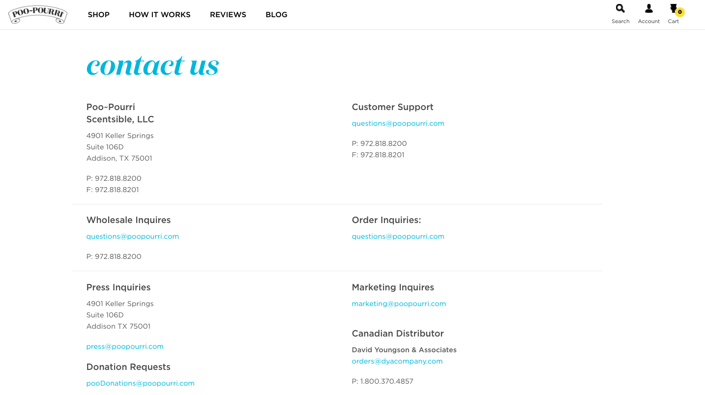
The tone of the page is humorous with a lot of wordplay that can resonate with their target audience.
The contact information section of the page has a well-organized layout with contact details for 12 different types of inquiries.
6. Design a Contact Page for Each Type of Visitor (Red Bull)
Defining the objectives of your contact page is one of the most important steps in contact page design.
As you saw in many of the previous contact page examples, you can optimize your store’s contact page to cater to different types of visitors.
Your contact page can perform its primary function of helping customers resolve their issues while also serving other purposes such as :
- Helping the media make press inquiries;
- Helping potential sponsors reach out to the company;
- And helping potential employees ask questions about the company.
Red Bull’s online shop mastered the art of speaking to each type of visitor in the design of their contact page.
The contact page opens with a beautiful image and a few sentences that clearly inform visitors of what they can get from the contact page in 18 characters.
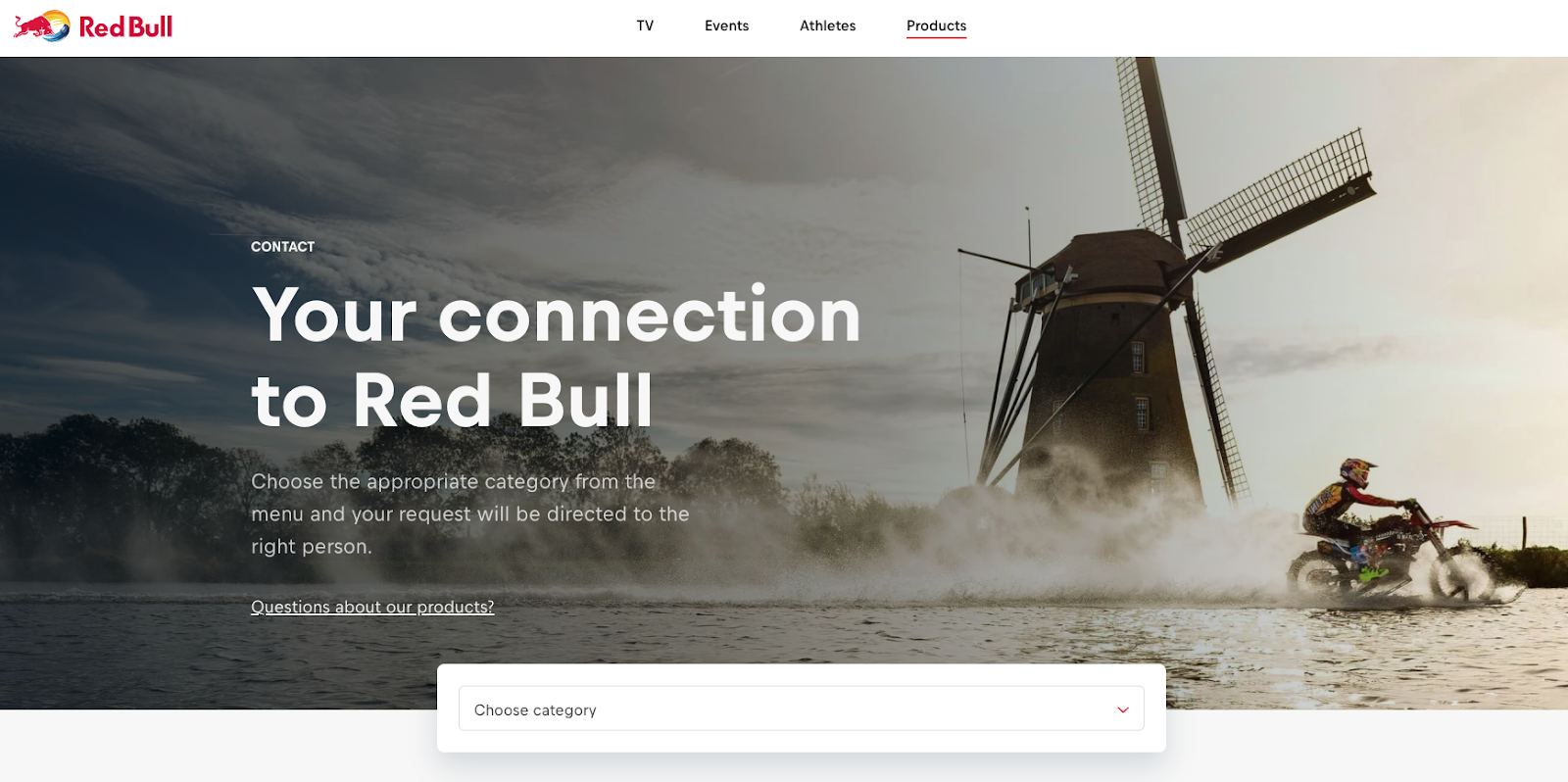
There’s a link to the FAQ page above the search bar, and different types of visitors can pick the right category from the search bar’s drop-down list.
As you scroll down the page, you see another section for members of the press to reach out to the company.
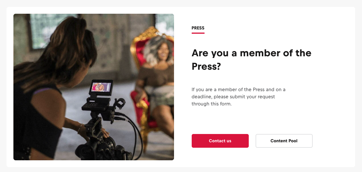
Granted, Red Bull is a global company, but if you’re expecting press coverage too, make sure to have a section for media outlets to know how to reach out to you.
7. Show Your Unique Brand Personality (Pit Viper)
If your audience is the type that appreciates an eccentric personality, don’t be afraid to use quirky copywriting to show off your unique brand personality.
Pit Viper’s brand is a loud and edgy one, which is evident throughout their website, including their contact page. Pit Viper is a company that sells sunglasses by using phrases such as “Cranky People Stuff” and “Add to Fart” on its homepage.
Pit Viper’s contact page opens with an intriguing image that their audience might find entertaining.
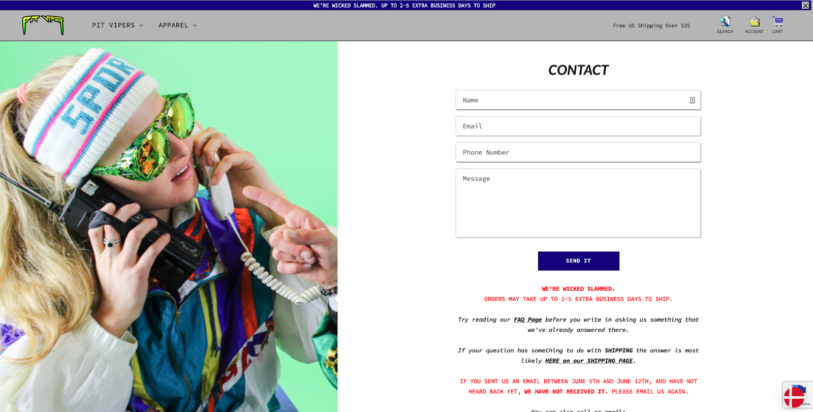
Below the hero image is a simple contact form for customers to send their questions.
Lower down the page are instructions for customers to check out the company’s FAQ page for shipping and other information before using the contact form. The tone is unsurprisingly snarky.
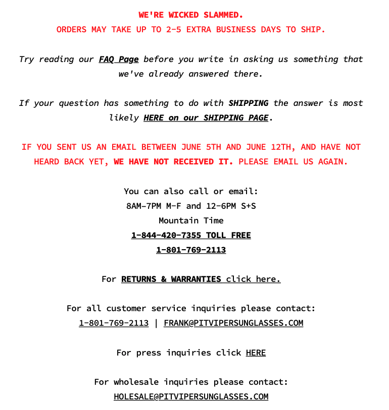
There are also contact details for visitors to reach out directly to customer support, together with their working hours.
The beauty of Pit Viper’s approach is that the eccentric and clever language does not impede clear communication. Visitors get all the information they need with a few clicks (and a little laugh.)
Conclusion
These were my favorite seven examples of well-designed e-commerce contact pages.
You’ll agree when I say that none of the examples I shared are boring, bland pages. Each of them features well-crafted copy, beautiful photos, and clutter-free forms.
Compare these examples to your contact page to see any changes you can make to improve the experience of visitors to your own page.

