
Imagine the following scenario: You go into a store at your local mall and are met by a scowling sales assistant. The atmosphere is somber and the rails are overcrowded and disorganized.
What do you do?
You leave, of course.
Similarly, if customers form a bad first impression of your online store they will bounce. The average ecommerce bounce rate is 45.68%. You want to encourage conversions from the get-go; you don’t want users to bounce.
Recognize that your homepage is your storefront. It needs to be well-designed, easy-to-navigate and it should clearly display what the customer is looking for.
This list of 13 ecommerce homepage best practices will help you make that happen.
1. Display Your Unique Value Proposition
Failing to display your unique value proposition (UVP) straight away is a rookie mistake.
Manish Dudharejia writes at SEJ, “It is very common for new ecommerce brands to fail to differentiate themselves from their competition.”
Your UVP tells customers why they should buy from you over the million other stores out there.
Thus, increasing conversions.
Scentos use their UVP as a tagline on their homepage:
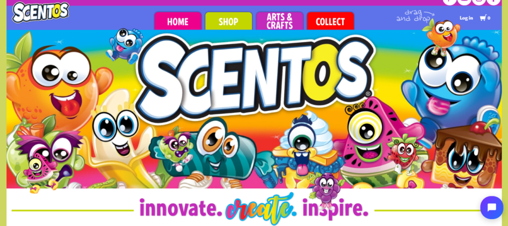
The message is short and simple, “innovate. create. inspire” and outlines the benefits their products have for kids.
To develop your own UVP, think about what sets your brand apart from competitors.
Does your product solve a unique problem? Do you offer better service or quality, perhaps? What benefits can’t be found anywhere else?
Also ask existing customers what they like most about your product, brand or service. This gives you a real insight into why customers buy from you.
Then, display your UVP prominently on your homepage to inspire purchases.
2. Have an Eye-Catching Sale Section
Let’s be honest, sales promotions generate big bucks.
Just to give you a quick example, Cardi B’s collab with Fashion Nova generated $10.8 million via its pre-Black Friday flash sale.
Not bad, huh?
With that in mind, it’s important that you have a distinguished sale section on your homepage. You want the bargain hunters to be able to access it quickly and easily.
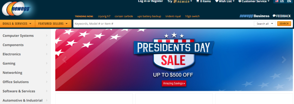
Newegg, for example, has a big old banner that displays their upcoming sales promotion:
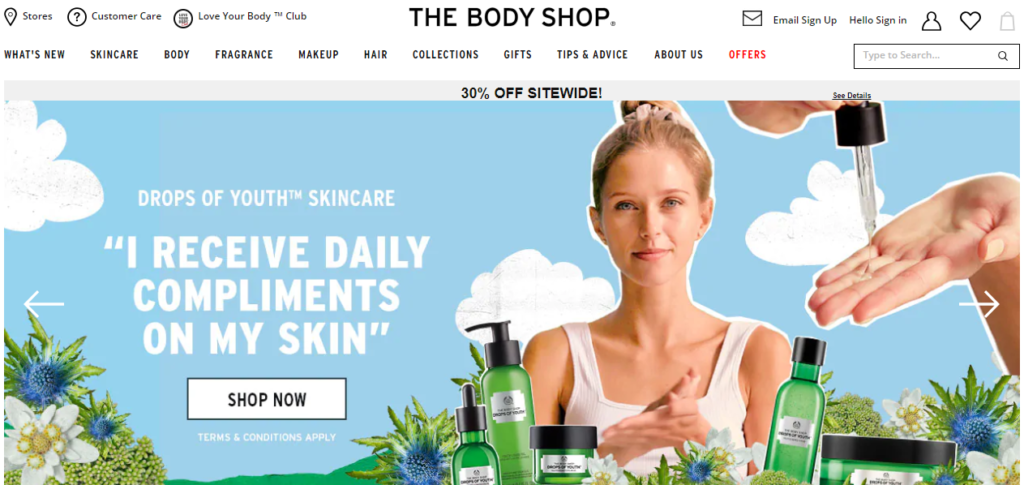
Some sites are a little more subtle. They differentiate their sale section in the navigation bar via color or font-size.
Here’s an example from The Body Shop:
For your ecommerce store, you may want to go big and bold if your promotion is your most important campaign at the time.
Or subtle, to get that regular stream of discount-loving customers to make purchases.
Either way, it’s easy to find where the bargains are on your homepage.
3. Demonstrate Site Security
Customers think Mr. Robot is just waiting to grab their details at any moment.
It can happen.
So, you have to show people that your site is secure.
According to Baymard, 17% of consumers abandon their cart due to a lack of trust.
If you have widely recognized trust seals on your homepage, then this shouldn’t be a problem.
ePassportPhoto.com has a badge that displays its security info when you hover over it:
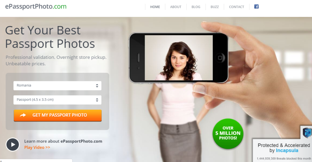
You may instead wish to display your security seals in your site’s footer. Only use seals that are well-known. Or attach a link that takes the customer to your security provider.
Furthermore, you need to have an SSL certificate. If you don’t, Chrome now flags your site as ‘Not secure’.
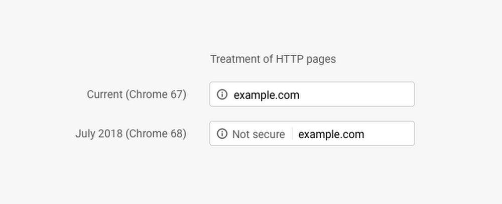
What a turn-off that would be for potential customers. No one wants to hand over their credit card number to an unsecured site. You need to reassure customers that their financial details are safe with you.
4. Make Your Search Bar Stand Out
A prominent search bar is handy for customers and seriously boosts business.
Shoppers that use your site search are 3x more likely to see a purchase through.
It makes sense when you think about it. They can find exactly what they’re looking for at lightning speed, directly from your homepage.
Helly Hansen has a super-sized search bar:
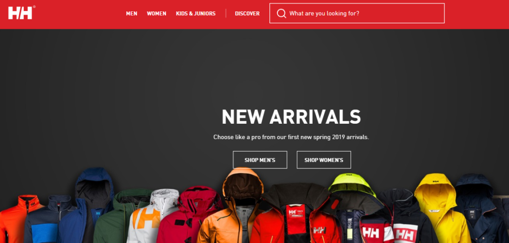
The copy, “What are you looking for?” is almost begging you to use it. A top tip for search bars is to have an autocomplete feature.
Naturally, you want customers to find the product they’re looking for (and buy it). Autocomplete gives them that extra helping hand by making their search more accurate.
Also, remember that your search bar should be ever-present on all your pages, not just the homepage. A search bar that stands out and pushes customers in the right direction will lead to more completed purchases.
5. Add Product Images to Categories
Your categories list presents an overview of your store.
Visitors to your homepage want to see what kind of products you sell. They need to gain this understanding, to encourage them to explore further. And images are supremely helpful in this respect.
Peep Laja at ConversionXL says that because you cannot try products out online, “You need to work twice as hard to make your products come alive via excellent photography and graphics.”
Thus, you should add excellent images that represent your categories.
Take a look at this example from Case-Mate:
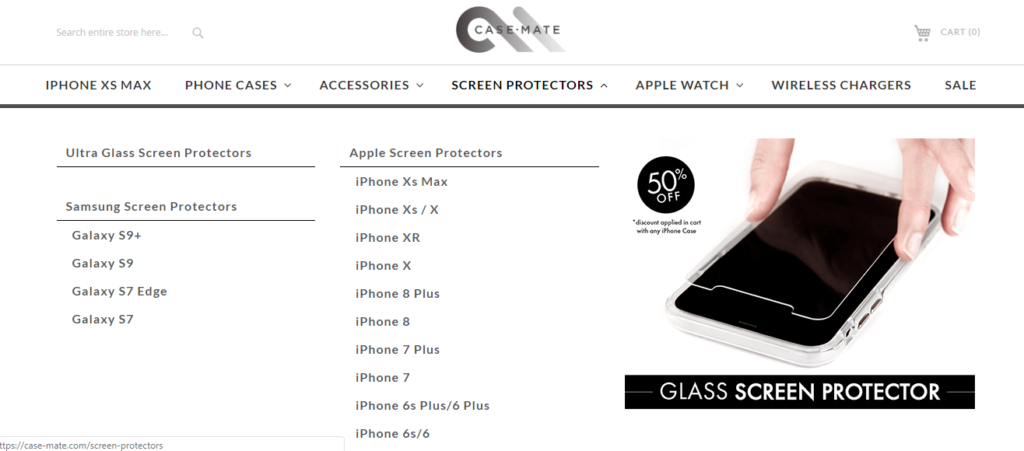
They indicate the kind of product you will find if you click one of the links.
Alternatively, you could use thumbnail images for each of your main categories. It’s little things like this that encourage customers further along your sales funnel.
6. Feature Your Best Products
Recommending products throughout your homepage gives customers an idea of what to buy.
You essentially help them make a purchase decision. And it makes sense to feature the very best of what you have on offer.
In the same way you would put your best pictures up on your Tinder profile…
Not the ones where your friends catch you off guard and you look like a monster.
Physiq Apparel displays its “Featured Products”:
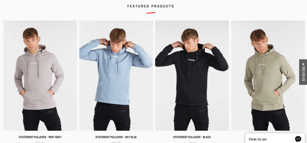
And “New Products” further down the page.
You can test which set of products works best on your homepage in terms of conversions. It could also be your best sellers or seasonal products, for instance. The key is to be strategic in order to get the most conversions.
7. Display Key Information First and Foremost
There are certain things that consumers want to know right off the bat; pieces of information that will influence their decision of whether to buy from you or not.
For example, 67% of shoppers will check your returns policy before making a purchase.
So, this is the kind of information you need on your homepage to encourage more sales.
Display your shipping and returns policies. It’s one of the first pieces of information you see from ASOS:
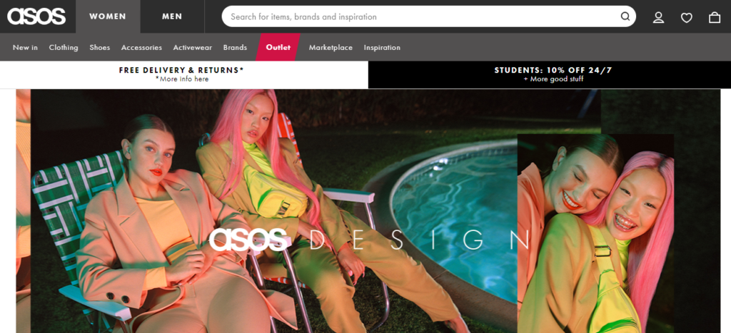
Place key information above the fold, if not at the very top of your homepage.
Because it’s a major incentive to buy.
8. Place Further Information in the Footer
It’s common practice to have important information and links in the footer. Like how you know you always put your keys in that dish by the door…
You expect to find them there.
Customers expect to find links in the footer. So, doing this makes your site easier to navigate, plus, it’s better for user experience.
And similar to the above point, you provide all of the information a customer needs to make a purchase.
Here’s an example from Easy Spirit:
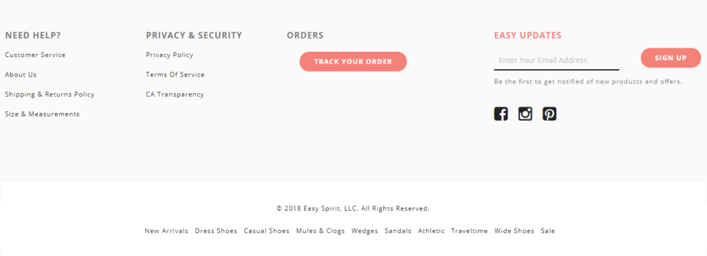
Free up your main navigation for product category pages.
Put links to other vital pages in your footer, such as your about, customer services, social media, contact, terms and conditions pages, etc.
Do this for the sake of usability and to remove any barriers that could stop visitors from making a purchase.
9. Personalize Your Homepage
Create personalized recommendations from the outset to increase sales.
One brand increased sales by 12% through AI personalization.
You can use a customer’s browsing and purchase history to suggest items they may want to buy.
A personalized experience, not only leads to more purchases but can also increase customer lifetime value.
The customer is likely to return to your online shop because they believe you understand their needs.
Of course, Amazon offers personalized recommendations spectacularly:
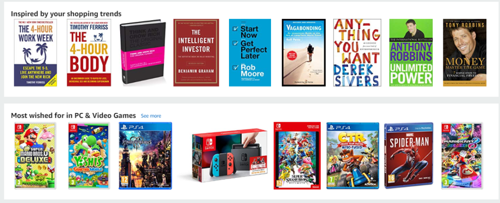
You can do something similar. Display items from abandoned carts. Upsell products based on recent purchases. Show related items or categories users might be interested in based on their browsing history.
There are lots of opportunities here to increase sales and create returning customers.
10. Keep Your Design Simple
Bombard your visitors and they will bounce without making a purchase.
Eighty-four point six percent of people believe crowded web design is the most common mistake that those in their industry make.
It’s best to keep your homepage simple.
Be inspired by how Lady GaGa went from outrageous, elaborate outfits to more simple and elegant looks.
Too many products, images and calls-to-action (CTAs) on your homepage distract users. And make it more difficult for them to choose where to go next.
Tinker has a simple homepage:
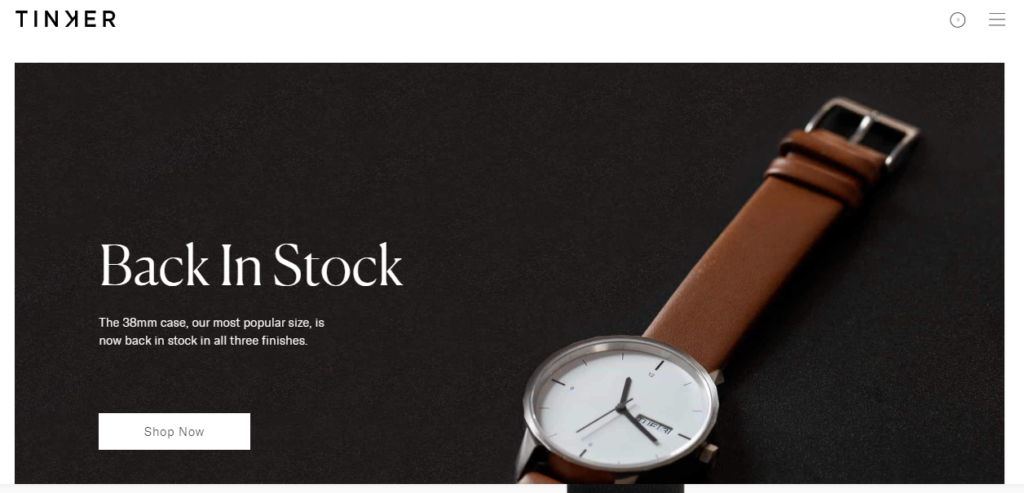
To follow this great example, declutter your homepage. Take out unnecessary images and multimedia elements. Make use of whitespace. Most of all, don’t pull visitors in several different directions.
Keep your homepage design as minimal as possible and customers are more likely to find their way to the product they desire.
11. Have a Simple Navigational Structure
Customers need to get to other pages quickly and easily.
A Baymard study showed that poor site navigation leads users to false conclusions. They believe you don’t stock the product they are looking for, abandon your site and are less likely to come back.
That’s the opposite of what you want to happen. Thus, your main homepage navigation must be simple and clear.
Here’s a nice example from SoYoung:
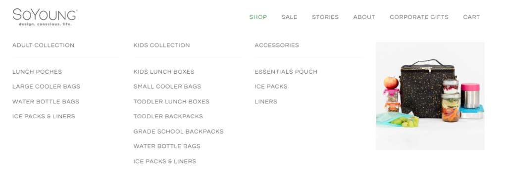
Categories and subcategories are descriptive and easy to follow.
Like SoYoung, your navigation should be at the top of the page so that visitors can discover it quickly. And be sure to make the destination of each link crystal clear.
This way visitors will stay on your site because there is no confusion.
12. Design for Mobile First
Nowadays, your ecommerce site should be designed primarily with mobile in mind.
Why?
Mobile commerce is expected to account for 72.9% of ecommerce sales by 2021.
More and more people are shopping on mobile, meaning you need to prioritize mobile UX.
KKW Beauty is a perfect example of this:
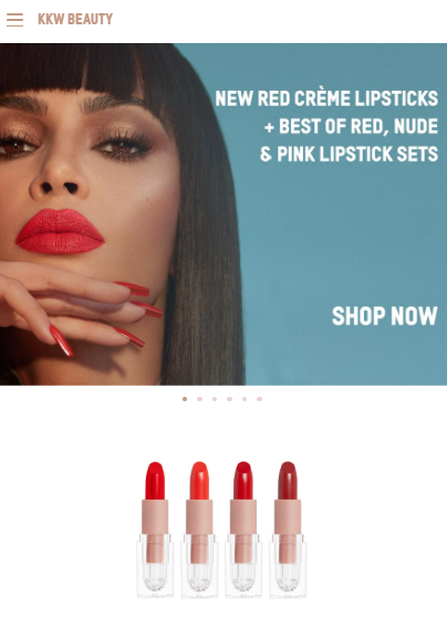
The site’s structure and features are no doubt designed for mobile-first.
It goes beyond being responsive.
Which makes sense when you think about their customer base, i.e. young people who are constantly on their phones.
Make like KKW Beauty and use mobile-friendly design elements on your homepage.
Examples of such are big tap-friendly CTA buttons and a hamburger navigation menu.
Make life easy for the mobile user.
13. Make Sure Your Homepage Loads Quickly
Your homepage must load at lightning speed, particularly on mobile. The negative impact of a slow site is ridiculous. A delay of just 100 milliseconds can reduce conversions by 7%.
Therefore, you need to optimize your site for faster load times.
Take Google’s PageSpeed Insights test to see exactly what’s affecting your site speed.
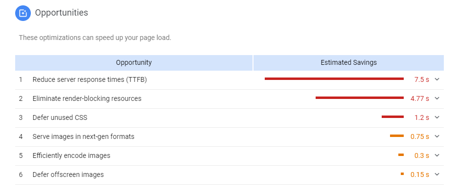
There could be a bunch of things slowing it down, such as server performance, bad plugins, image size and so on.
Resolve any issues to boost your site speed.
Conclusion
When a visitor reaches your homepage, there are things they expect to see and need to see.
They expect to gain insight into your products and find key information about your store.
That’s why you have to follow best practices.
Essentially, you need to provide a positive user experience.
If customers can navigate your homepage with speed and ease they are more likely to make a purchase.
Now it’s time to take the first step.

