E-commerce shoppers will inevitably have questions. No matter how thorough you are with your copy, explainer video, policies, etc., there will still be some issues that need clarification and elaboration.
Taking the time to build an FAQ page provides shoppers with a convenient resource to find the specific information they need and reduces the likelihood of them becoming frustrated.
It also benefits your brand because you won’t have to keep answering the same questions over and over again.
On top of that, it can potentially give your site an SEO boost by optimizing your FAQ page for search queries and adding internal links.
In this guide, I’ll discuss how to build an FAQ page and break it down in an easy to follow sequence. I’ll also include plenty of examples to make it simple to understand. By the end, you’ll know the ins and outs of the FAQ building process, along with critical mistakes to avoid.
Here we go.
Table of Contents
2. Be Clear and Concise with Your Answers
3. Insert Relevant Internal Links
4. Consider Adding Screenshots When Answering Tricky Questions
5. Break Information Down into Categories
6. Include a Popular Questions Section
7. Consider Adding a Search Bar
1. Answer the Right Questions
Before doing anything else, you must first figure out which specific questions you need to answer.
The key letter in FAQs is “F.”
You want to answer frequently asked questions and not just ones that are only asked on occasion.
Otherwise, you may end up adding too much information that overwhelms shoppers rather than helping them.
So, how do you ensure you answer the right questions?
I recommend looking at emails, support tickets, and customer service messages and identifying the top questions that pop up time and time again.
Write down a list until you’re confident that you’ve covered everything.
“When creating your first list of FAQs, keep a close watch for shorter, more generic questions as these tend to be popular in searches,” explains customer support advocate Stephanie Gonzaga.
“With the longtail, less frequently asked questions, leave these to be addressed by your support team or a knowledge base article.”
Here’s an illustration of what she’s talking about.
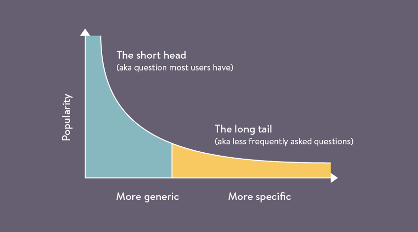
In other words, be selective about the questions you decide to answer and be sure that they’re being asked by a large volume of shoppers.
And remember that you can always go back and add more to your FAQ page later on.
2. Be Clear and Concise with Your Answers
When it comes to writing answers to questions, brevity is essential.
The goal here is to provide answers without droning on with extra details clearly.
Honestly, this is often easier said than done, especially if writing isn’t naturally your strong suit.
So, let me give you a nice example of a brand which I think nails it.
Fat Face is a British lifestyle clothing and accessories company with a rock-solid FAQ page.
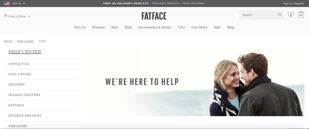
When you look through it, you’ll notice that their answers are straightforward and get right to the point.
The information they provide on delivery charges, for example, is about as concise as it gets.
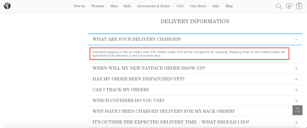
With just a glance, shoppers can find the important details and don’t have to comb through piles of information.
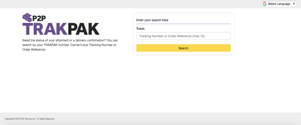
And look how simple it is to figure out how to track an order.
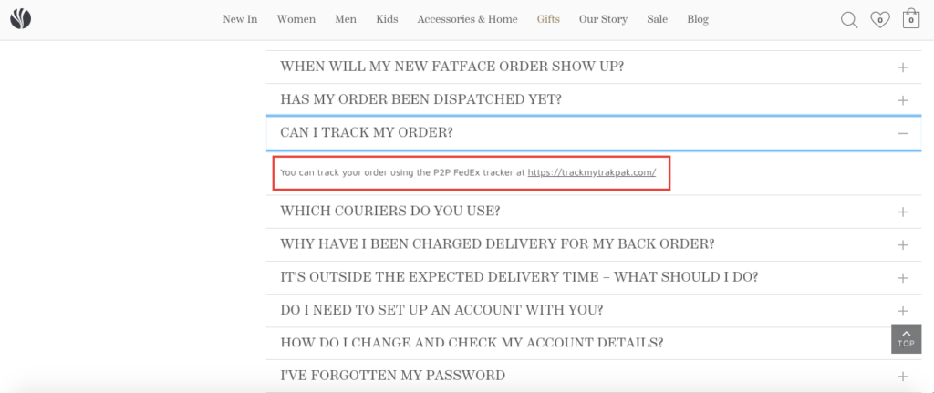
You simply follow a link to a FedEx tracker, and you’re good to go.
The bottom line here is less is more when writing answers to FAQs. Stephanie Gonzaga suggests using an absolute maximum of four paragraphs. However, she points out that one or two sentences is often sufficient for answering many questions.
I personally recommend creating a set of initial answers and then going back to “trim the fat” and remove information that’s not truly necessary. Just treat it like you’re editing any other type of content.
Doing so should keep things flowing and make for a much more pleasant user-experience.
3. Insert Relevant Internal Links
Besides adding external links like the one to the FedEx tracker I just mentioned, you’ll also want to incorporate internal links, which serves two main purposes.
First, it helps expedite the information retrieval process for shoppers, helping them find answers to their questions.
Rather than writing some long-winded answers, it often makes more sense to redirect a person to another page on your site.
Second, it’s beneficial from an SEO standpoint.
By peppering in relevant internal links, it helps search engines figure out the meaning of your content and strengthens your overall link profile.
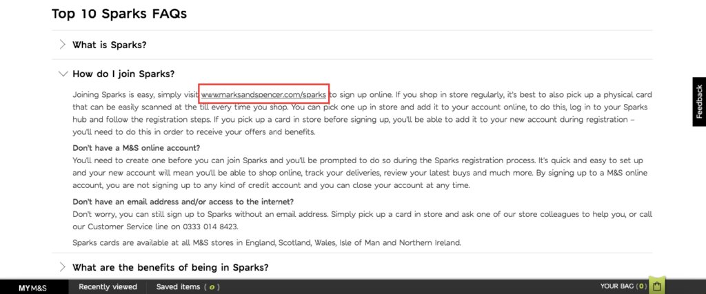
For example, British multinational retailer Marks and Spencer has an FAQ page specifically for their members’ club called Sparks. On it, they include multiple internal links like this one to the Sparks sign up page under the section, “How do I join Sparks?”
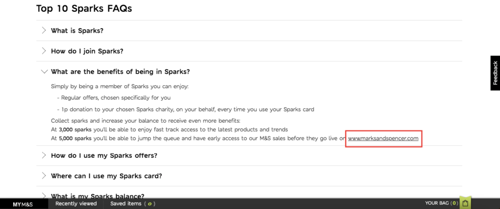
They also include a link to their homepage under the section, “What are the benefits of being in Sparks?”
You don’t want to go overboard to the point that it looks unnatural or spammy, but I highly recommend inserting them wherever it makes sense.
It’s also not a bad idea to familiarize yourself with the basics of internal linking best practices, as this can help with your SEO.
4. Consider Adding Screenshots When Answering Tricky Questions
While it probably won’t be necessary for most answers, throwing in a few screenshots can be really helpful when basic text just won’t cut it.
Here’s an example.
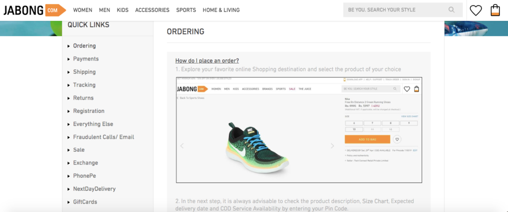
The first question Indian fashion and lifestyle company Jabong answers on their FAQ page is, “How do I place an order?”
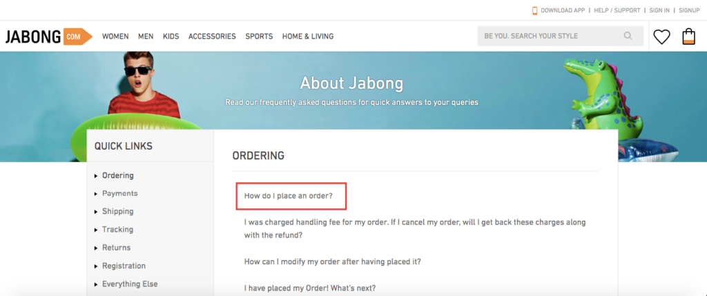
Rather than just using text and hoping their shoppers figure it out, they include a series of screenshots that walks shoppers through the ordering process step-by-step.
They start with selecting a product.
Then they move on to choosing a size, adding to a product to a bag, and so on.
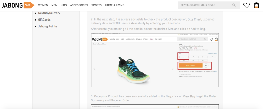
That way, it’s basically foolproof, and the visual nature of this answer makes learning about the ordering process a breeze.
Including screenshots is a technique that I’ve only seen a few brands utilize, but it can have a big impact and is certainly worth considering.
5. Break Information Down into Categories
Like I said before, the last thing you want to do is overwhelm shoppers with a barrage of information.
Instead, you want to create a smooth, streamlined experience where they can zero in on the specific information they’re looking for without any fuss.
The best way to do this is to break everything down into categories like orders, returns, delivery, payment information, and so on.
A good example of a brand that does this well is footwear and apparel company TOMS.
Check out their FAQ page.
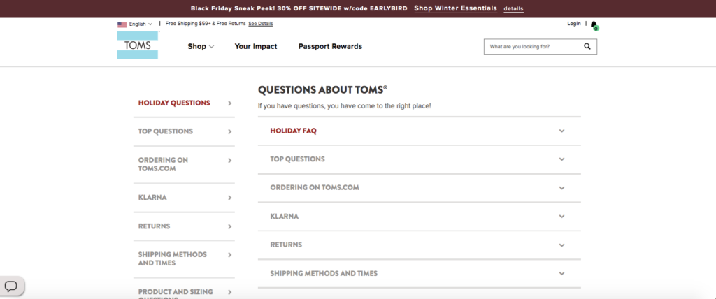
Questions are broken down succinctly into categories.
You simply click on whatever you’re interested in—I’ll use returns as an example—and you can get the details.
For instance, you can see what their holiday return policy is, how you get a refund, and how to return an item.
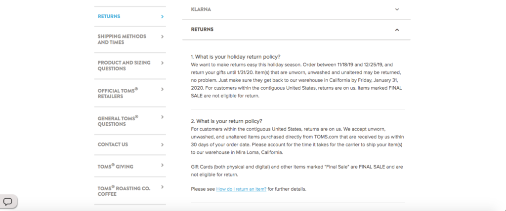
I like this format because it makes everything more digestible as opposed to having one long page that’s not broken down into categories.
So, unless you’re only answering a handful of questions, this is a good approach to take and should make the process of locating answers much more user-friendly.
6. Include a Popular Questions Section
Another way you can streamline things, even more, is to include a section that covers popular questions—the ones that are asked most of all.
You can think of this is an FAQ page within an FAQ page and a way to provide shoppers with answers to the most common questions.
Clothing and footwear company Next does a good job at weaving this into their FAQ page.
Toward the top, there’s a list of categories. And just below that, there’s a popular FAQ section that covers women’s wear, men’s wear, how to return an item and ready-made curtains and blinds—the topics their customers are most curious about.
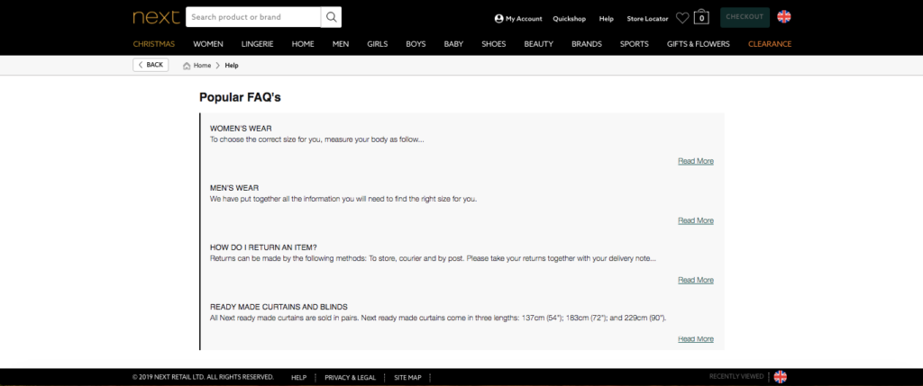
This no doubt saves many shoppers a step, which I’m sure is much appreciated. So, if there are four or five questions that are asked most frequently, it’s smart to devote an entire section solely to them.
7. Consider Adding a Search Bar
If you look at the top right-hand corner of TOMS’ FAQs page, they also have a search bar.
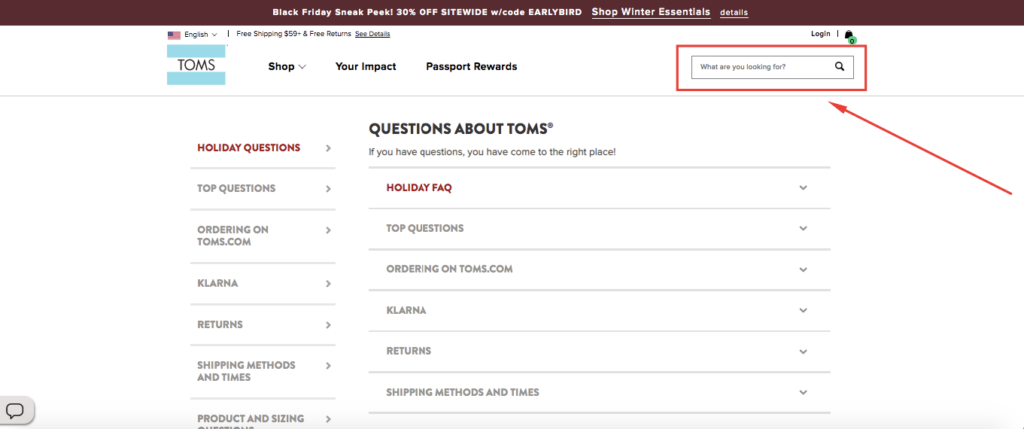
This is helpful for shoppers who have a single question and are looking for a fast answer without having to sift through categories or scroll through dozens of questions.
When I type in “exchanges” into the search bar, I’m instantly taken to the returns section, where I quickly find what I’m looking for.
No sweat.
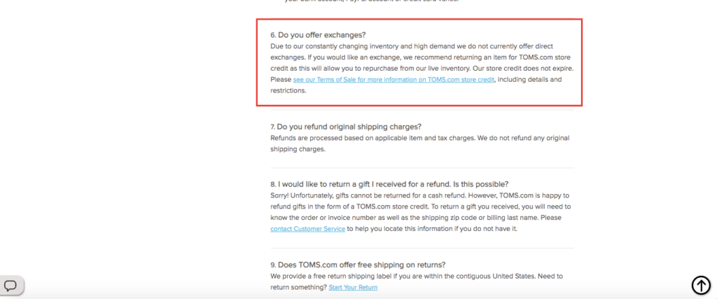
This will take some additional effort, and you may need a professional developer to make it work. But the improved customer experience should be worth it.
8. Be Conscious of Aesthetics
Like any other type of digital content, it’s important that your FAQ page looks good. If you can make it eye appealing, shoppers will be more inclined to engage with this page and feel more comfortable using it.
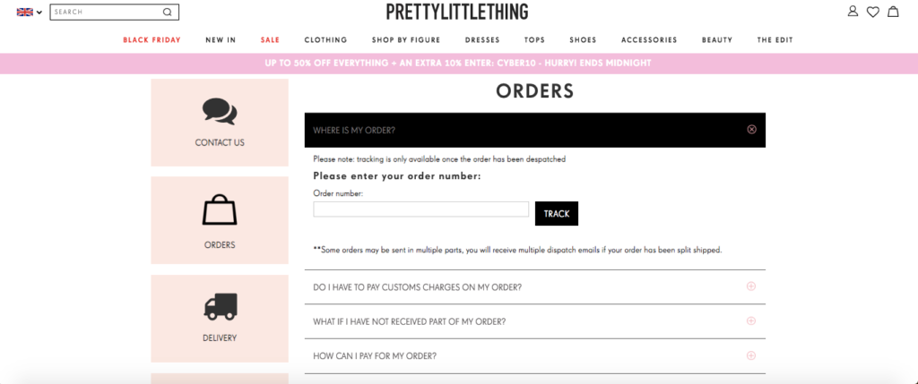
One particular brand that really nailed it aesthetically is women’s fashion and clothing company Pretty Little Thing.
They use a grid layout with icons for each category, which looks great visually.
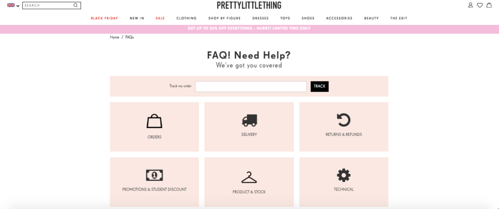
When you click on a category like “Orders,” it narrows down the search and brings you to another page that covers specific parts of the ordering process.
It’s also neatly organized and includes the categories on the left-hand side so you can easily navigate your way through the FAQs page until all of your questions have been fully answered.
You don’t need to get too crazy and add a bunch of fancy graphics or anything, but be cognizant of how you arrange the information and ensure that it’s pleasing to the eye.
9. Place Your FAQ Link in a Conspicuous Location
You never know exactly when shoppers will have burning questions.
Some may have them shortly after arriving on your homepage, while others may have them further along in the sales funnel like when they’re exploring a particular product or after arriving at your checkout.
It’s important that shoppers can get quick answers at any time, so I generally recommend placing the link to your FAQ page in a highly conspicuous place like your main menu.
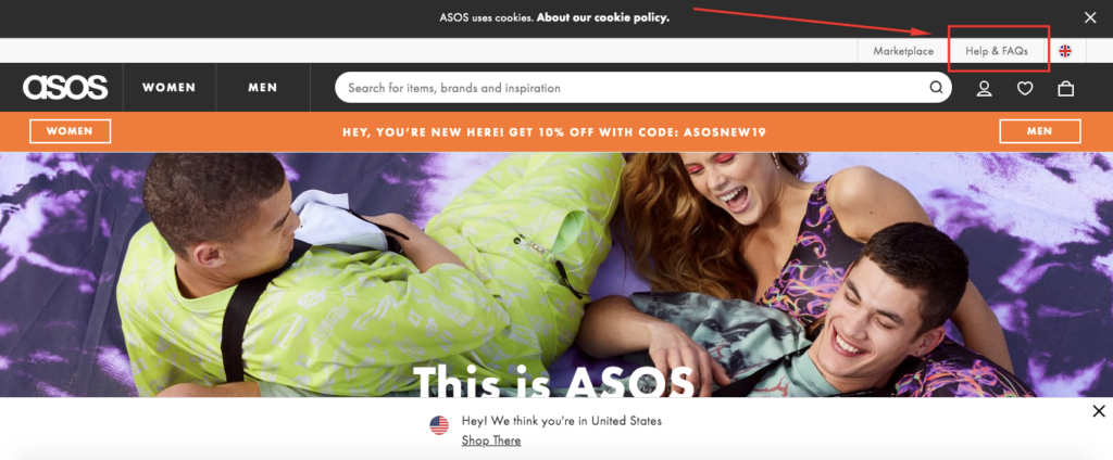
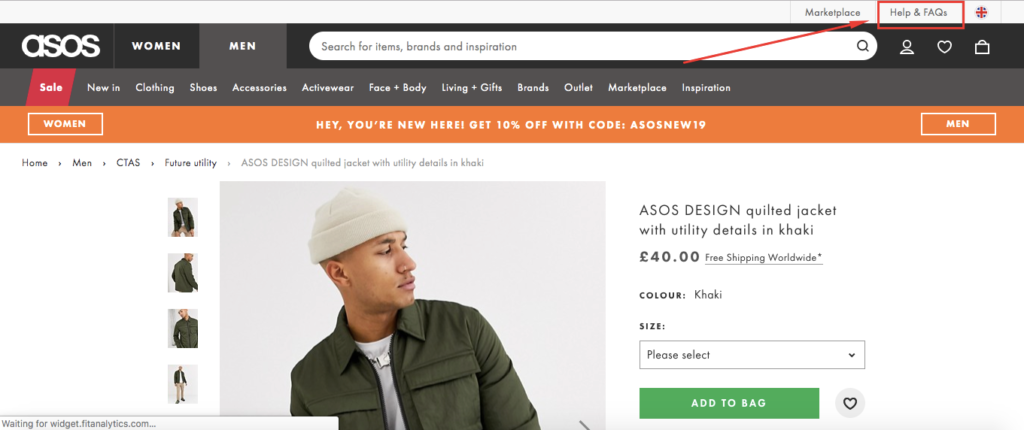
Take the ASOS website, for example. Their FAQ page is located in the top right-hand corner of their main menu.
That way, you see it after initially arriving at their site.
You also see it on any other page you happen to be checking out, such as this product page.
Besides that, many e-commerce stores place a link in the footer section, with Buffy Comforters being just one example.
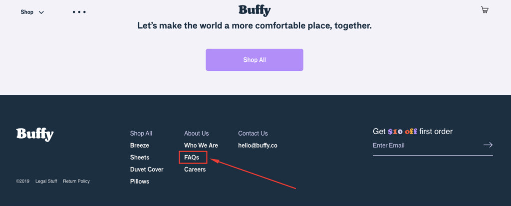
This makes it convenient for shoppers who scroll all the way to the bottom, looking for navigational elements.
As long as shoppers can quickly locate your FAQ page without any fuss, you should be in good shape.
10. Make Continual Adjustments
I have one final point to make. An FAQ page should be treated like it’s dynamic rather than static.
Your e-commerce business will inevitably keep evolving, so it’s important that you make continual adjustments to ensure your shoppers always have up-to-date information.
Maybe your initial return policy was the standard 30 days, but you later changed it to 45 days. You would obviously want to update your FAQ page to reflect this change.
Or maybe you’ve received a ton of emails asking a question that isn’t covered on your original FAQs page. You would probably want to take the time to add it so future shoppers can find a convenient answer.
Conclusion
At the end of the day, a well-built FAQ page will be simple and intuitive. So, you shouldn’t overthink it.
It’s just a matter of succinctly and concisely providing answers to the most common questions shoppers have.
Following the formula outlined above should help you accomplish this while keeping any friction to a minimum.
That way, shoppers can conveniently locate the information they’re looking for, get answers to pressing questions, and carrying on with their shopping.

