
If you’re an online retailer, you’re likely recommending products on your product pages.
But that assumes that potential buyers are already on those pages, ready to buy.
And we both know that’s not always the case.
In this article, I’ll share my seven favorite product recommendation strategies using real brands are examples.
I’ll also explain why the strategies work, step-by-step, and as always, how you can copy (and even improve on) their efforts for your online store.
Here we go.
Part 1: Use Product Recommendation Popups
In Part 1, we’ll cover how to recommend products to online visitors using website popups. Contrary to belief, there’s more to website popups than collecting emails.
In fact, product recommendation popups can meet a visitor based on where they currently are in their buying cycle, and guide them to the right product at the right time.
Let’s look at how to do that.
Table of Contents
Bonus: Offer Personalized Recommendations
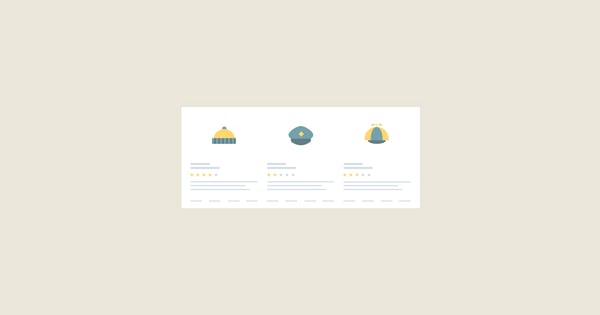
1. Promote (Seasonal) Bestsellers
Ny-Form is a Danish retailer that specializes in sports and leisure clothing.
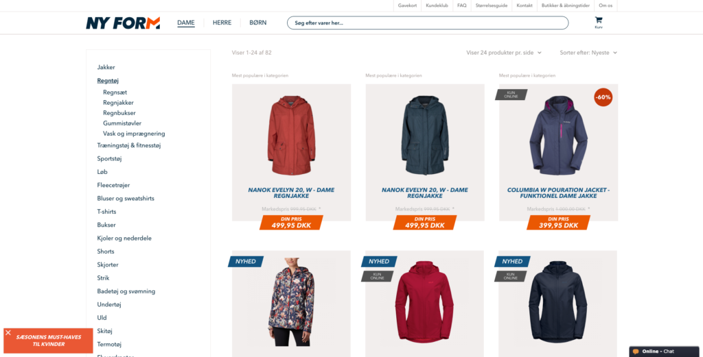
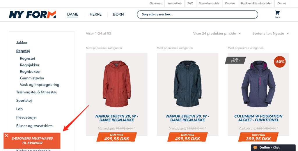
While browsing the site recently, I noticed that, depending on the pages I viewed, the brand used various slide-in popups, including one on its category page for fleeces.
Ny-Form first caught my attention with a teaser saying, “The Must-Haves of the Season for Women.”
When I clicked the teaser, the brand then recommended three bestselling products.
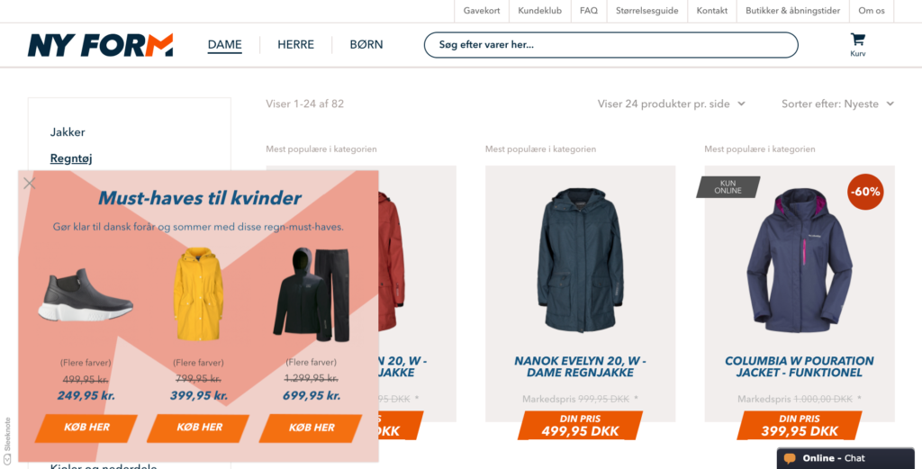
Next, when I clicked one of the calls-to-action (CTAs), Ny-Form took me to the product page where I could learn more about the product.
Ny-Form is also running this popup on mobile, which serves as an important reminder to never exclude popups from mobile visitors.
But that’s not all. Take a closer look at the image above. You might have noticed a second teaser in the bottom left-hand corner of the screen.
Translation: “Are you well-equipped for spring and the Danish summer? 🌦”
Rather than recommend another product, this popup’s goal is to capture the visitor’s email via a giveaway in the event that the visitor doesn’t convert into a customer right away.
Translation: “Win the Perfect Spring Jacket 🌦🌱”
There’s a lot going on in this strategy, so let’s break down how you can do the same for your website:
- Make a category-specific popup recommending (seasonal) bestsellers. I’ve added seasonal in parentheses because this strategy works for all bestsellers, regardless of seasonality. But mentioning when products are selling well adds more specificity, meaning more clicks and conversions.
- Use strikethroughs to anchor prices and sort items in ascending order. One of my favorite parts of Ny-Form’s popup is its emphasis on price reduction. You don’t have to reduce your bestsellers, of course, but if you’re running a promotional campaign, it’s a no-brainer.
- Capture the visitor’s email with a second campaign. While this strategy is effective on its own, it’s twice as effective when adding a second popup to capture the visitor’s email. That way, if the visitor doesn’t convert right away, you can target them later with a well-targeted email campaign.
2. Offer Tiered Pricing
I’ve written before about Apuls and how they’re using tier-pricing in their popups.
But since writing about them, I’ve noticed that they’re now using this strategy for multiple product pages.
Here’s a quick refresher if you’re unfamiliar.
When you visit certain product pages on Apuls’ site, say, exercise bikes, Apuls shows a teaser asking, “Have You Considered These Exercise Bikes?”
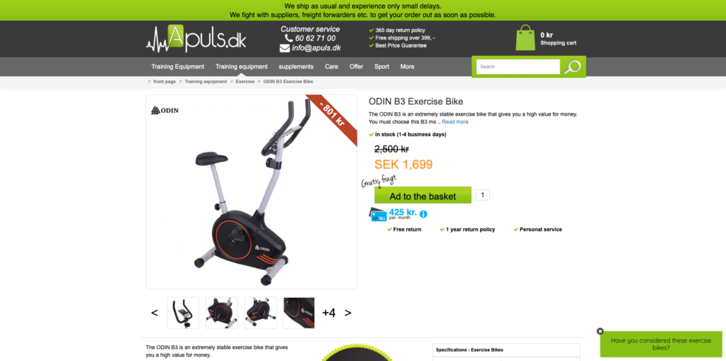
If you click the teaser, Apuls shows three different offers, each with its own CTA, similar to the above example from Ny-Form.
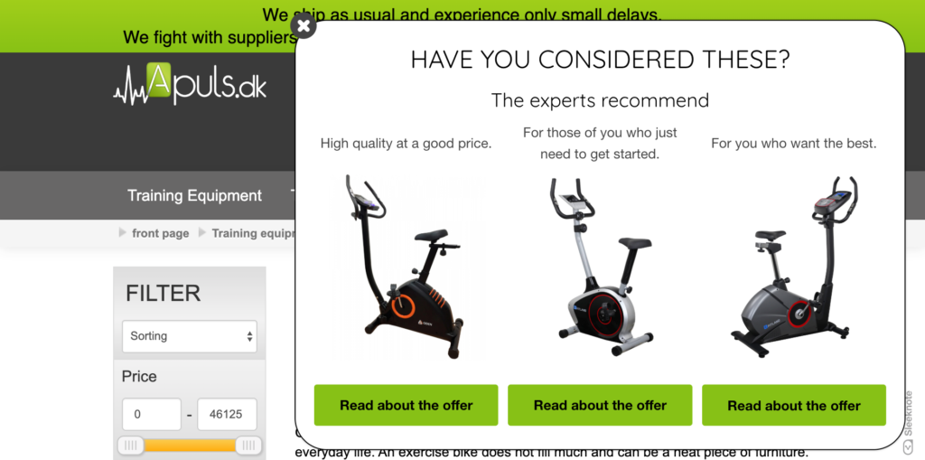
What’s clever, though, is each bike has accompanying copy that recommends the bike based on budget, with:
- Offer one (1,699 SEK) appealing to visitors that want a bargain without compromising on quality;
- Offer two (6,000 SEK) appealing to impulse buyers; and
- Offer three (7,500 SEK) appealing to those who typically buy the most expensive option.
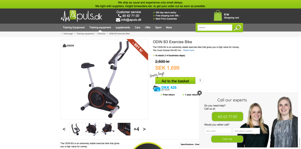
After clicking one of the offers, Apuls takes you to the product page, where a new slide-in appears, offering assistance, if needed.
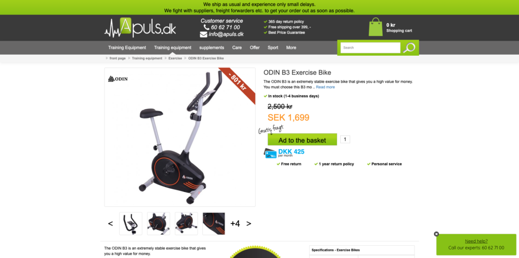
From there, you can call customer service if you have any further questions.
Apuls’ strategy is similar to Ny-Form’s in the sense that it offers three related products, but it adds more specificity in terms of copy so potential buyers can self-segment based on their budget.
Like Ny-Form’s strategy, a helpful, albeit optional step, is to show a second popup, offering further assistance (though this is better reserved for complicated products that require further questions).
Help visitors find the right product for them and your efforts won’t go unrewarded.
3. Upsell Related Products
We’ve all seen product recommendations on product pages.
They’re an essential element of any high-converting product page, and while the phrasing often changes, where they’re found, beneath the product description, rarely does:
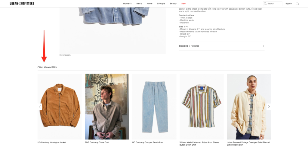
While effective, what’s better, in our experience, is recommending a similar product after a visitor has already taken action—such as adding an item to their cart.
In fact, this is exactly what fashion and apparel brand Under Armour is doing.
While browsing the website recently, I added an item to my cart. When I did that, Under Armour showed a popup recommending items customers had also bought.
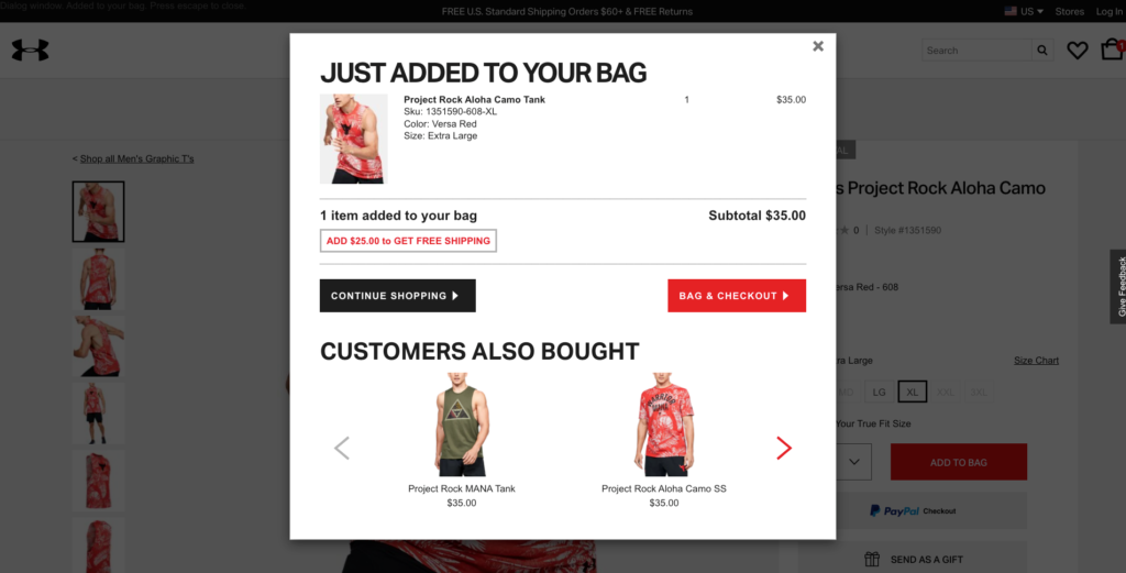
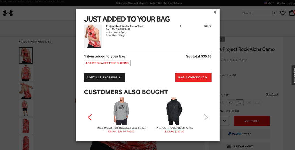
What’s more, there was even an option to click left and right to view more items if the default upsells weren’t of interest:
Now, I know what you might be thinking. “Won’t that annoy visitors if they add multiple items to their cart during their visit?” I thought that, too. Fortunately, there’s an easy workaround.
Using a feature like SiteData, you could trigger a popup, like the one above, based on specific behaviors such as when a viewer adds certain items or exceeds a certain basket value. That way, you would only upsell to customers that are already willing to drop a lump sum during their visit.
Few brands are utilizing this strategy. So, if you’re advantageous, there’s ample opportunity to boost your buyers’ average order value without being too salesy.
Part 2: Use Product Recommendation Emails
If you’re like most marketers, you’re growing your email list and emailing relevant content with the goal of turning your subscribers into customers.
In Part 2, we’ll cover three types of email you can use to that. I’ve ignored many of the emails where you would expect (e.g., product recommendation emails), and instead, focused on those less obvious.
4. Behavior-Based Recommendations
How many times have you added an item to your wishlist only to forget about it later?
I know I have. In fact, my Amazon wish list currently has 267 items as of writing, going as far back in 2014!
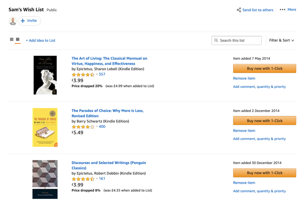
The problem for many retailers has little to do with getting visitors to express interest in their products. Rather, it has everything to do with getting visitors to return to buy their wish list items.
One way to solve that problem is with behavior-based emails. With them, you inform subscribers of any changes to the wish items such as availability, price reduction, and more.
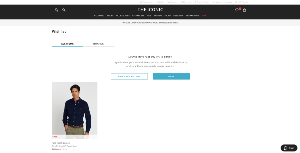
Let me show you what I mean using the online retailer, The Iconic, as an example.
If you browse their website, you’ll notice that there’s an option to add items to a wish list.
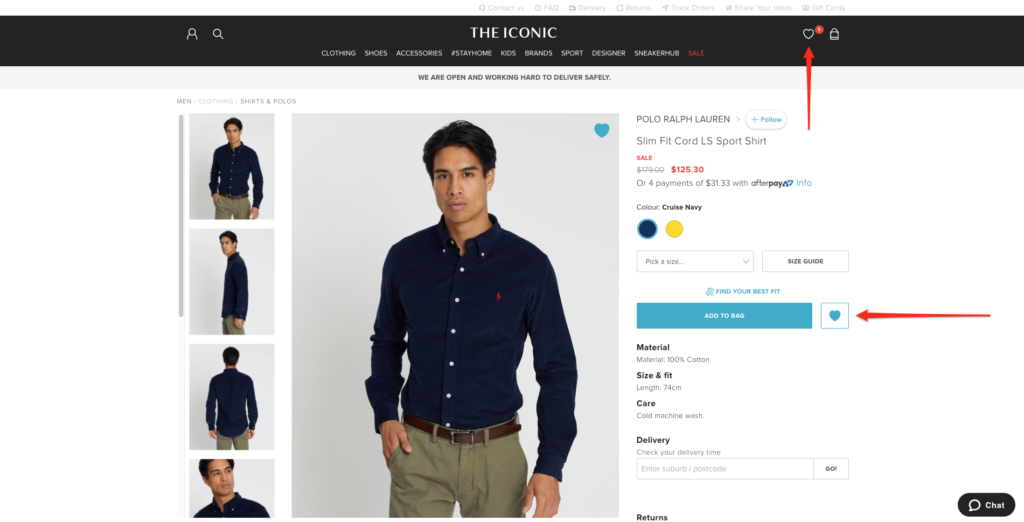
And to access that wish list in the future, you need to create an account by entering your email address.
Once The Iconic has your email address, they can then send hyper-targeted campaigns for when an item is, say, about to run out, as shown in the example below.
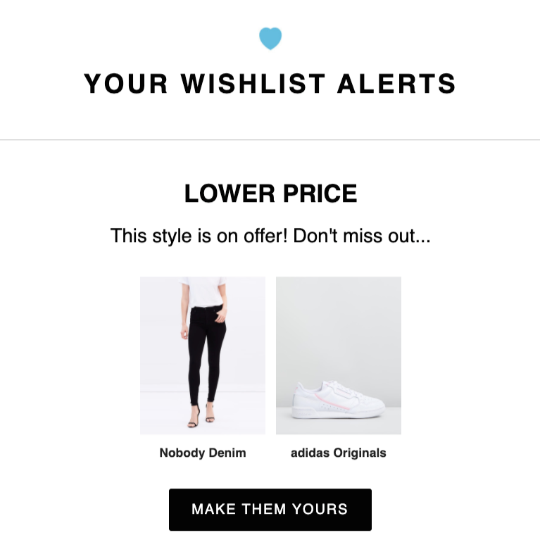
Or, even better, when they’re back in stock for a limited time only.

Rather than sending promotional emails and risk annoying a percentage of your subscribers, you can send emails that subscribers actually want to receive and in the process, boost your conversions from click to purchase.
5. Cart Recovery (with a Twist)
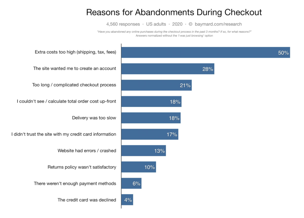
We’re all familiar with cart abandonment, with the well-informed among us knowing that extra costs are the number one cause, according to research by Baymard.
However, there’s another common reason potential buyers abandon their cart, and it has nothing to do with the brand, its website, or any of the above:
The buyer simply changed their mind about what they were ordering.
Maybe they realized they didn’t really need a new pair of trainers or wanted more time to price shop.
Cart recovery emails, then, for that reason, become unnecessary. In instances like the above, potential buyers don’t need a coupon to nudge them to buy or a reminder that the item is about to sell out.
Those potential buyers need a new offer, and it’s something I’m seeing certain brands, like online retailer Huckberry, are now adding to their cart recovery emails.
When I abandoned my cart before completing my purchase, Huckberry sent me a typical cart recovery email with everything you would normally expect.
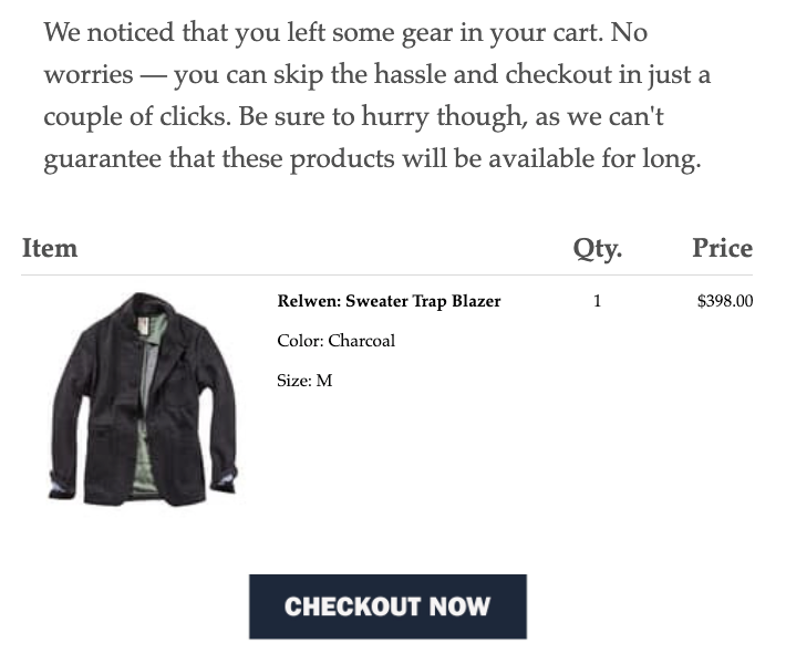
However, further down, they also included a part for “trending gear.”
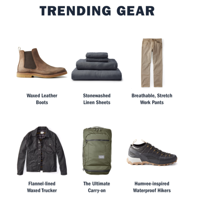
The framing is key, here. “You might also like” might perform better than, say, “Customers also bought,” so you will need to test this. But offering a new offer in the event that the prospect changed their mind is a great way to re-engage them and even clinch a sale.
6. Order Confirmation
For a newbie, the order confirmation email is nothing but a way to confirm a buyer’s purchase and maybe, at most, manage expectations concerning delivery.
For a more advanced retailer, however, it serves as a prime reselling opportunity. Think about it. Moments earlier, a buyer took action and bought something.
That means, they’re far more likely to take further action, such as returning to their site, referring a friend, or even better, placing a second order.
That’s exactly what Zalando does in its order confirmation emails. After placing an order recently, I got an email confirming my order. Nothing new there.
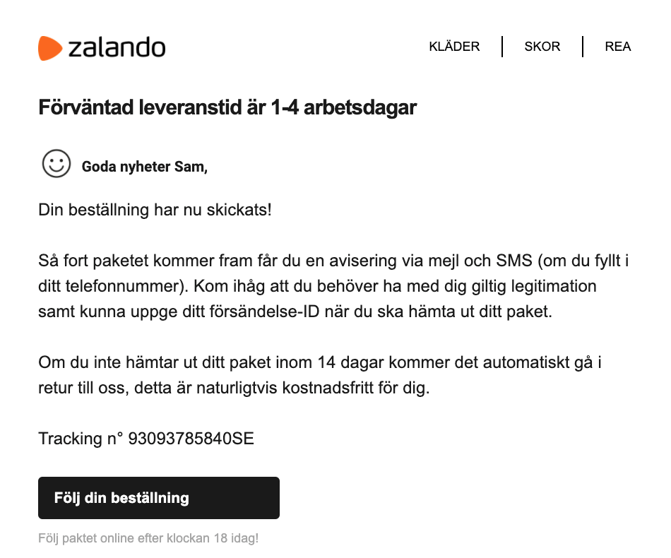
When I scrolled to the bottom, however, I saw four product recommendations based on my purchase.
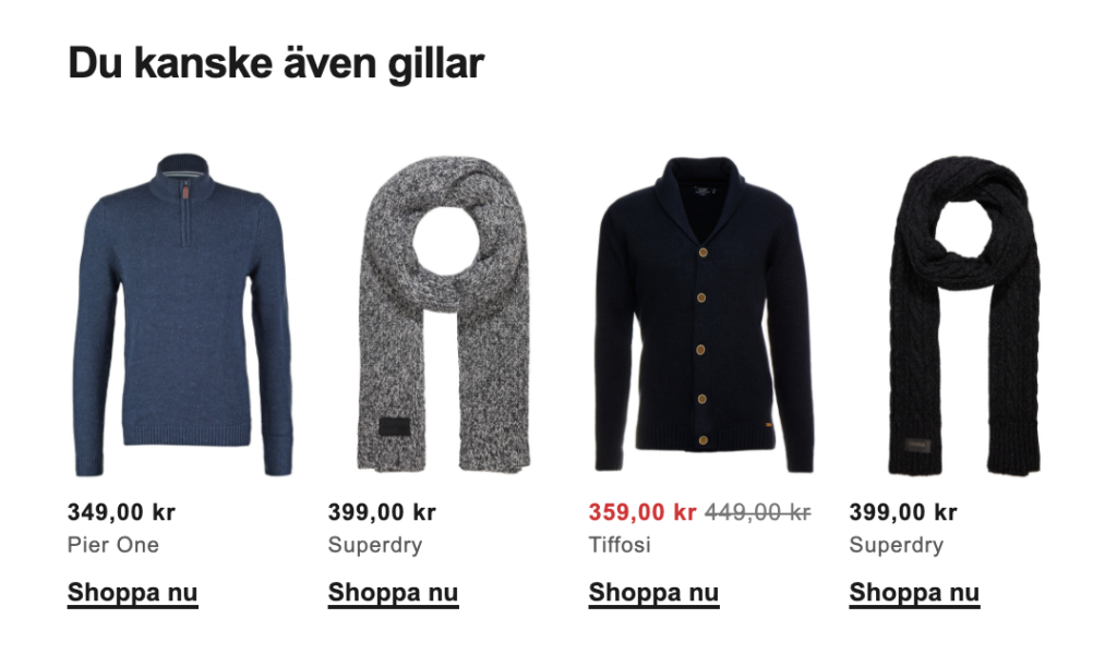
Translation: “You Might Also Like…”
Like tweaking your cart recovery email, it’s an easy way of taking what you’re already doing and adding a little more to ensure you’re always giving your customer an opportunity to buy from you again (and again).
Bonus: Offer Personalized Recommendations
One of my favorite ways to recommend the right products to the right visitors involves quizzing your visitors and pairing them with items based on their answers.
Here’s how it works:
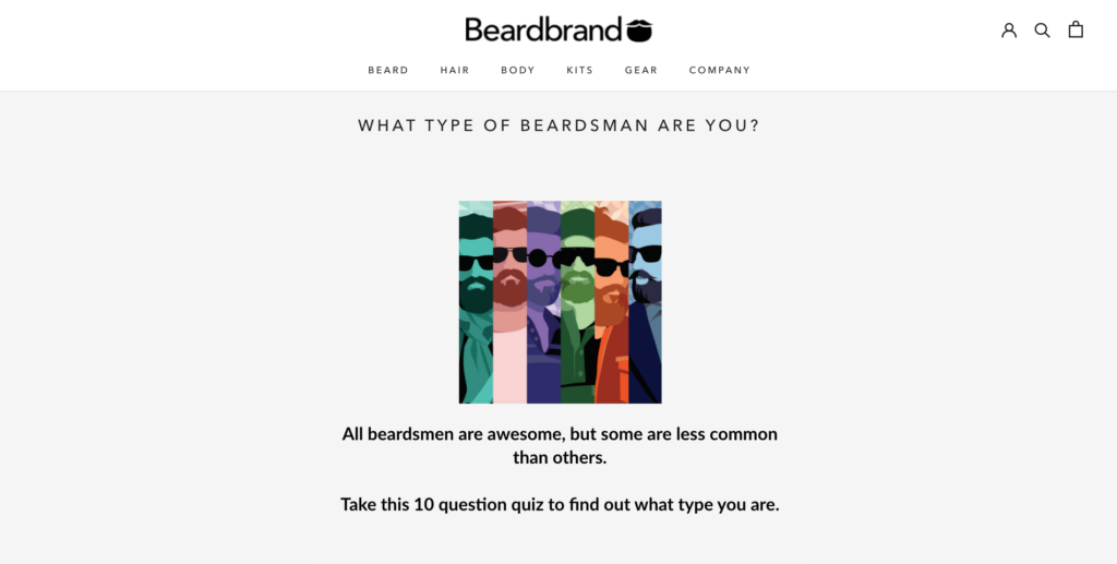
First, you invite visitors to complete a short quiz to discover something about themselves. For Beardbrand, for instance, it’s to learn which type of beardsman you are.
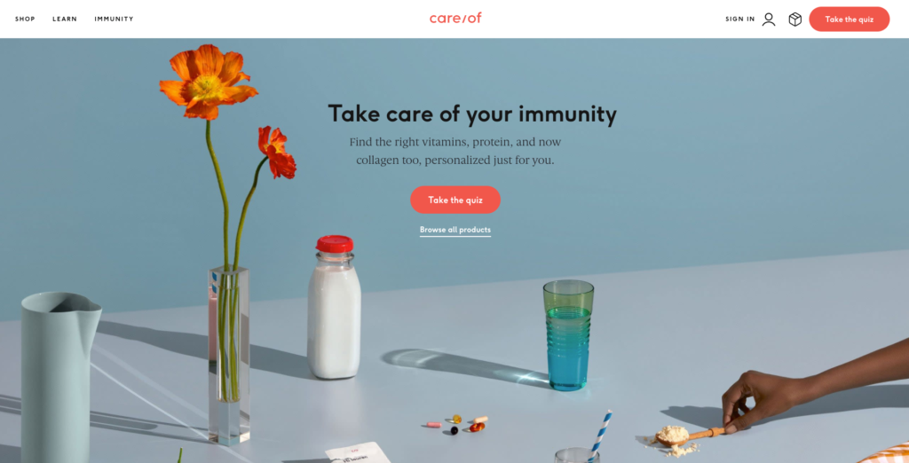
For Care/of, a brand that knows the feeling of overwhelm that comes with buying vitamins for the first time, it’s to learn more about which vitamins are right for you.
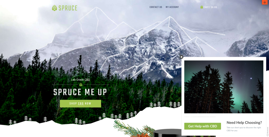
You can have a CTA above the fold on your home page, or, if you prefer, use a slide-in popup, as Spruce does.
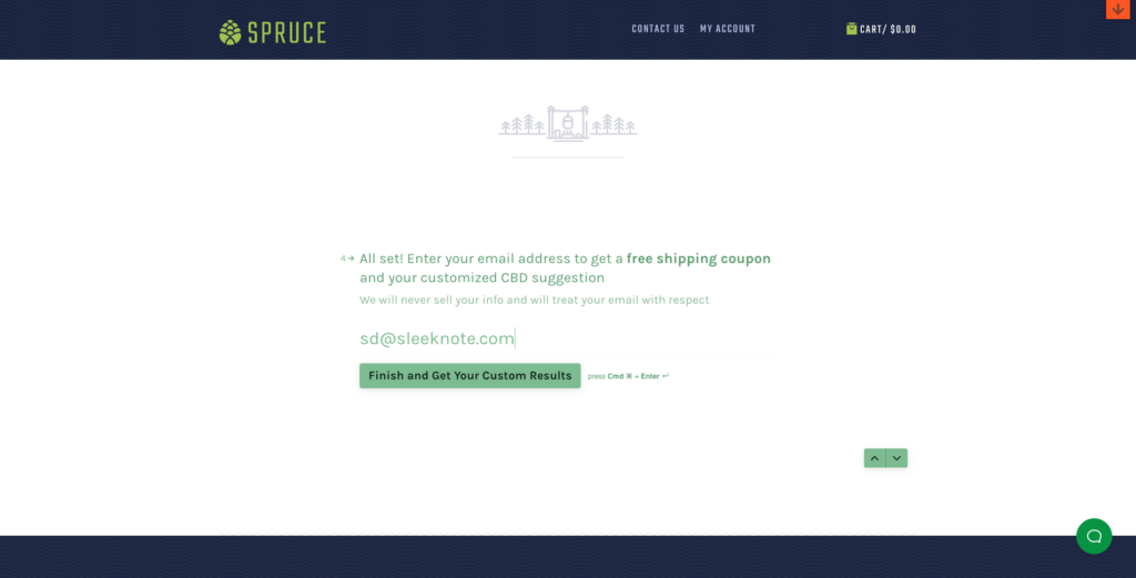
Then, before revealing the user’s results, you can, if you prefer, ask for their email address as Spruce does in their quiz.
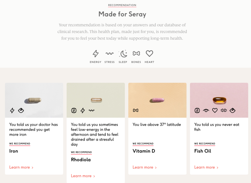
Finally, you recommend products based on the user’s answers. Here’s what Care/of recommended when Seray took its quiz.
Best of all, if you capture the user’s email address, you can market to them again later, especially if they add one or more of the items to their wish list, as discussed above.
Conclusion
There’s more to product recommendations than simply mentioning “Customers Also Bought…” and adding a few upsells beneath an items’ product description.
Top online retailers are constantly on the hunt for new ways to personalize those recommendations based on what they know about their subscribers.
But as we’ve seen, you don’t have to be technologically savvy. A timely popup and relevant email are often more to guide visitors to relevant products and put more money in your back pocket.

