
Imagine the power of a platform if nearly every e-commerce seller thinks of using it to start their online business. That’s WooCommerce for you.
A powerful and versatile e-store tool, WooCommerce makes it easier than ever to turn your website into a commercial one. In fact, it powers over 70 million e-commerce shops on WordPress and 22 percent of the top 1 million e-commerce sites.
By working on top of WordPress, WooCommerce can successfully integrate content with commerce. You can create your online store however you want, depending on the products you’re selling.
However, this also poses a serious challenge for new retailers—with so many brands trusting WooCommerce for all things e-commerce, standing out can be hard.
To help you find inspiration for your own online store, here are the seven best WooCommerce store examples that are absolutely killing it. From modern to colorful to quirky—whatever your aesthetic—I have something for every vision.
7 WooCommerce Store Examples to Inspire Your Own
1. R.E.D.D Superfood Energy Bars
R.E.D.D offers plant-based protein bars that come in delicious and intriguing flavors, including peanut butter boost, mint chocolate, and salted caramel. It was founded by an entrepreneur and model, Alden Blease, who created these energy bars to deliver clean, on-the-go nutrition.
With just one look, you know R.E.D.D has one of the best WooCommerce stores you’ll see.
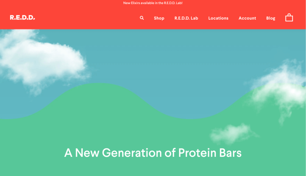
It puts the spotlight on its delicious and colorfully packaged energy bars, showing visitors how the product looks right off the bat. Also, adding a little motion at the top of their landing page is a good tactic to immediately capture the visitor’s attention.
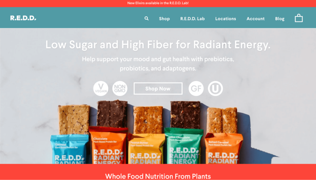
The overall website layout is clean and minimalist, which makes it easily navigable. This streamlined user experience is another reason why I chose to start my list with R.E.D.D.
As you scroll down, you notice the company uses the package colors of its five energy bars to create seamless sections throughout its website. Not only does this improve its navigation, but it also adds a branded touch to help create brand awareness.
Recently, R.E.D.D secured $2.2 million in funding to help advance sales, marketing, and R&D efforts. In fact, the company has already started pushing its approach to deliver standout formulations, taste, and texture, building a stronger nutrition profile that includes more plant-based protein and probiotics.
2. Studio Job
Job Smeets’s Studio Job offers “once-in-a-lifetime objects” that are created using traditional and modern techniques. The site is the ultimate one-stop-shop to buy unique art to give your space a distinct and artistic look.
If you want your WooCommerce store to stand out (and I mean really stand out,) you can take some pointers from Studio Job.
Its comic-book-esque theme is highly creative. The overall aesthetic is quirky and fun to complement the high-end kitch art products on offer.
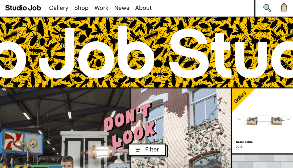
The homepage consists of a patchwork of images, videos, and animations. But instead of striking as odd, it’s a breath of fresh air compared to traditional website designs and instantly catches your attention.
An eclectic mix of design elements and visuals are splattered across the website, perfectly reflecting Studio Job’s artistic flair.
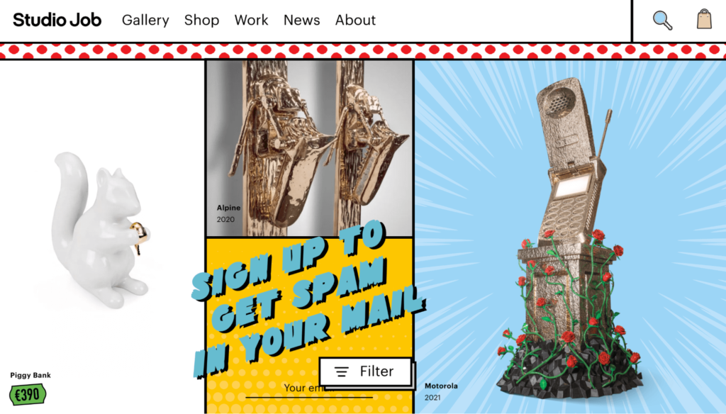
Custom cursors replace the conventional pointers with various fun (and sometimes crude) graphics depending on the page you’re on.
For instance, when you open its “Shop” page, the cursor graphic changes to a shopping cart. There’s also a hand raising the middle finger in a rude gesture and an eyeball.
It doesn’t get cooler than this.
Studio Job also does an excellent job at combining static elements with motion and GIFs. This keeps you hooked, forcing you to keep checking out other pages on the website and I speak from experience.
3. Nalgene
Known as “the original water bottle,“ Nalgene has been selling high-quality water bottles for ages to keep outdoor lovers hydrated. The company strives to provide a water bottle for every lifestyle and adventure, made from durable and dishwasher-safe, BPA-free plastic.
Nalgene’s WooCommerce store combines the best of style and functionality. The above the fold content on its website lists the key selling points of its bottles right away. This helps build trust and encourages shoppers to keep scrolling, maybe even place an order for a water bottle.
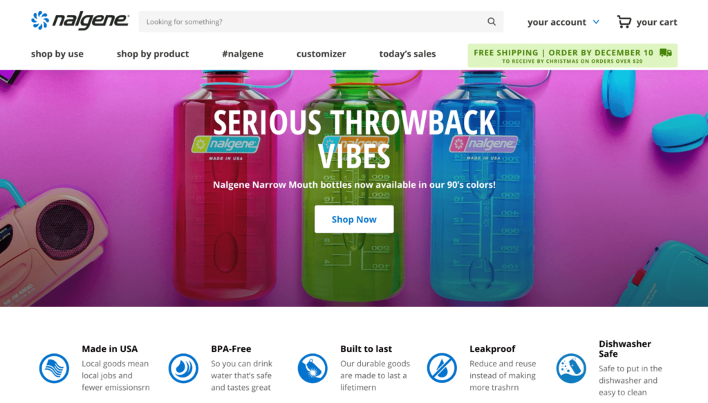
Following e-commerce website best practices, Nalgene places a prominent “Shop Now” call to action (CTA) smack at the middle of the homepage. A search bar at the top of the page allows visitors to navigate the website easily.
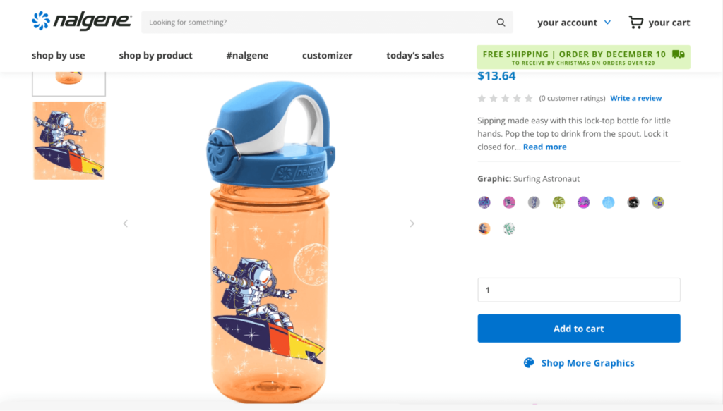
Below the fold, you’ll find high-quality images of Nalgene bestsellers, complete with their price, capacity, and colorways. This lets shoppers shop on the go with minimal cognitive exertion. A stark white background ensures your attention remains on the bottles.
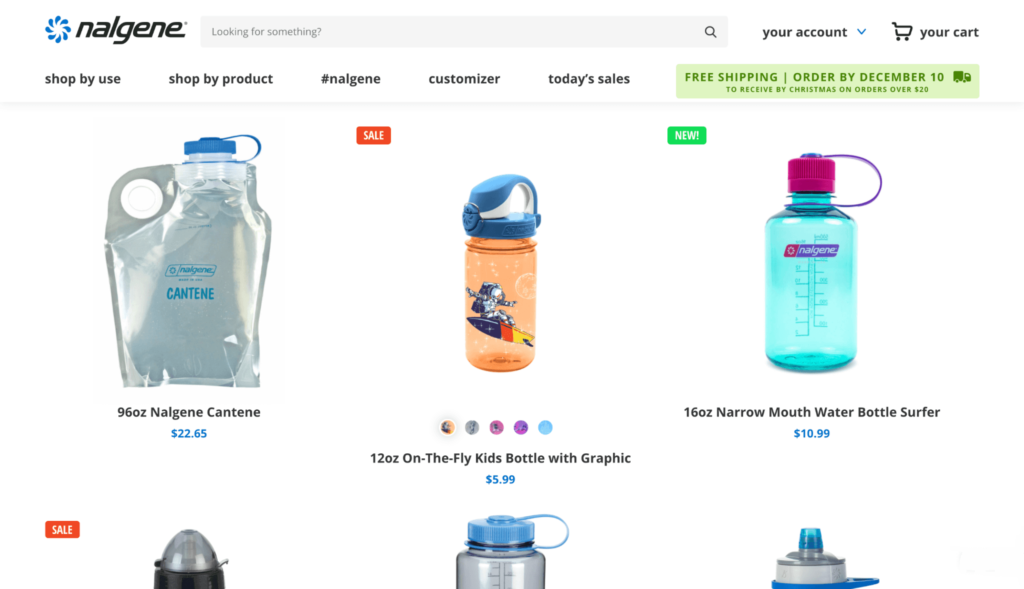
Nalgene uses a popular WooCommerce extension called “Variation Swatches and Photos” that lets you “replace dropdown fields on your variable products with WooCommerce color and image swatches.”
This helps shoppers see different variations of the product, such as water bottle color or graphics. They can see what the bottle looks like with a “Dancing Astronaut” graphic…
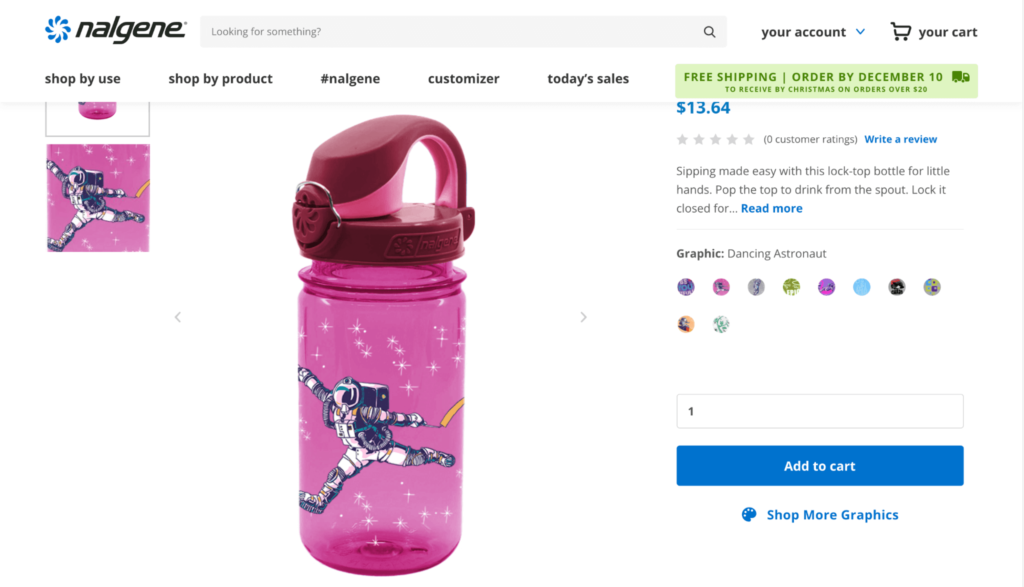
…and what it looks like with a “Surfing Astronaut” graphic (or eight other graphics).
This is one feature you should definitely consider for your e-commerce store. It’ll help you deliver an online shopping experience that is simple and effective while looking fantastic.
4. Yubico
Sweden-based company Yubico aims to make secure login easy and available to everyone.
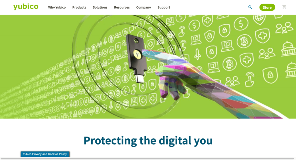
While Yubico’s product is fairly technical, its WooCommerce store is simple and information-packed. The homepage has a large feature image that makes for an instant eye-catcher, drawing you in.
The website has a modern aesthetic, with a good balance between images and text. This is a good strategy to provide visitors easy access to content while keeping them engaged and interested.
Yubico is undoubtedly one of the best WooCommerce store examples that make simplicity work in its favor.
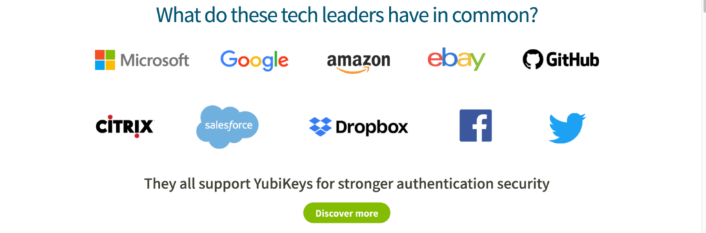
Adding social proof is an excellent tactic to boost business and one that Yubico does well.
As you scroll down, the website mentions industry heavyweights like Google, Microsoft, GitHub, Amazon, and Facebook, and how they all trust Yubico for stronger authentication security. This helps the company win its shoppers’ trust, making the latter more likely to give Yubico a shot.
After all, if it’s good enough for Google, it’s probably good enough for us.
Yubico also makes good use of the available real estate. It showcases its key product (YubiKey) and has a small section directing viewers to its blog and white papers. Placing a striking CTA towards the end of the web page provides visitors with the next steps.
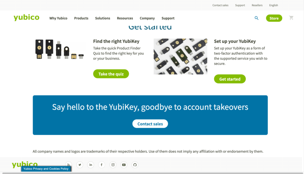
Notice how the CTA section uses blue instead of the standard green used throughout the website. Seeing a different color immediately draws your attention to it, which is exactly what you want from a CTA.
5. Dineamic
Australia-based Dineamic aims to provide people with ready-to-have, nutritious meals prepared by expert chefs.
Considering Dineamic is a meal delivery service, it naturally puts the spotlight on its mouthwatering meals. Just like Yubico, the company uses a large feature image showing off its delicious-looking and healthy meals to customers.
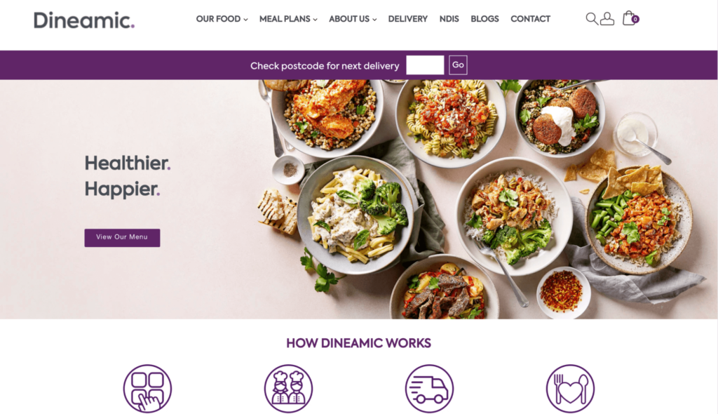
It then has a quick four-step text explaining how Dineamic works. You can always have a separate page explaining your delivery process in detail, but keeping a smaller, bite-sized gist on the homepage like Dineamic can also work wonders. Visitors will know what to expect and how to proceed if they’re interested in subscribing to your service.
The homepage also includes mouth-watering images of meals from Dineamic’s menu.
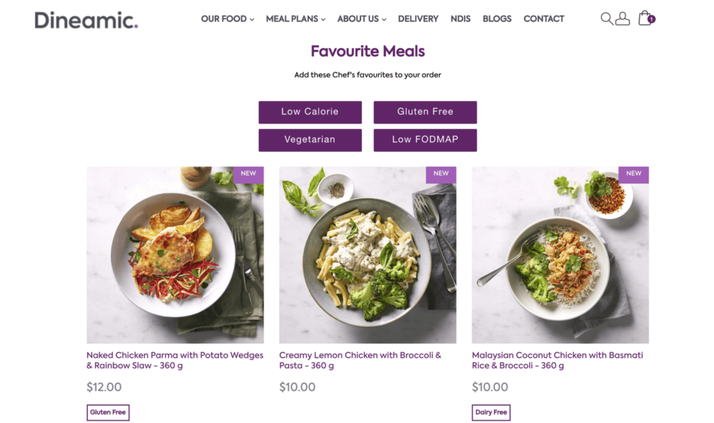
Each image is presented in a similar setting that helps maintain design and color consistency and provides users with necessary information regarding each meal, such as the ingredients, portion, and price.
Adding four meal categories—Low Calorie, Gluten-Free, Vegetarian, and Low FODMAP—allows shoppers to explore relevant options easily, improving UX.
Dineamic uses the WooCommerce Cart Tab plugin, along with a custom-developed WordPress theme and tracking and analytics plugins to keep a shopping cart visible to the top of the screen, regardless of where they are on the website.
This is a useful tip as keeping the cart at the forefront of the customer’s vision can improve conversions and lower cart abandonment rates.
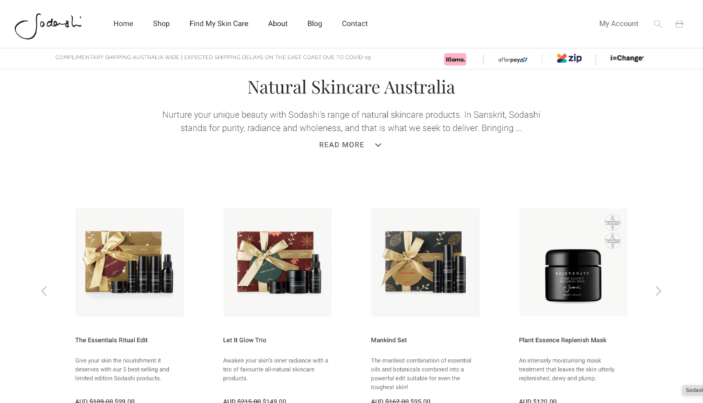
6. Sodashi
Sodashi has a unique philosophy: to nurture and celebrate every individual’s unique beauty.
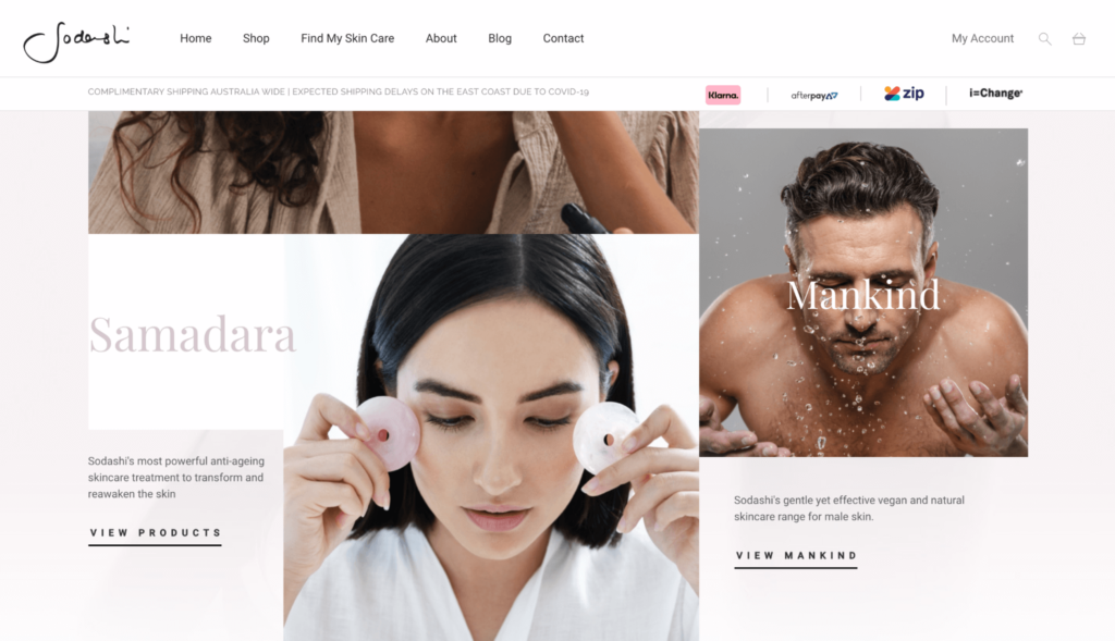
Just like its value proposition, Sodashi has put a lot of thought into designing its website, making it yet another stunning WooCommerce store example.
The website is designed to tell Sodashi’s story by introducing the company, its products, and brand vision in a natural order with closeups of people looking after their skin.
The entire storefront is done using a natural color palette, with soft pastels to reflect a clean beauty brand image. As you scroll through the site, you’ll find several CTAs placed at the appropriate places without sticking out like a sore thumb. This does a great job of engaging visitors and keeping them on the website for longer.
I really like how Sodashi uses interactive forms on the “Find My Skincare” page to great effect.
The multistep form asks customers simple questions regarding their skin type, and then based on their answers, directs them to a personalized product page based on their responses.
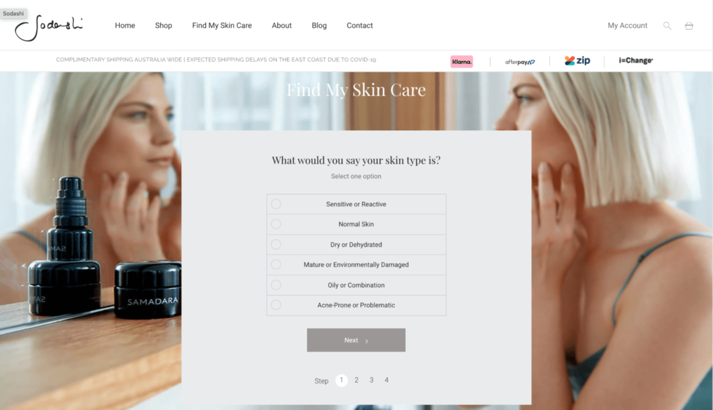
This kind of personalization is a brilliant incentive from Sodashi. Skincare is a personal thing, and offering personalized recommendations will help customers find the perfect products based on their needs, boosting sales and improving customer service.
What’s more, Sodashi also asks customers for their email addresses to send them a personalized skincare ritual. This is another effective strategy to grow their mailing list and build customer loyalty.
7. April Soderstrom
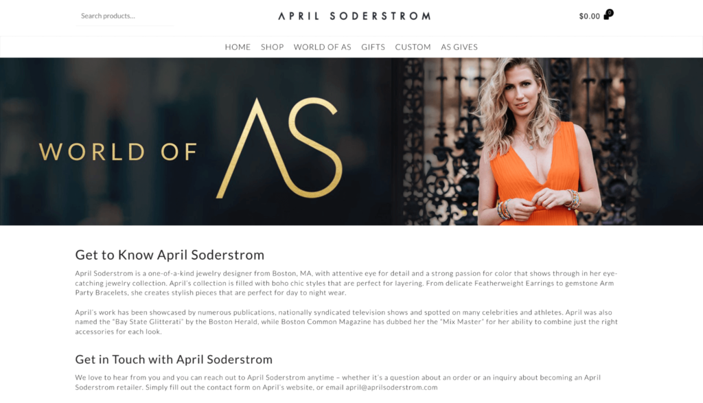
Boston-based April Soderstrom designs colorful, luxury, handmade jewelry for everyday living, and she uses the same ideology for her website.
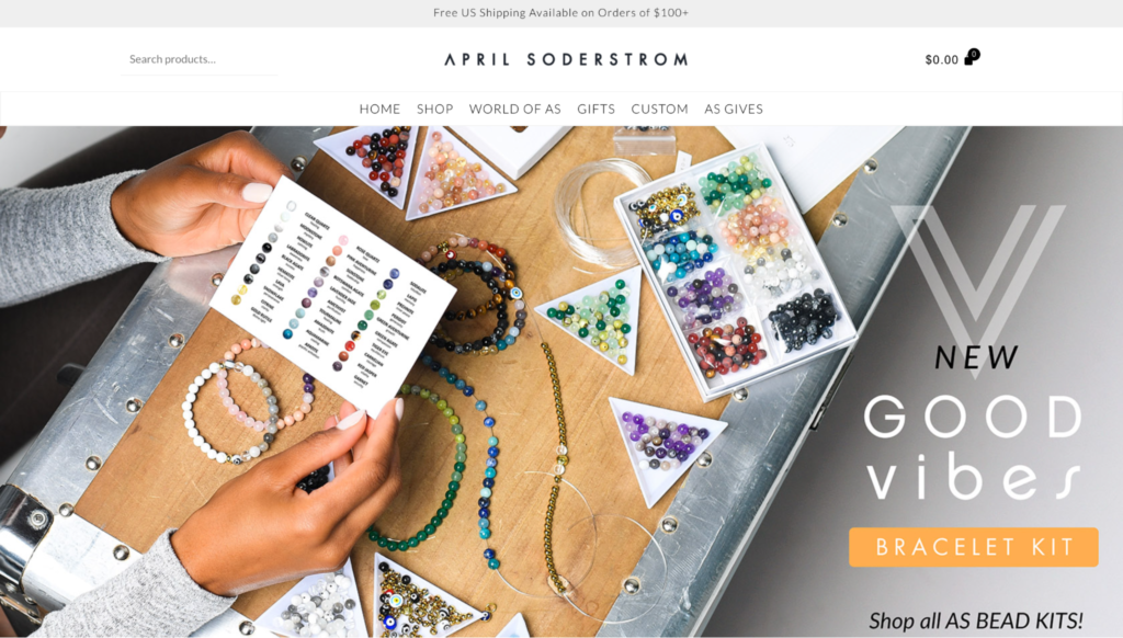
Using WooCommerce’s customization features, April has created a beautiful digital storefront that is easily navigable and aesthetically pleasing—all the while making her jewelry pieces the star of the show.
The top of the website has a simple menu in the middle and a small search bar and a shopping cart that tells your grand shopping total at the corners.
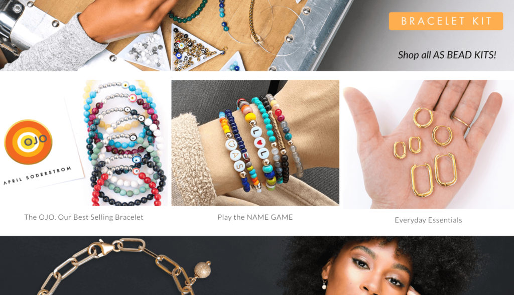
Throughout the site, you’ll find various clickable links that make it easier for visitors to shop. They can browse through different collections, ranging from everyday essentials to personalized pieces to April’s bestsellers.
An “About” page tells visitors more about April and her vision behind the brand. This is a good tactic to educate customers about what makes the jewelry unique from its competitors and build credibility.
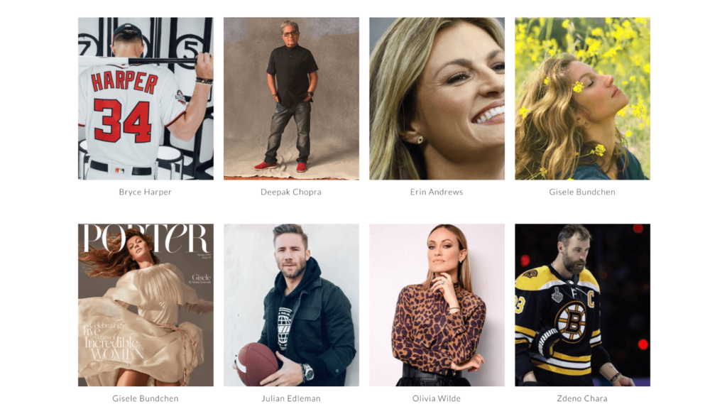
More links below the fold help direct shoppers to the different parts of the website. April’s website also does a brilliant job adding some social proof, including the likes of Gisele Bundchen, Bryce Harper, and Olivia Wilde wearing their own April Soderstrom pieces.
But that’s not all.
There’s also an “AS Gives” section, where the company tries to give back to society and help others. For every bracelet sold, April Soderstrom gives 38 meals to people in need.
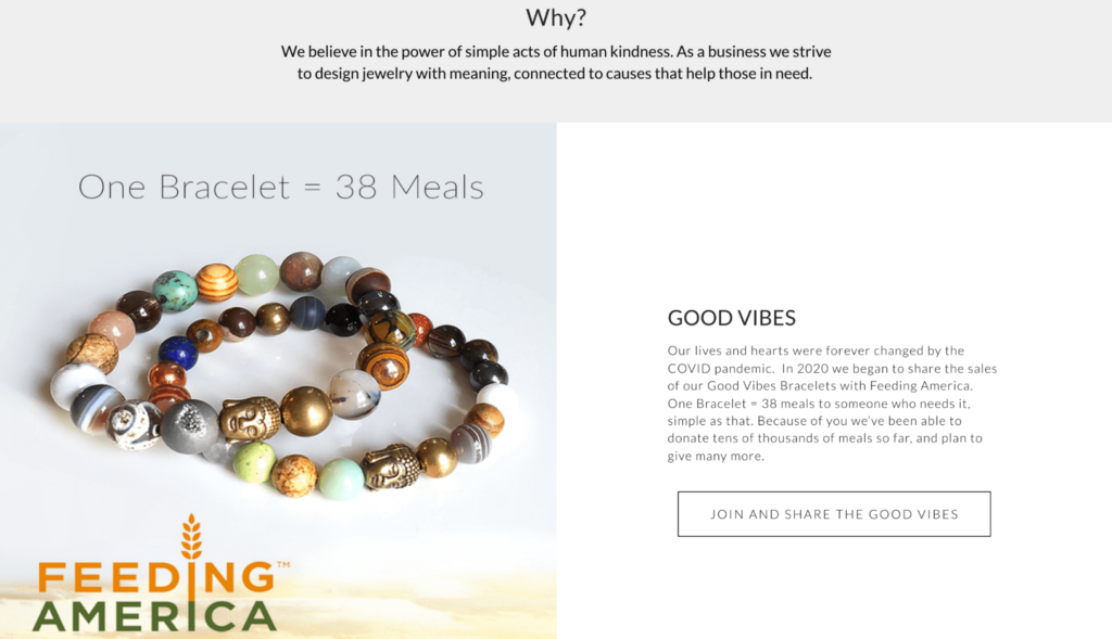
This makes shoppers feel like they are a part of the greater good, making them more likely to purchase from a company that’s using their revenue to uplift society.
The April Soderstrom website uses two amazing commerce extensions called Smart Coupons and Facebook for WooCommerce.
Smart Coupons is a coupon management plugin that allows brands to offer their customers discounts, credits, coupons, and vouchers, as well as do product giveaways.
On the other hand, Facebook for WooCommerce integrates your website with popular social media platforms like Facebook, Instagram, Facebook Messenger, and WhatsApp to help you enhance your reach.
Conclusion
The best WooCommerce sites focus on simple navigation, high-quality images, and an on-brand color scheme and layout design.
All the above WooCommerce store examples trust the platform for all things e-commerce, and from the looks of it, they’ve made the right choice.
WooCommerce is one of the most user-friendly and highly customizable e-commerce platforms you can get your hands on. Use it to create your own professional online store from the ground up and watch your brand skyrocket to success.

